
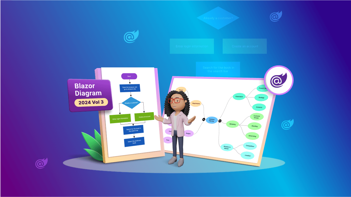
TL;DR: Explore the AI-powered features of Syncfusion Blazor Diagram! The 2024 Volume 3 release adds Text-to-Flowchart and Text-to-Mind Map capabilities, effortlessly turning text into diagrams. Other features include Mermaid syntax support and enhanced CRUD operations, making Blazor Diagram a powerful tool for visualizing workflows.
The Essential Studio® 2024 Volume 3 release brings a host of exciting new AI-powered smart features and other enhancements to the Syncfusion Blazor Diagram component. These features are designed to simplify the creation and management of diagrams. With a focus on intuitive usability and flexibility, this update enables technical and non-technical users to visualize their ideas more effectively.
Let’s explore the standout updates that make this release a game-changer for diagramming!
AI-powered smart features
Text-to-flow chart conversion
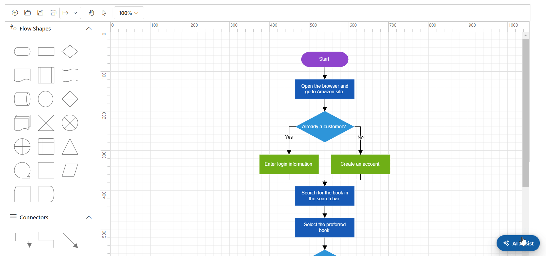
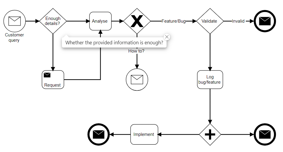
The Blazor Diagram component now includes a Text-to-Flowchart feature that leverages AI to seamlessly convert textual descriptions into well-structured flowcharts. This innovative tool automatically arranges nodes and connectors, creating a flowchart layout representing processes and workflows. It’s an excellent solution for visualizing step-by-step procedures, decision-making paths, and complex workflows interactively.
This AI-driven flowchart creation tool allows users to quickly transform complex processes into visual diagrams, enhancing understanding and analysis. Without manual intervention, it can represent algorithms, business workflows, and process maps. This feature speeds up the diagramming process and ensures precise and accurate representations of workflows, making it an invaluable asset for professionals aiming to convey complex ideas visually.
Refer to the following image.
Text-to-mind map conversion
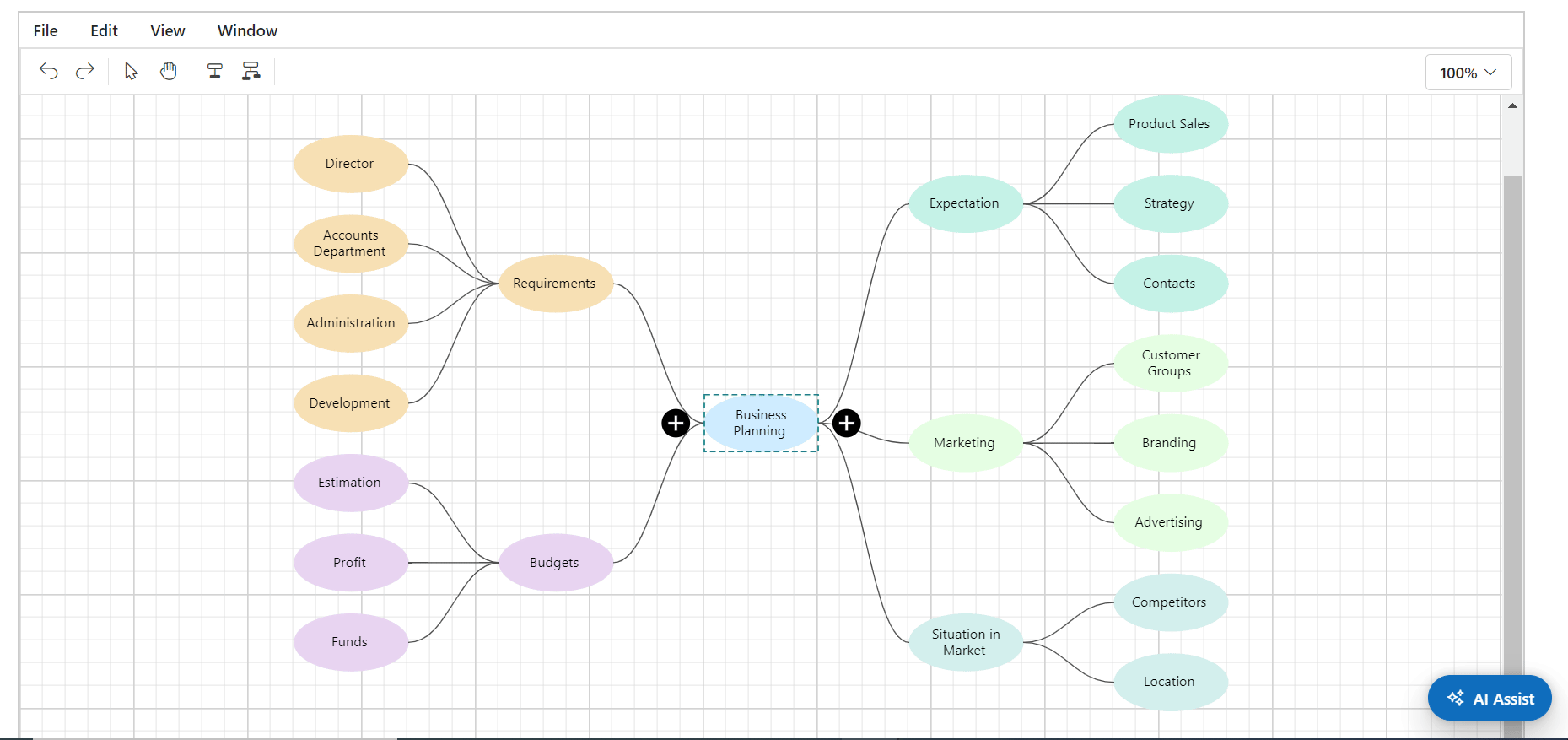
In addition to flowcharts, the Blazor Diagram component now supports a text-to-mind map conversion capability powered by AI. This feature automatically creates dynamic mind map diagrams, where nodes and connectors are arranged to organize and represent ideas in a mind map layout. It’s perfect for brainstorming sessions, organizing thoughts, and visually mapping complex information.
The AI-powered mind map diagram includes a context menu that facilitates quick actions such as adding, editing, or deleting nodes, making it an interactive tool for efficiently managing and expanding mind maps. This enhances productivity by providing a flexible environment to dynamically explore ideas and visualize relationships between concepts.
These AI-powered enhancements to the Blazor Diagram component make it an indispensable tool for both technical and non-technical users, enabling the swift translation of text into visual formats for better communication and analysis.
Note: For more details, refer to the AI-powered features in the Blazor Diagram GitHub demos.
Flowchart layout support
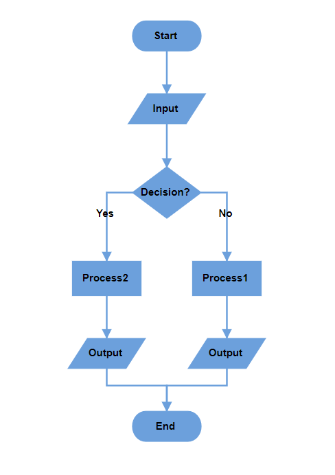
The Blazor Diagram component now supports Flowchart layout, providing a powerful way to visually represent complex processes, workflows, systems, or algorithms. This layout utilizes an advanced algorithm to automatically arrange nodes and Connectors in a logical and visually appealing manner. Whether you’re working with nodes and connectors sourced from business objects defined in the DataSource, the Flowchart Layout ensures that your diagram is clear and easy to understand.
To enable this feature, set the Flowchart enum value in the Type and configure the FlowchartLayoutSettings property of the Layout. This layout automatically handles elements’ positioning and spacing, saving time and effort.
@using Syncfusion.Blazor.Diagram

<SfDiagramComponent @ref="Diagram" Width="100%" Height="900px" ConnectorCreating="@OnConnectorCreating" NodeCreating="@OnNodeCreating" DataLoaded="@OnDataLoaded">
 <DataSourceSettings ID="Id" ParentID="ParentId" DataSource="DataSource"> </DataSourceSettings>
 <Layout Type="LayoutType.Flowchart" HorizontalSpacing="50" Orientation="LayoutOrientation.TopToBottom" VerticalSpacing="50" FlowchartLayoutSettings="@flowchartSettings">
 </Layout>
</SfDiagramComponent>

@code
{
    //Initialize diagram component.
    SfDiagramComponent Diagram;
    //Initialize flowchart layout settings.
    FlowchartLayoutSettings flowchartSettings = new FlowchartLayoutSettings()
        {
            YesBranchDirection = BranchDirection.LeftInFlow,
            NoBranchDirection = BranchDirection.RightInFlow
        };

    private void OnDataLoaded(object obj)
    {
        for (int i = 0; i < Diagram.Connectors.Count; i++)
        {
            var connector = Diagram.Connectors[i];
            var node = Diagram.GetObject(connector.TargetID) as Node;
            var srcNode = Diagram.GetObject(connector.SourceID) as Node;
            if (node.Data != null && node.Data is ItemInfo itemInfo)
            {
                if (itemInfo.Label != null && itemInfo.Label.Count > 0)
                {
                    if (itemInfo.ParentId.IndexOf((srcNode.Data as ItemInfo).Id) != -1)
                    {
                        var parentIndex = itemInfo.ParentId.IndexOf((srcNode.Data as ItemInfo).Id);
                        if (itemInfo.Label.Count > parentIndex)
                        {
                            connector.Annotations = new DiagramObjectCollection<PathAnnotation>()
                            {
                                new PathAnnotation() { Content = itemInfo.Label[parentIndex], Style = new TextStyle(){ Bold = true} }
                            };
                        }
                    }
                }
            }
        }
    }
    //Creates connectors with some default values.
    private void OnConnectorCreating(IDiagramObject obj)
    {
        if (obj is Connector connector)
        {
            connector.Type = ConnectorSegmentType.Orthogonal;
        }
    }
    //Creates nodes with some default values.
    private void OnNodeCreating(IDiagramObject obj)
    {
        Node node = obj as Node;
        if (node.Data != null && node.Data is ItemInfo)
        {
            ItemInfo employeeDetails = node.Data as ItemInfo;
            node.Width = employeeDetails._Width;
            node.Height = employeeDetails._Height;
            if (employeeDetails._Shape == "StartOrEnd")
            {
                node.Shape = new FlowShape() { Shape = NodeFlowShapes.Terminator };
            }
            else
                node.Shape = new FlowShape() { Shape = (NodeFlowShapes)Enum.Parse(typeof(NodeFlowShapes), employeeDetails._Shape.ToString()) };
            node.Style.Fill = employeeDetails._Color;
            node.Style.StrokeColor = employeeDetails._Color;
            node.Annotations = new DiagramObjectCollection<ShapeAnnotation>()
            {
                new ShapeAnnotation(){ Content = employeeDetails.Name, Style = new TextStyle(){ Color = "white", Bold = true} }
            };
        }
    }
    //Initialize data source collection.
    public List<ItemInfo> DataSource = new List<ItemInfo>(){
        new ItemInfo()
        {
            Id = "1",
            Name = "Start",
            _Shape = "StartOrEnd",
            _Width = 80,
            _Height = 35,
            _Color = "#6CA0DC"
        },
        new ItemInfo()
        {
            Id = "2",
            Name = "Input",
            ParentId = new List<string> { "1" },
            _Shape = "Data",
            _Width = 90,
            _Height = 35,
            _Color = "#6CA0DC"
        },
        new ItemInfo()
        {
            Id = "3",
            Name = "Decision?",
            ParentId = new List<string> { "2" },
            _Shape = "Decision",
            _Width = 80,
            _Height = 60,
            _Color = "#6CA0DC"
        },
        new ItemInfo()
        {
            Id = "4",
            Label = new List<string> { "No" },
            Name = "Process1",
            ParentId = new List<string> { "3" },
            _Shape = "Process",
            _Width = 80,
            _Height = 40,
            _Color = "#6CA0DC"
        },
        new ItemInfo()
        {
            Id = "5",
            Label = new List<string> { "Yes" },
            Name = "Process2",
            ParentId = new List<string>() { "3" },
            _Shape = "Process",
            _Width = 80,
            _Height = 40,
            _Color = "#6CA0DC"
        },
        new ItemInfo()
        {
            Id = "6",
            Name = "Output",
            ParentId = new List<string> { "5" },
            _Shape = "Data",
            _Width = 90,
            _Height = 35,
            _Color = "#6CA0DC"
        },
        new ItemInfo()
        {
            Id = "7",
            Name = "Output",
            ParentId = new List<string> { "4" },
            _Shape = "Data",
            _Width = 90,
            _Height = 35,
            _Color = "#6CA0DC"
        },
        new ItemInfo()
        {
            Id = "8",
                Name = "End",
                ParentId = new List<string> { "6","7" },
                _Shape = "Terminator",
                _Width = 80,
                _Height = 35,
                _Color = "#6CA0DC"
        },
    };
    public class ItemInfo
    {
        public string Name { get; set; }
        public string Id { get; set; }
        public List<string> Label { get; set; }
        public List<string> ParentId { get; set; }
        public string _Shape { get; set; }
        public double _Width { get; set; }
        public double _Height { get; set; }
        public string _Color { get; set; }
    }
}
Refer to the following image.
Note: For more details, refer to the example of flowchart layout in Blazor Diagram.
Import and export diagrams using Mermaid syntax
In this 2024 volume 3 release, the Blazor Diagram component introduces support for Mermaid syntax, a Markdown-inspired language that simplifies diagram creation. This new feature allows you to seamlessly import and export mind maps and flowcharts.
Key features
- Create diagrams from Mermaid syntax: Easily visualize complex ideas and workflows directly from Mermaid text, eliminating the need to draw each element manually.
- Export diagrams to Mermaid syntax: You can share, edit, and reuse your diagrams across various platforms by exporting them to Mermaid format.
How to use Mermaid syntax in Blazor Diagram
You can access this functionality through the following methods in the SfDiagramComponent:
1. SaveDiagramAsMermaid
The SaveDiagramAsMermaid() method converts the current diagram into Mermaid text format for easy sharing.
SfDiagramComponent Diagram;
//Returns the serialized Mermaid string of the Diagram.
string data = Diagram.SaveDiagramAsMermaid();
2. LoadDiagramFromMermaidAsync
The LoadDiagramFromMermaidAsync is a method that generates a diagram from Mermaid text data, automatically creating the necessary nodes and connectors.
The following code example demonstrates how to load a diagram using a Mermaid string data.
SfDiagramComponent Diagram;
// Retrieves the serialized Mermaid string of the Diagram.
string data = Diagram.SaveDiagramAsMermaid();
// Loads the Diagram from the saved Mermaid string.
await Diagram.LoadDiagramFromMermaidAsync(data);
This functionality not only streamlines diagram creation but also enhances collaboration by using a widely recognized syntax format.
Perform CRUD actions in the Blazor Diagram
With the introduction of CRUD (Create, Read, Update, Delete) action support, managing diagram data has become more dynamic and flexible. This feature allows you to modify the diagram’s data source at runtime, enabling real-time updates to your diagrams. You can easily add, update, or remove nodes and connectors from the DataSource using the following built-in methods in the SfDiagramComponent.
1. ReadDataAsync
The ReadDataAsync(Query) method retrieves the current data from the DataSource, allowing you to access existing nodes and connectors at runtime.
Refer to the following code example for reading data from the DataSource.
@using Syncfusion.Blazor.Diagram

<button class="btn btn-primary" @onclick="Read">Read</button>
<SfDiagramComponent ID="diagram" @ref="@diagram" Width="100%" Height="690px" ConnectorCreating="@ConnectorCreating" NodeCreating="@NodeCreating">
 <DataSourceSettings ID="EmployeeID" ParentID="ReportsTo">
  <SfDataManager Url="api/Data" Adaptor="Syncfusion.Blazor.Adaptors.WebApiAdaptor"></SfDataManager>
 </DataSourceSettings>
 <Layout Type="Syncfusion.Blazor.Diagram.LayoutType.HierarchicalTree" VerticalSpacing="75" HorizontalSpacing="75" GetLayoutInfo="GetLayoutInfo"></Layout>
</SfDiagramComponent>

@code {
    SfDiagramComponent diagram;

    public async void Read()
    {
        List<object> Details = (List<object>)await diagram.ReadDataAsync();
    }
}
2. InsertDataAsync
The InsertDataAsync method allows you to insert new data into the DataSource, dynamically adding new elements (nodes or connectors) to the diagram.
The following code illustrates how to insert new data into the DataSource.
@using Syncfusion.Blazor.Diagram

<button class="btn btn-primary" @onclick="Insert">Insert</button>
<SfDiagramComponent ID="diagram" @ref="@diagram" Width="100%" Height="690px" ConnectorCreating="@ConnectorCreating" NodeCreating="@NodeCreating">
 <DataSourceSettings ID = "EmployeeID" ParentID="ReportsTo">
  <SfDataManager Url = "api/Data" Adaptor="Syncfusion.Blazor.Adaptors.WebApiAdaptor"></SfDataManager>
 </DataSourceSettings>
 <Layout Type = "Syncfusion.Blazor.Diagram.LayoutType.HierarchicalTree" VerticalSpacing="75" HorizontalSpacing="75" GetLayoutInfo="GetLayoutInfo"></Layout>
</SfDiagramComponent>

@code {
  SfDiagramComponent diagram;
  public async void Insert()
   {
      EmployeeDetails employeeDetails = new EmployeeDetails()
       {
           EmployeeID = 6,
          Name = "Michael",
          Designation = "Team Lead",
            ReportsTo = "5",
            Colour = "Orange"
       };
       await diagram.InsertDataAsync(employeeDetails);

     }
    }
3. UpdateDataAsync
The UpdateDataAsync method updates existing data in the DataSource based on a specified key field, allowing you to modify nodes or connectors in real time.
The following code illustrates how to update existing data in the DataSource.
@using Syncfusion.Blazor.Diagram

<button class="btn btn-primary" @onclick="Update">Update</button>
<SfDiagramComponent ID="diagram" @ref="@diagram" Width="100%" Height="690px" ConnectorCreating="@ConnectorCreating" NodeCreating="@NodeCreating">
 <DataSourceSettings ID = "EmployeeID" ParentID="ReportsTo">
  <SfDataManager Url = "api/Data" Adaptor="Syncfusion.Blazor.Adaptors.WebApiAdaptor"></SfDataManager>
 </DataSourceSettings>
 <Layout Type = "Syncfusion.Blazor.Diagram.LayoutType.HierarchicalTree" VerticalSpacing="75" HorizontalSpacing="75" GetLayoutInfo="GetLayoutInfo"></Layout>
</SfDiagramComponent>

@code {
  SfDiagramComponent diagram;
  public async void Update()
   {
      EmployeeDetails employeeDetails = new EmployeeDetails()
         {
               EmployeeID = 6,
               Name = "Michael",
               Designation = "Product Manager",
               ReportsTo = "1",
               Colour = "Green"
            };
           await diagram.UpdateDataAsync("EmployeeID", employeeDetails);
     }
    }
4. DeleteDataAsync
The DeleteDataAsync method removes data from the DataSource based on a specified key field, allowing you to easily delete nodes or connectors from the diagram.
The following code illustrates how to delete data from the DataSource.
@using Syncfusion.Blazor.Diagram

<button class="btn btn-primary" @onclick="Delete">Delete</button>
<SfDiagramComponent ID="diagram" @ref="@diagram" Width="100%" Height="690px" ConnectorCreating="@ConnectorCreating" NodeCreating="@NodeCreating">
 <DataSourceSettings ID = "EmployeeID" ParentID="ReportsTo">
  <SfDataManager Url = "api/Data" Adaptor="Syncfusion.Blazor.Adaptors.WebApiAdaptor"></SfDataManager>
 </DataSourceSettings>
 <Layout Type = "Syncfusion.Blazor.Diagram.LayoutType.HierarchicalTree" VerticalSpacing="75" HorizontalSpacing="75" GetLayoutInfo="GetLayoutInfo"></Layout>
</SfDiagramComponent>

@code {
  SfDiagramComponent diagram;
  public async void Delete()
   {
      await diagram.DeleteDataAsync("EmployeeID", 6);
    }
These CRUD actions offer a seamless way to manage your diagram data, providing the flexibility to modify, add, update, or remove nodes and connectors in real-time. This feature significantly enhances dynamic interactivity and ensures that your diagrams always reflect the most up-to-date information.
Tooltip support for fixed user handles, ports, and user handles
Enhance your Blazor Diagram’s user experience with Tooltip support for fixed ports and user handles. This feature allows you to display informative tooltips when users hover over these elements, providing context and additional details without cluttering the diagram. Tooltips can be easily configured using the Tooltip property in the following classes:
1. Port
Use the Tooltip property in the Port class to display helpful hints about port functionality. Here’s how to configure the tooltip for a port:
The following code illustrates how to set the tooltip for the port.
………………
………………..
Node node = new Node()
{
    // Position of the node
    OffsetX = 250,
    OffsetY = 250,
    // Size of the node
    Width = 100,
    Height = 100,
    Style = new ShapeStyle() { Fill = "#6495ED", StrokeColor = "white" },
    // Initialize port collection
    Ports = new DiagramObjectCollection<PointPort>()
    {
        // Sets the position for the port
        new PointPort()
        {
        Style = new ShapeStyle() { Fill = "gray" },
        Offset = new DiagramPoint() { X = 0, Y = 0 },
        Visibility = PortVisibility.Visible,
        Tooltip = new DiagramTooltip() { Content = "OutConnectPort"}
        }
    }
};
………………..
………………..
2. Fixed user handle tooltip
The FixedUserHandle class lets you give users insights into specific fixed handles through Tooltip. The following code illustrates how to set the Tooltip for FixedUserhandle.
………………
………………..
Node node1 = new Node()
        {
            OffsetX = 250,
            OffsetY = 250,
            Width = 100,
            Height = 100,
            Style = new ShapeStyle() { Fill = "#6495ED", StrokeColor = "white" },
            FixedUserHandles = new DiagramObjectCollection<NodeFixedUserHandle>()
            {
                new NodeFixedUserHandle()
                {
                    ID = "user1",
                    Height = 20,
                    Width = 20,
                    Visibility = true,
                    Padding = new DiagramThickness() { Bottom = 1, Left = 1, Right = 1, Top = 1 },
                    Margin = new DiagramThickness() { Right = 20 }, Offset = new DiagramPoint() { X = 0 , Y = 0 },
                    PathData = "M60.3,18H27.5c-3,0-5.5,2.4-5.5,5.5v38.2h5.5V23.5h32.7V18z M68.5,28.9h-30c-3,0-5.5,2.4-5.5,5.5v38.2c0,3,2.4,5.5,5.5,5.5h30c3,0,5.5-2.4,5.5-5.5V34.4C73.9,31.4,71.5,28.9,68.5,28.9z M68.5,72.5h-30V34.4h30V72.5z",
                    Tooltip = new DiagramTooltip(){Content="CloneNode", Position=Position.BottomLeft},
                },
            }
        };
………………..
…………………..
3. User handle tooltip
Tooltips can also be added to user handles by setting the Tooltip property in the UserHandle class. The following code illustrates how to set the tooltip for UserHandle.
………………………………….
…………………………………
UserHandle cloneHandle = new UserHandle()
        {
            Name = "clone",
            PathData = "M60.3,18H27.5c-3,0-5.5,2.4-5.5,5.5v38.2h5.5V23.5h32.7V18z M68.5,28.9h-30c-3,0-5.5,2.4-5.5,5.5v38.2c0,3,2.4,5.5,5.5,5.5h30c3,0,5.5-2.4,5.5-5.5V34.4C73.9,31.4,71.5,28.9,68.5,28.9z M68.5,72.5h-30V34.4h30V72.5z",
            Visible = true,
            Offset = 0,
            Side = Direction.Right,
            Margin = new DiagramThickness() { Top = 0, Bottom = 0, Left = 0, Right = 0 },
            Tooltip = new DiagramTooltip() { Content = "CloneNode" }
        };
        UserHandles = new DiagramObjectCollection<UserHandle>()
        {
            cloneHandle
        };
        SelectedModel.UserHandles = UserHandles;
………………………………….
…………………………………
This feature significantly enhances interactivity by providing instant feedback to users, thereby improving the overall usability of your diagram. With tooltips in place, users can easily access additional information without overwhelming the interface.
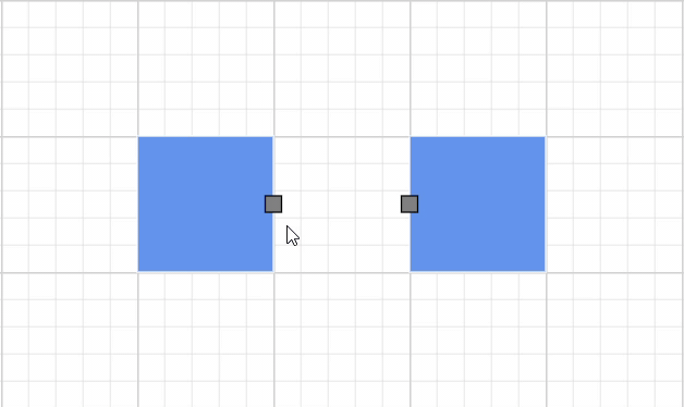
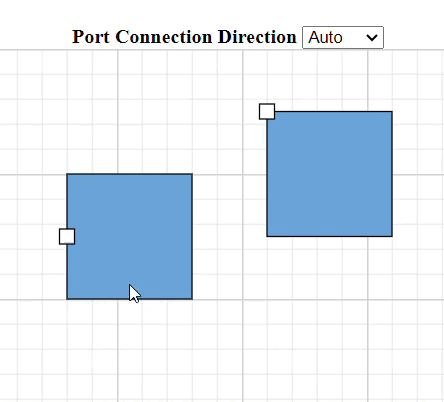
Connection direction for ports
The ConnectionDirection property of a port offers enhanced control over how connectors should interact with ports. You can now define whether a connector should connect to the port (incoming) or from the port (outgoing). This is particularly useful in scenarios like process modeling or network diagrams, where maintaining the direction of flow is critical. This feature ensures that connections are established in the intended direction, preserving the logical flow of the diagram.
Note: For more details, refer to the example of ports in the Blazor Diagram component.
Refer to the following code example to set the connection direction for a port.
……………
……………
 Node node = new Node()
   {
       ……………
       Ports = new DiagramObjectCollection<PointPort>()
       {
           // Sets the position for the port
           new PointPort()
           {
               ID = "port",
               ConnectionDirection = PortConnectionDirection.Bottom
           }
       }
       ……………
   };
………………
………………
Refer to the following image.
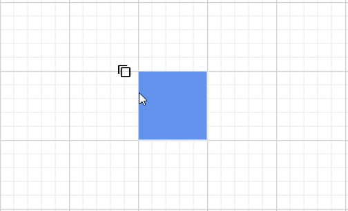
Scroll padding support
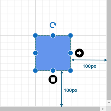
Navigating through large diagrams is now easier with the ScrollPadding property in the ScrollSettings. This allows you to add extra spacing between diagram elements and the edges of the viewport, ensuring that elements aren’t too close to the boundaries. With ScrollPadding, you can focus on specific parts of the diagram without feeling cramped.
Note: For more details, refer to the example of scrolling in Blazor Diagram component.
The following example shows how to apply scroll padding.
<SfDiagramComponent Width="1000px" Height="1000px">
 <ScrollSettings ScrollPadding="@ScrollBorder">
 </ScrollSettings>
</SfDiagramComponent>

@code {
// Initializes the scroll padding to 100px for all four sides.
  DiagramMargin ScrollBorder = new DiagramMargin { Left = 100, Right = 100, Top = 100, Bottom = 100 };
………………………
………………………
 }
Refer to the following image.
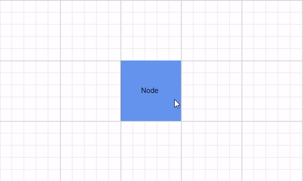
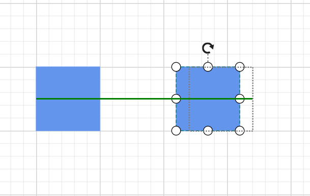
Snap line style customization
We’ve introduced the snap line style customization feature to elevate your diagramming experience. Snap lines are essential for aligning elements within your diagram, and now you can fully customize their appearance to suit your design preferences or improve their visibility.
Adjusting the SnapLineStyle property in the SnapSettings allows you to modify the snap line’s color, thickness, and pattern, ensuring your diagram maintains a clean, consistent, and visually appealing layout.
Note: For more details, refer to the example of snapping in Blazor Diagram.
Refer to the following code example to customize the snap line style.
@using Syncfusion.Blazor.Diagram

<SfDiagramComponent Height="600px" Nodes="@nodes">
 <SnapSettings Constraints="@snapConstraints" SnapAngle="10" SnapDistance="10" SnapLineStyle="snapLineStyle">
 </SnapSettings>
</SfDiagramComponent>

@code
{
    //Sets the Snap to objects constraints.
    public SnapConstraints snapConstraints = SnapConstraints.ShowLines | SnapConstraints.SnapToObject | SnapConstraints.SnapToLines;
    DiagramObjectCollection<Node> nodes = new DiagramObjectCollection<Node>();
    ShapeStyle snapLineStyle = new ShapeStyle() { StrokeColor = "green", StrokeWidth = 3 };
…………………
……………………
Refer to the following image.
Sticky tooltip
Tooltips just got smarter with the new IsSticky Tooltip feature! Now, tooltips remain visible while you hover over different diagram elements, including nodes, connectors, swimlanes, ports, and user handles (both regular and fixed). This ensures that users consistently receive relevant information, making the diagramming experience more interactive and informative.
Note: For more details, refer to the example of the tooltip in the Blazor Diagram.
Refer to the following code example.
<SfDiagramComponent @ref = "diagram" Width="1000px" Height="500px" @bind-Nodes="@nodes"></SfDiagramComponent>

  @code {
      SfDiagramComponent diagram;
      DiagramObjectCollection<Node> nodes = new DiagramObjectCollection<Node>();
      DiagramObjectCollection<Connector> connectors = new DiagramObjectCollection<Connector>();

      protected override void OnInitialized()
      {
          // Initialize a node and add a node to nodes collection.
            nodes.Add(
            new Node()
             {
// Initialize node properties

Tooltip = new DiagramTooltip()
{
IsSticky = true,
// Other tooltip properties
               };
            });
      }
  }
Refer to the following image.
Segment thumb shape and style customization
Fine-tuning connector paths is now easier with the ability to customize the segment thumb shape and style for orthogonal and bezier connectors.
This update allows you to set the Shape enum value in the SegmentThumbSettings class for both the SfDiagramComponent and Connector classes. You can modify the segment thumb shape to make it more visually distinct or match your design preferences. To enable segment thumbs, set the connector constraints to DragSegmentThumb. This feature provides more control over connector customization, improving the overall diagram aesthetics.
Note: For more details, refer to the example of connectors in Blazor Diagram.
The following table describes different types of connectors and their thumb customization.
Connector type | Output |
Orthogonal | 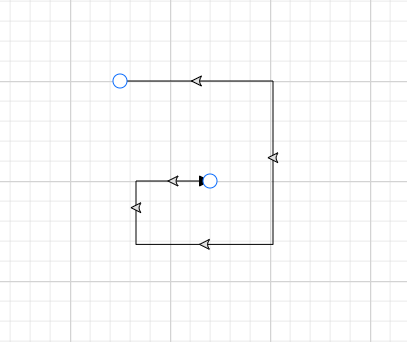 |
Bezier | 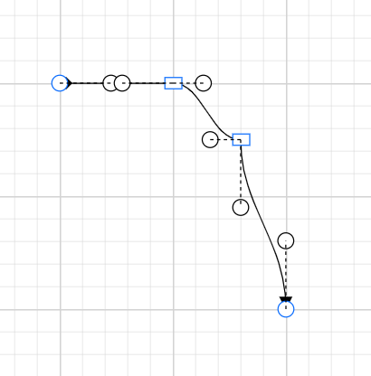 |
Straight | 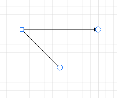 |

Conclusion
Thank you for reading! In this blog, we explored the latest updates to the Blazor Diagram component in the 2024 Volume 3 release, including AI-powered features that streamline diagram creation and management. For a complete overview of all the new features in this release, check out our Release Notes and What’s New pages. Try these features, and don’t forget to share your thoughts in the comments!
If you’re an existing Syncfusion user, you can download the latest version of Essential Studio® from the License and Downloads page. For those new to Syncfusion, we offer a 30-day free trial so you can experience these exciting features firsthand.
Need help? Feel free to reach out via our support forum, support portal, or feedback portal. We’re always here to assist you!

