The world is always curious about new things! In this new year, Syncfusion is excited to provide new controls and features for the WPF and Windows Forms platforms.
This article will provide an overview of these new controls and features, which will be available with the 2020 Volume 1 beta release, expected to be available in the third week of March.
WPF
New Material light and dark themes and improved Theme Studio
The WPF Theme Studio has been improved with support for Material light and Material dark themes. These will allow users to change the visual presentation of controls within a few minutes, without requiring any change in the code or the designer. Both Syncfusion WPF controls and frameworks will be categorized in tabs and showcased within the Theme Studio application.
On any change in visual presentation, users can view the entire outcome under one roof. Users will be able to export the themes for .NET Core projects, too.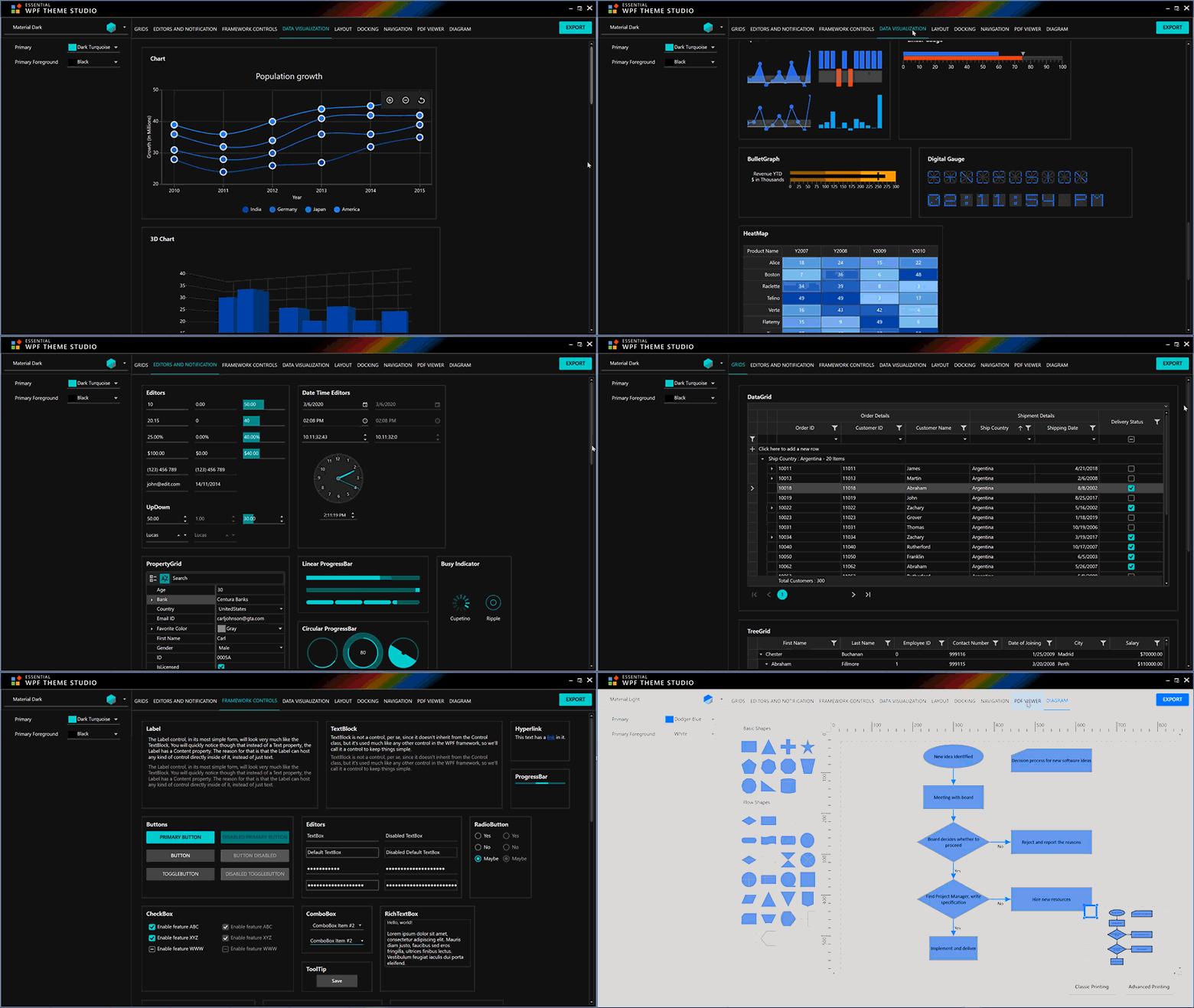
Circular Gauge
Tail support for needle pointer
This feature will allow users to add a tail to the needle pointer and customize it.
Rounded corner support
This feature will allow users to customize the range pointer’s start and end points with rounded corners.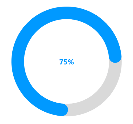
Add a custom view
This feature will allow users to add annotation text or views with customization options.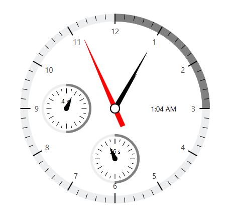
Offset support
This feature will allow users to adjust the position of the rim, ranges, pointers, ticks, labels, and annotations based on the offset value and arrange them in relative positions.
Label-created event support
Customize the label text in a label-created event.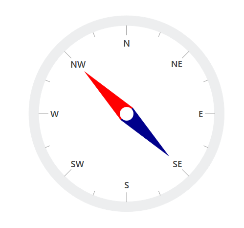
AutoComplete (SfTextBoxExt)
The following new features will be available for the AutoComplete (SfTextBoxExt) control.
Token support
Display selected items from the suggestions as tokens. The customizable token representation will allow users to remove an item with a close button. Also, automatically increment the height of the control to display the selected items as tokens.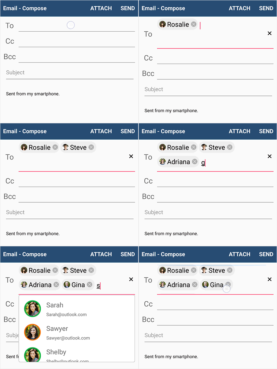
No results found template
Display a custom message to end-users when no search results are found.
Image member path support
This feature will allow users to provide a path for the image to be displayed in the token.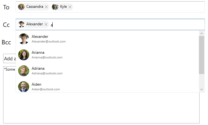
Drop-down UI support
Show a drop-down button in the AutoComplete control. The user can click and review items to select from, similar to a combo box.![]()
Image Editor
Adding custom views
Add a custom view in the Image Editor and use different customization options such as rotate and resize.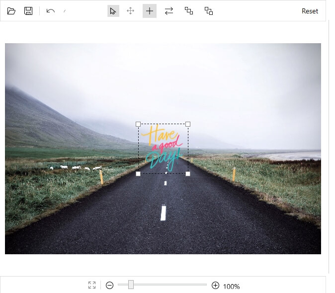
File name support for saving image
Save an edited image with a specified name.
Command support
Command support will be provided for toolbar items in the Image Editor. These commands can be used for creating a customized toolbar.
Image picker support
Browse images in a local folder and load them in the Image Editor.
PropertyGrid
Editing attached properties
This feature will enable PropertyGrid to show and edit an attached property of any object.
UpdateSource Mode
This feature will allow users to update the edited values of a selected object in property change and lost focus modes.
DatePicker and TimePicker
Editing
Complete keyboard navigation and editing support will be available for the DatePicker and TimePicker controls.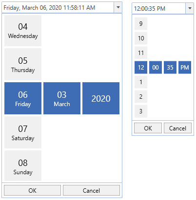
Maps
Auto zoom based on map geo-bounds or distance
Set the initial zoom level of a map automatically based on map geo-bounds (northeast, southwest) or distance (KM/miles) from the geo-point center value.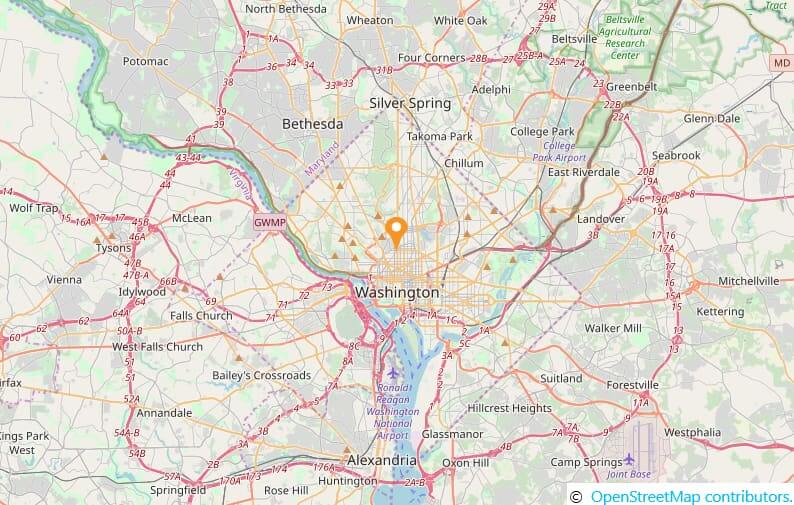
Tooltip support
This feature will allow users to show tooltips with information on shapes, markers, and bubbles when the cursor interacts with them.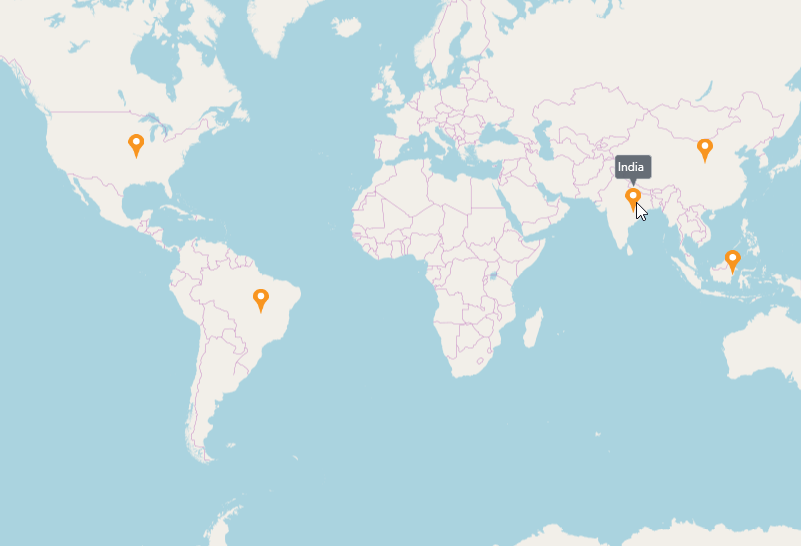
WinForms
DataGrid
Calculate the summary for selected records
With this feature, you will be able to calculate summary rows for the selected records.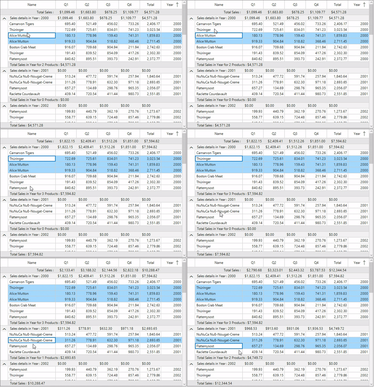
Display the summary for columns with titles
Display the title summary and column summary at the same time.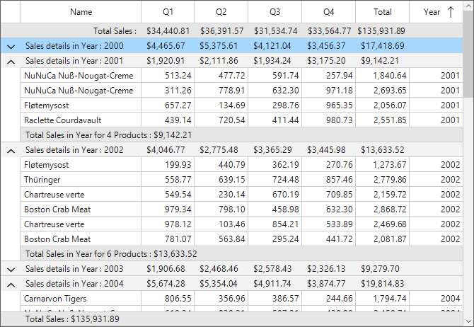
Unbound check box selector column
One of the most requested features for the DataGrid was to show check boxes in a column to select or deselect rows. Now, you can also easily select all the rows in a column using an intuitive check box in the header. This feature will be available with this release.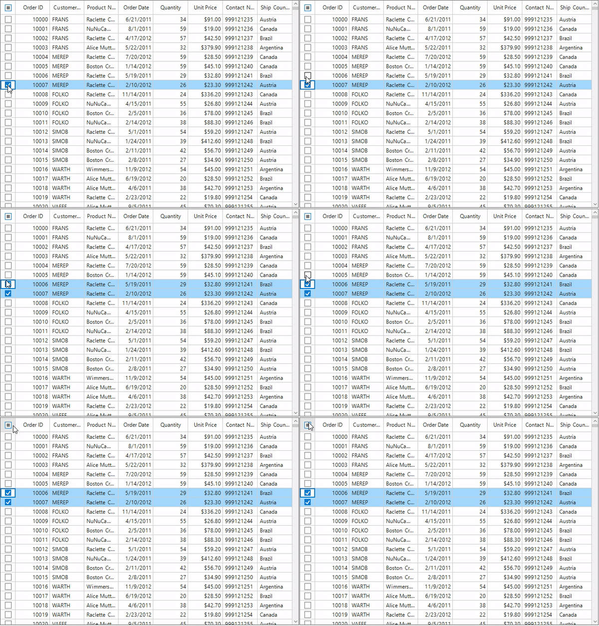
Gradient background
You will be able to set a gradient background for cells.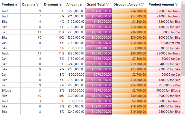
Calculate
LINEST formula support
Support for LINEST formula will be provided in the calc engine. The same support will be added in the WPF and WinForms Spreadsheet controls, also.
Conclusion
This is not the end of the feature list for the 2020 Volume 1 beta release. Check the list of all the features and improvements made after the rollout of the release.
Stay tuned to our official Twitter, Facebook, and LinkedIn pages for the announcement about the release.

