– Uma Maheswari C
Gauge Introduction
Essential JavaScript Gauge encompasses three types of gauges: circular, linear and digital gauges. These gauges include basic features like scales, pointers, ranges, indicators, labels, ticks, and custom label options. One of the most important features available in both circular and linear gauges is the User Interaction feature that allows the user to directly interact with the gauge pointers.
Controls List
Essential JavaScript provides us with three types of gauges as follows:
1. Circular gauge
2. Linear gauge
3. Digital gauge
Getting Started
Here, we are going to discuss the basic things we need to do before getting into our Essential Gauge controls.
Circular Gauge
Declare the Essential JS UI widget in the body section as shown in the following sample to create the circular gauge.
To create the circular gauge control with default settings:
Example
<title>Getting Started with Essential JS Gauge</title>
    <!--  jQuery script  -->
    <script src="scripts/jquery-1.10.1.min.js" type="text/javascript"></script>
    <!-- Essential JS UI widget -->
    <script src="http://cdn.syncfusion.com/js/ej.widgets.all-latest.min.js" type="text/javascript"></script>
To create the circular gauge control with the options provided:
Example:
// Circular Gauge creation with options.
  $("#SampleGauge").ejCircularGauge({
                scales: [{
                    startAngle: 122, sweepAngle: 296, pointerCapRadius: 10,showScaleBar:
                    true, scaleRadius: 130, scaleBarSize: 2,
                    pointers: [{
                        value: 60,
                        showBackNeedle: true, pointerLength: 75, pointerWidth: 10
                    }]
                }]
  });
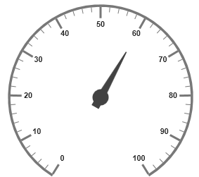
The output for the previous gauge creation with options is as follows:

Figure 1: Circular Gauge
|
Features
There are various features available in circular gauge, but for now we will just discuss two of them – subGauge and User Interaction.
Sub-Gauge
We have provided support for adding any number of sub-gauges to the circular gauge.
The example code for adding two sub-gauges to the circular gauge is as follows:
Example:
// Container element for Circular gauge and subgauges.
// SampleGauge definition $(“#SampleGauge”).ejCircularGauge({ backgroundColor: “transparent”, width: 500, scales: [{ showPointers: false, showTicks: false, showLabels: false, scaleRadius: 164, showScaleBar: true, scaleBarSize: 0.2, sweepAngle: 360, scaleBorderWidth: 0.5, subGauge: [{ controlID: “subGauge1”, subGaugeHeight: 150, subGaugeWidth: 150, location: { x: 102, y: 120 } }, { controlID: “subGauge2”, subGaugeHeight: 150, subGaugeWidth: 150, location: { x: 230, y: 60 } }] }] }); // sub-Gauge1 definition $(“#subGauge1”).ejCircularGauge({ backgroundColor: “transparent”, scales: [{ showScaleBar: true, showPointers: false, scaleBarSize: 4, showTicks: false, showLabels: false, sweepAngle: 360 }, { startAngle: 130, sweepAngle: 275, showScaleBar: true, scaleBarSize: 2, minorIntervalValue: 5, scaleRadius: 130, showRanges: true, pointers: [{ pointerLength: 60, showBackNeedle: true, backNeedleLength: 15, pointerWidth: 10, value: 10 }], ranges: [{ distanceFromScale: -30, startValue: 0, endValue: 70 }, { distanceFromScale: -30, startValue: 70, endValue: 100, backgroundColor: “#fc0606”, borderColor: “#fc0606”}], ticks: [{ tickHeight: 15, tickWidth: 5, tickStyle: “Major” }, { tickHeight: 8, tickWidth: 2, tickStyle: “Minor” }], labels: [{ font: { size: “20px”, fontFamily: “Segoe UI”, fontStyle: “Bold” }, distanceFromScale: 5, labelColor: “#8c8c8c” }] }] }); // sub-Gauge2 definition $(“#subGauge2”).ejCircularGauge({ backgroundColor: “transparent”, scales: [{ showScaleBar: true, showPointers: false, scaleBarSize: 4, showTicks: false, showLabels: false, sweepAngle: 360 }, { startAngle: 130, sweepAngle: 275, showScaleBar: true, scaleBarSize: 2, minorIntervalValue: 5, scaleRadius: 130, showRanges: true, pointers: [{ pointerLength: 60, showBackNeedle: true, backNeedleLength: 15, pointerWidth: 10, value: 50 }], ranges: [{ distanceFromScale: -30, startValue: 0, endValue: 70 }, { distanceFromScale: -30, startValue: 70, endValue: 100, backgroundColor: “#fc0606”, borderColor: “#fc0606”}], ticks: [{ tickHeight: 15, tickWidth: 5, tickStyle: “Major” }, { tickHeight: 8, tickWidth: 2, tickStyle: “Minor” }], labels: [{ font: { size: “20px”, fontFamily: “Segoe UI”, fontStyle: “Bold” }, distanceFromScale: 5, labelColor: “#8c8c8c” }] }] });
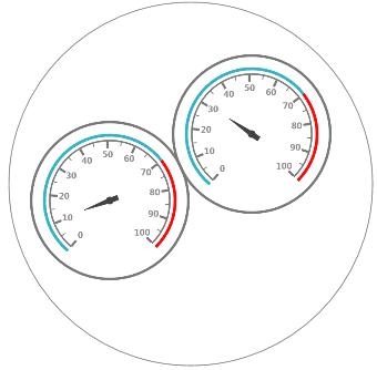
The output for the previous code for adding sub-gauges is as follows:

Figure 2: Sub-Gauge
|
User Interaction
One of the most important and unique features available in the circular gauge is the User Interaction feature, which allows the users to directly interact with the pointers on the gauge.
To enable the User Interaction feature, it is necessary to change the value of the readOnly property to false in the sample. By default, the value of the readOnly property is true.
Example:
// Circular Gauge with UserInteraction enabled.
  $("#SampleGauge").ejCircularGauge({
                readOnly: false,
                scales: [{
                    startAngle: 122, sweepAngle: 296, pointerCapRadius: 10,showScaleBar:
                    true, scaleRadius: 130, scaleBarSize: 2,
                    pointers: [{
                        value: 60,
                        showBackNeedle: true, pointerLength: 75, pointerWidth: 10
                    }]
                }]
  });
Linear Gauge
Declare the Essential JS UI widget in the body section as mentioned in the following sample for creating the linear gauge.
To create the linear gauge control with default settings:
Example
<title>Getting Started with Essential JS Gauge</title>
    <!--  jQuery script  -->
    <script src="scripts/jquery-1.10.1.min.js" type="text/javascript"></script>
    <!-- Essential JS UI widget -->
    <script src="http://cdn.syncfusion.com/js/ej.widgets.all-latest.min.js" type="text/javascript"></script>
To create the linear gauge control with the options provided:
Example:
// LinearGauge creation with options.
$("#SampleGauge").ejLinearGauge({
                scaleDirection: "Clockwise",
                scales: [{
                    scaleBarLength: 310, showBarPointers: false, showRanges: true,
                    scaleBarSize: 4,
                    markerPointers: [{ value: 50, pointerLength: 10, pointerWidth: 10}],
                    ranges: [{
                        endValue: 70,
                        startValue: 0,
                        backgroundColor: "#F6B53F",
                        borderColor: "#F6B53F", startWidth: 4, endWidth: 4
                    },
                    {
                        endValue: 100,
                        startValue: 70,
                        backgroundColor: "#E94649",
                        borderColor: "#E94649", startWidth: 4, endWidth: 4
                    }]
                }]
            });
The output for the previous gauge creation with options is as follows:

Figure 3: Linear Gauge |
Features
Linear gauge provides us with various numbers of features, for now we will just discuss two: scaleStyle and User Interaction.
Scale Styles
There are three built-in scale styles available in linear gauges. They are:
i. Rectangle
ii. RoundedRectangle
iii. Thermometer
The following code describes how to define the Thermometer style for the scale:
Example:
// Linear Gauge with thermometer scale style.
$("#SampleGauge").ejLinearGauge({
                scaleDirection: "Clockwise",
                scales: [{
                    scaleBarLength: 310, scaleBarSize: 20, scaleStyle: "Thermometer",
                    barPointers: [{ value: 50, pointerWidth: 10, backgroundColor:
                    "#DB3738"}],
                    markerPointers: [{ opacity: 0 }],
                    labels: [{ yDistanceFromScale: 4 }],
                    ticks: [{ tickStyle: "MajorInterval", yDistanceFromScale: 4,
                              tickHeight: 10, tickWidth: 1 },
                            { tickStyle: "MinorInterval", yDistanceFromScale: 4,
                              tickHeight: 5, tickWidth: 1 }]
                }]
  });
The output for the previous sample code looks as follows:

Figure 4: Thermometer (Scale Style) – Linear Gauge
|
User Interaction
The User Interaction feature in linear gauge offers the same functionality as it does in the circular gauge.
i.) We need to set the “readOnly” property value as “false” in the sample in order to enable the User Interaction in the sample. The sample code for this is as follows:
Example
// Linear Gauge with UserInteraction enabled.
$("#SampleGauge").ejLinearGauge({
                readOnly: false,
                scaleDirection: "Clockwise",
                scales: [{
                    scaleBarLength: 310, showBarPointers: false, showRanges: true,
                    scaleBarSize: 4,
                    markerPointers: [{ value: 50, pointerLength: 10, pointerWidth: 10}],
                    ranges: [{
                        endValue: 70,
                        startValue: 0,
                        backgroundColor: "#F6B53F",
                        borderColor: "#F6B53F", startWidth: 4, endWidth: 4
                    },
                    {
                        endValue: 100,
                        startValue: 70,
                        backgroundColor: "#E94649",
                        borderColor: "#E94649", startWidth: 4, endWidth: 4
                    }]
                }]
            });
Digital Gauge
Declare the Essential JS UI widget in the body section as mentioned in the sample provided for creating the digital gauge.
To create the digital gauge control with default settings
Example
<title>Getting Started Essential JS Gauge</title>
    <!--  jQuery script  -->
    <script src="scripts/jquery-1.10.1.min.js" type="text/javascript"></script>
    <!-- Essential JS UI widget -->
    <script src="http://cdn.syncfusion.com/js/ej.widgets.all-latest.min.js" type="text/javascript"></script>
To create the digital gauge control with the options provided.
Example:
// DigitalGauge creation with options
 $("#SampleGauge").ejDigitalGauge({
    width: 600,
    items: [{
             segmentWidth: 2, segmentSpacing: 0, characterOpacity: 0.8,
             value: "Welcome"
           }]
 });
The output for the previous gauge creation with options is as follows:

Figure 5: Digital Gauge
|
Features
There are various features available in digital gauge and among them, but for now we will just discuss two of them – characterType and segmentSpacing.
characterType
The default character type in digital gauge is EightCrossEightDotMatrix. There are five character types supported by Digital gauge used to customize the display of the text. They are:
i. SevenSegment
ii. FourteenSegment
iii. SixteenSegment
iv. EightCrossEightDotMatrix
v. EightCrossEightSquareMatrix
The following code describes how to set the character type:
Example:
// DigitalGauge with specific character type.
 $("#SampleGauge").ejDigitalGauge({
    width: 600,
    items: [{
             segmentWidth: 2, segmentSpacing: 0, characterOpacity: 0.8,
             value: "1234567890", characterType: ej.characterType.SevenSegment
           }]
 });
The output for the previous sample code looks as follows:
Figure 6: Seven Segment – Character type
|
segmentSpacing
The segmentSpacing allows us to specify the spacing to be left between each segments present. The following code sample denotes how to set the segment spacing:
Example:
// DigitalGauge with specified segment space.
 $("#SampleGauge").ejDigitalGauge({
    width: 600,
    items: [{
             segmentWidth: 2, segmentSpacing: 3, characterOpacity: 0.8,
             value: "1234567890"

           }]
 });
The output for the previous code is as follows:
Figure 7: Text with Segment spacing set to 3
|
Dependencies
We should register the following dependency script file in order to use the Essential JS Gauge control:
- jQuery – 1.7.1 and above.
Conclusion
We have presented the steps to be followed in order to create a simple gauge control. We have also shared the sample codes to be used in order to customize the display of the gauge controls with the various options available.
A recap of the important features available in the gauges:
– The subGauge and User Interaction features in circular gauge.
– The scaleStyle and User Interaction features in linear gauge.
– The characterType and segmentSpacing features in digital gauge.
For those who have not yet tried our Essential Studio® for JavaScript, check out our complete list of controls, take a look at our online demos, or download a free evaluation today.
