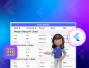
Welcome to our Chart of the Week blog series!
In this blog, we’ll explain how to create a Heat Map Chart using the Syncfusion Flutter Charts, a handy tool for developers. With just a few simple steps, you can turn large amounts of data into a clear, colorful chart, making it easier to spot patterns, trends, and outliers.
The onCreateRenderer callback allows you to customize the appearance of the heat map chart by creating a custom series renderer. You can use a custom renderer like _HeatmapSeriesRenderer to control how the data is displayed. The populateDataSource method organizes raw data into a structured format, making the chart more interactive and dynamic. The custom series enables you to modify the default chart behavior, allowing for unique visual effects.
What is a Heat Map?
A heat map is a data visualization technique used to represent data in a two-dimensional format, where colors indicate different values. It helps make complex data easier to understand by showing patterns, trends, and differences through various shades of color.
In a heat map, data is arranged in a grid or table, with each cell representing a value. The color of each cell changes based on the data, with darker or lighter colors usually indicating higher or lower values. This makes it easy to compare information quickly.
Use cases of heat maps:
- Website and user behavior analysis: Helps to track where users click, scroll, and spend time improving website design.
- Business and market analysis: Identifies sales trends, customer behavior, and market performance to aid decision-making.
- Geographic and weather mapping: Displays temperature variations, rainfall distributions, and population densities across regions.
- Healthcare and medical research: Monitors disease outbreaks, patient health records, and the utilization of hospital resources.
- Sports and performance analytics: Analyzes player movements, ball possession, and team strategies to enhance performance.
Creating a heat map using Flutter Charts
To create a heat map chart in Flutter, we’ll use the Syncfusion Flutter Charts package. This guide will walk you through each step required to implement a heat map chart using the StackedBar100Series in the SfCartesianChart.
Step 1: Add dependencies
To get started, add the Syncfusion Flutter Charts package to your pubspec.yaml file.
dependencies:
  flutter:
    sdk: flutter
  syncfusion_flutter_charts: ^xx.x.x  # Replace with the latest version
Step 2: Populate the data source
Then, we need to define the dataset for our heat map. The _HeatMapData class represents data points with multiple numerical values.
class _HeatMapData {
  final String percentage;
  final double nancy;
  final double andrew;
  final double janet;
  final double margaret;
  final double steven;
  final double michael;
  final double robert;
  final double laura;
  final double anne;
  final double paul;
  final double mario;

  _HeatMapData(
    this.percentage,
    this.nancy,
    this.andrew,
    this.janet,
    this.margaret,
    this.steven,
    this.michael,
    this.robert,
    this.laura,
    this.anne,
    this.paul,
    this.mario,
  );
}
Now, we can populate the dataset using the initState method.
@override
void initState() {
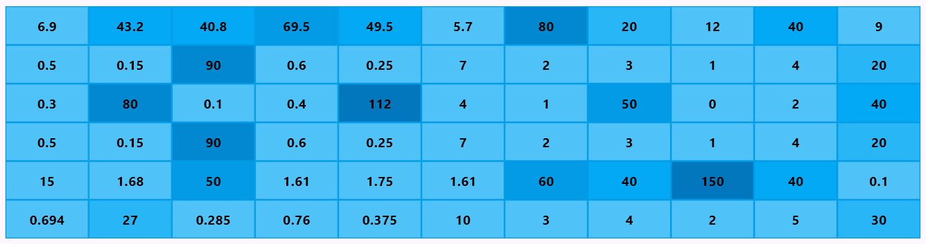
_heatMapData = <_HeatMapData>[
_HeatMapData('Mon', 0.694, 27, 0.285, 0.76, 0.375, 10, 3, 4, 2, 5, 30),
_HeatMapData('Tue', 15, 1.68, 50, 1.61, 1.75, 1.61, 60, 40, 150, 40, 0.1),
_HeatMapData('Wed', 0.5, 0.15, 90, 0.6, 0.25, 7, 2, 3, 1, 4, 20),
_HeatMapData('Thu', 0.3, 80, 0.1, 0.4, 112, 4, 1, 50, 0, 2, 40),
_HeatMapData('Fri', 0.5, 0.15, 90, 0.6, 0.25, 7, 2, 3, 1, 4, 20),
_HeatMapData('Sat', 6.9, 43.2, 40.8, 69.5, 49.5, 5.7, 80, 20, 12, 40, 9),
];
super.initState();
}Step 3: Set up a StackedBar100Series
Here, we’ll create the heat map using the StackedBar100Series from SfCartesianChart. The _buildHeatmapSeries method is used to generate 11 stacked bar series, each showing a different part of the data.
The xValueMapper sets the percentage value from _HeatMapData on the x-axis, while the yValueMapper uses _findValueByIndex to get the correct y-axis value for each segment.
The pointColorMapper decides the color based on the data value using _buildColor, making it easier to see differences. The dataLabelSettings feature is enabled by setting the isVisible property to true to show labels inside each segment. This setup keeps the heat map clear, colorful, and easy to understand.
SfCartesianChart(
  series: _buildHeatmapSeries(),
);

List<CartesianSeries<_HeatMapData, String>> _buildHeatmapSeries() {
  return List.generate(11, (index) {
    return StackedBar100Series<_HeatMapData, String>(
      dataSource: _heatMapData,
      xValueMapper: (_HeatMapData data, int _) => data.percentage,
      yValueMapper: (_HeatMapData data, int _) => _findValueByIndex(data, index),
      pointColorMapper: (_HeatMapData data, int _) =>
          _buildColor(_findValueByIndex(data, index)),
      ....
      dataLabelSettings: DataLabelSettings(
        isVisible: true,
      ),
      ....
    );
  });
}
Step 4: Create and configure a custom heat map series renderer
In this step, we’ll create a custom renderer for the heat map series by extending the StackedBar100SeriesRenderer class. This will allow us to customize how the heat map data is processed and displayed in Syncfusion Flutter Charts. This customization is done using the onCreateRenderer property of the StackedBar100Series.
Calculate the default range
The heat map visualization needs to maintain a consistent value range to ensure proper color representation.
- We override the populateDataSource method to set a fixed range for the y-axis values.
- The yMin is set to 0, and the yMax is set to 101, meaning the heat map will always represent values within this range, even if negative values are present in the dataset. This step helps keep the chart balanced, making it easier to compare different data points.
class _HeatmapSeriesRenderer extends StackedBar100SeriesRenderer<_HeatMapData, String> {
  _HeatmapSeriesRenderer();

  @override
  void populateDataSource(
    [
      List<ChartValueMapper<_HeatMapData, num>>? yPaths,
      List<List>? chaoticYLists,
      List<List>? yLists,
      List<ChartValueMapper<_HeatMapData, Object>>? fPaths,
      List<List<Object?>>? chaoticFLists,
      List<List<Object?>>? fLists
    ]
  ) {
    super.populateDataSource(
      yPaths, chaoticYLists, yLists, fPaths, chaoticFLists, fLists
    );

    // Always keep positive 0 to 101 range even set negative value.
    yMin = 0;
    yMax = 101;

    // Calculate heatmap segment top and bottom values.
    _computeHeatMapValues();
  }
  ....
}
Calculate the heat map values
We calculate the top and bottom values for each segment using the _computeHeatMapValues() method, ensuring they are evenly distributed, which makes the chart visually balanced.
The height of each segment is determined using the formula yValue = 100 / seriesLength, where seriesLength is the number of series dependent on the y-axis. For each series, we skip those that are not visible or have no data, then assign the bottom value based on its position and set the top value as stackValue + yValue.
Finally, we loop through the data points and apply these values, ensuring all segments maintain a consistent height across the heatmap.
class _HeatmapSeriesRenderer extends StackedBar100SeriesRenderer<_HeatMapData, String> {
  _HeatmapSeriesRenderer();
  ....
  _computeHeatMapValues();
}

void _computeHeatMapValues() {
  if (xAxis == null || yAxis == null) {
    return;
  }

  if (yAxis!.dependents.isEmpty) {
    return;
  }

  // Get the number of series dependent on the yAxis.
  final int seriesLength = yAxis!.dependents.length;
  // Calculate the proportional height for each series (as a percentage of the total height).
  final num yValue = 100 / seriesLength;
  // Loop through each dependent series to calculate top and bottom values for the heatmap.
  for (int i = 0; i < seriesLength; i++) {
    // Check if the current series is a '_HeatmapSeriesRenderer'.
    if (yAxis!.dependents[i] is _HeatmapSeriesRenderer) {
      final _HeatmapSeriesRenderer current =
          yAxis!.dependents[i] as _HeatmapSeriesRenderer;

      // Skip processing if the series is not visible or has no data.
      if (!current.controller.isVisible || current.dataCount == 0) {
        continue;
      }

      // Calculate the bottom (stack) value for the current series.
      num stackValue = 0;
      stackValue = yValue * i;

      current.topValues.clear();
      current.bottomValues.clear();

      // Loop through the data points in the current series.
      final int length = current.dataCount;
      for (int j = 0; j < length; j++) {
        // Add the bottom value (stackValue) for the current data point.
        current.bottomValues.add(stackValue.toDouble());
        // Add the top value (stackValue + yValue) for the current data point.
        current.topValues.add((stackValue + yValue).toDouble());
      }
    }
  }
}
Configure axes and disable gridline appearance
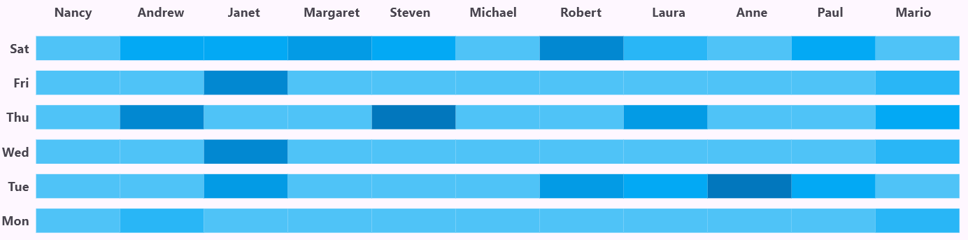
In the _buildHeatmapChart() method, the primaryXAxis is set to a CategoryAxis. The axisLine, majorGridLines, and majorTickLines are all disabled by setting their widths to 0. This removes unnecessary visual elements, making the heat map more straightforward. The label text is also formatted in bold with a font size of 14.
For the primaryYAxis, a NumericAxis is used, positioned on the opposite side by setting the opposedPosition property to true. Like the X-axis, the opposedPosition, majorGridLines, and majorTickLines of the Y-axis are also hidden to keep the chart simple.
Additionally, the y-axis also includes multiLevelLabels, created using _buildNumericLabels(), with a transparent border to ensure a seamless look. The multiLevelLabels property in the NumericAxis applies the _buildNumericLabels() method to ensure custom numeric labels, and these labels are further formatted using the _formatLabel() method for bold styling. By setting the labelStyle to have a font size of 0, the axis labels are effectively hidden.
By removing gridlines and customizing axis labels, this setup makes the heat map clearer and easier to read without extra distractions.
List<NumericMultiLevelLabel> _buildNumericLabels() {
return [
NumericMultiLevelLabel(start: 0, end: 8, text: 'Nancy'),
NumericMultiLevelLabel(start: 8, end: 19, text: 'Andrew'),
NumericMultiLevelLabel(start: 19, end: 26, text: 'Janet'),
NumericMultiLevelLabel(start: 26, end: 38, text: 'Margaret'),
NumericMultiLevelLabel(start: 38, end: 43, text: 'Steven'),
NumericMultiLevelLabel(start: 43, end: 56, text: 'Michael'),
NumericMultiLevelLabel(start: 56, end: 62, text: 'Robert'),
NumericMultiLevelLabel(start: 62, end: 75, text: 'Laura'),
NumericMultiLevelLabel(start: 75, end: 80, text: 'Anne'),
NumericMultiLevelLabel(start: 80, end: 92, text: 'Paul'),
NumericMultiLevelLabel(start: 92, end: 98, text: 'Mario'),
];
}
ChartAxisLabel _formatLabel(MultiLevelLabelRenderDetails details) {
return ChartAxisLabel(
details.text,
const TextStyle(fontWeight: FontWeight.bold, fontSize: 14.0)
);
}
SfCartesianChart(
....
primaryXAxis: CategoryAxis(
axisLine: const AxisLine(width: 0),
majorGridLines: const MajorGridLines(width: 0),
majorTickLines: const MajorTickLines(width: 0),
labelStyle: const TextStyle(
fontWeight: FontWeight.bold,
fontSize: 14.0
),
),
primaryYAxis: NumericAxis(
opposedPosition: true,
axisLine: const AxisLine(width: 0),
majorGridLines: const MajorGridLines(width: 0),
majorTickLines: const MajorTickLines(width: 0),
labelStyle: const TextStyle(fontSize: 0),
multiLevelLabelStyle: MultiLevelLabelStyle(borderColor: Colors.transparent),
multiLevelLabels: _buildNumericLabels(),
multiLevelLabelFormatter: _formatLabel
),
....
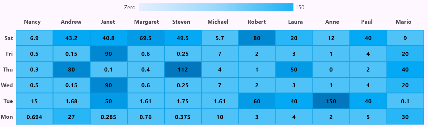
);Refer to the following image.
Customizing heat map appearance
The heat map is designed to be clear and easy to understand by adjusting colors, borders, and labels. The pointColorMapper property in the StackedBar100Series automatically assigns colors to each segment based on its data value. This helps display different intensity levels in the chart.
The width property controls the size of each segment, keeping the layout organized. The borderColor makes the segment edges clear.
The _findValueByIndex function retrieves the correct data value for each segment, while _buildColor assigns a color based on that value, creating a smooth color gradient for better visualization. The animationDuration is set to 0 to ensure the heat map appears instantly without any delay.
Color _buildColor(num value) {
  if (value >= 100.0) return Colors.lightBlue.shade800;
  if (value >= 80.0) return Colors.lightBlue.shade700;
  if (value >= 50.0) return Colors.lightBlue.shade600;
  if (value >= 40.0) return Colors.lightBlue.shade500;
  if (value >= 20.0) return Colors.lightBlue.shade400;
  if (value >= 0.0) return Colors.lightBlue.shade300;
  return Colors.redAccent.shade100;
}

double _findValueByIndex(_HeatMapData data, int index) {
  switch (index) {
    case 0:
      return data.nancy;
    case 1:
      return data.andrew;
    case 2:
      return data.janet;
    case 3:
      return data.margaret;
    case 4:
      return data.steven;
    case 5:
      return data.michael;
    case 6:
      return data.robert;
    case 7:
      return data.laura;
    case 8:
      return data.anne;
    case 9:
      return data.paul;
    case 10:
      return data.mario;
    default:
      return 0;
  }
}

StackedBar100Series<_HeatMapData, String>(
  ....
  pointColorMapper: (_HeatMapData data, int _) => _buildColor(_findValueByIndex(data, index)),
  ....
  animationDuration: 0,
  width: 1,
  borderWidth: 1,
  borderColor: Colors.lightBlue.shade600,
),
....
);
Refer to the following image.

Step 5: Adding data labels
The dataLabelSettings property in the StackedBar100Series is used to display labels on each heat map segment, making it easier to interpret the data. The isVisible property is set to true, ensuring that the labels appear on the chart. The labelAlignment is set to ChartDataLabelAlignment with the value as middle, which places the labels at the center of each segment for better readability.
These settings help users quickly understand the data by displaying values directly on the heat map segments.
StackedBar100Series<_HeatMapData, String>(
  ....
  dataLabelSettings: DataLabelSettings(
    isVisible: true,
    labelAlignment: ChartDataLabelAlignment.middle,
    textStyle: const TextStyle(
      fontSize: 15,
      color: Colors.black,
      fontWeight: FontWeight.bold,
    ),
  ),
  ....
);
Refer to the following image.
Step 6: Adding legend
The legend helps users understand the color variations in the heat map. In the SfCartesianChart, the Legend property is enabled by setting the isVisible property to true, and the legend is placed at the top by setting the LegendPosition property. The legendItemBuilder is used to create a custom legend, displaying a gradient color bar from red to light blue, representing the data range from Zero to 150.
The isVisibleInLegend property in the StackedBar100Series ensures that only the first series’ legend is shown. This makes the chart easier to understand by showing how colors match data values.
SfCartesianChart(
  ....
  legend: Legend(
    isVisible: true,
    position: LegendPosition.top,
    toggleSeriesVisibility: false,
    legendItemBuilder: (legendText, series, point, seriesIndex) {
      return Row(
        children: [
          const Text('Zero '),
          const SizedBox(width: 5),
          SizedBox(
            width: 400,
            height: 20,
            child: DecoratedBox(
              decoration: BoxDecoration(
                gradient: LinearGradient(
                  colors: [
                    Colors.lightBlue.withValues(alpha: 0.1),
                    Colors.lightBlue.withValues(alpha: 0.4),
                    Colors.lightBlue.withValues(alpha: 0.9),
                  ],
                  begin: Alignment.centerLeft,
                  end: Alignment.centerRight,
                ),
              ),
            ),
          ),
          const SizedBox(width: 5),
          const Text('150'),
        ],
      );
    },
  ),
  ....
  series: _buildHeatmapSeries(),
);

List<CartesianSeries<_HeatMapData, String>> _buildHeatmapSeries() {
  return List.generate(11, (index) {
    return StackedBar100Series<_HeatMapData, String>(
      ....
      isVisibleInLegend: index == 0,
      ....
    );
  });
}
Refer to the following image.
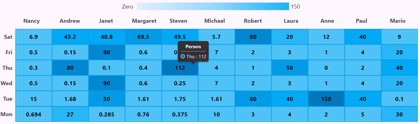
Step 7: Adding tooltip
The tooltip feature is enabled using the TooltipBehavior to make the chart more interactive and user-friendly. This allows users to see detailed information when they hover over a data point.
- The tooltipPosition is set to TooltipPosition.pointer, so the tooltip moves with the cursor or touch point for easier tracking.
- The format property is used to display both X and Y values (point.x : point.y).
- The header is set to Person, providing a clear label for the tooltip.
- The animationDuration is set to 0 to ensure the tooltip appears instantly without delay.
This setup improves readability and provides instant insights when interacting with the heat map.
class HeatMapState extends State<HeatMap> {
  ....
  TooltipBehavior? _tooltipBehavior;

  @override
  void initState() {
    ....
    _tooltipBehavior = TooltipBehavior(
      enable: true,
      header: 'Person',
      animationDuration: 0,
      tooltipPosition: TooltipPosition.pointer,
      format: 'point.x : point.y',
    );
    super.initState();
  }

  SfCartesianChart(
    ....
    tooltipBehavior: _tooltipBehavior,
  );
}
Refer to the following image.
GitHub reference
For more details, refer to the creating a heat map using the Flutter Charts demo on GitHub.

Conclusion
Thanks for reading! This blog explains creating a heat map using the Syncfusion Flutter Charts. We hope these steps help you easily create a similar heat map and enhance your data visualization.
The existing customers can download the new version of Essential Studio on the License and Downloads page. If you are not a Syncfusion customer, try our 30-day free trial to check out our incredible features.
You can also contact us through our support forums, support portal, or feedback portal. We are always happy to assist you!