TL;DR: Responsively App provides a platform to view your website across multiple devices simultaneously for quick and efficient responsiveness testing. Features like live reload, customizable device profiles, and a responsive inspector help identify and rectify layout issues across various breakpoints, ensuring a seamless user experience across all devices.
Web development today demands a fast and efficient workflow and a seamless user experience across multiple devices. Responsively.app helps developers achieve just that by simplifying the testing and optimization process for responsive designs. Here’s a step-by-step approach to optimizing your workflow with Responsively App.
What is the Responsively.app?
Responsively.app is a powerful toolset designed to simplify the testing of responsive web designs. Traditionally, developers had to manually resize browser windows or switch between different devices to verify how a site would appear on varying screen sizes. Responsively App eliminates this cumbersome process by providing real-time, multidevice previews, significantly enhancing development efficiency. It allows developers to view how their websites behave on desktop, tablet, and mobile devices simultaneously, leading to a more streamlined development workflow.
Experiencing the features of the Responsively.app
In Responsively App, you can efficiently test the appearance and functionality of your website or local sample across multiple devices by simply navigating to the URL within the app. Whether you’re developing for mobile, tablet, or desktop, Responsively App provides an intuitive interface that mirrors real-world device usage.
We’re going to use an example app in this blog for demonstration purposes. If you need help creating an app, you can refer to the Syncfusion Getting Started documentation. It walks you through setting up a JavaScript app with Syncfusion components, such as grids, charts, and calendars.
In this blog, we are using the Syncfusion Expense Tracker example app. Follow these steps to test Responsively App with your example app:
- Download and install the Responsively.app. Once it’s installed, open it.
- In Responsively App, paste the following URL into the address bar:
https://ej2.syncfusion.com/showcase/javascript/expensetracker/
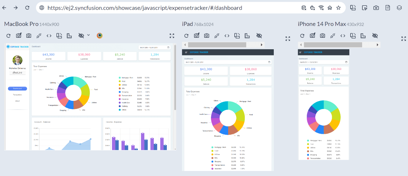
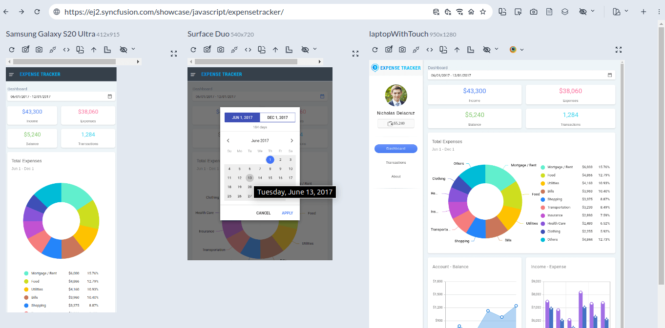
Responsively App will display the Syncfusion Expense Tracker on multiple screen sizes, giving insights into how the design adapts to different devices.
Maximize efficiency with multi-device testing
Responsively App lets you view your website on multiple devices at once for quick testing. This eliminates the need to switch tabs or resize windows, saving time. You can instantly check how your site performs on different screen sizes. Focus on the devices that matter most to your audience, like popular phones or specific desktops. This boosts your efficiency in ensuring consistent design across platforms.
Accelerate development with live reload
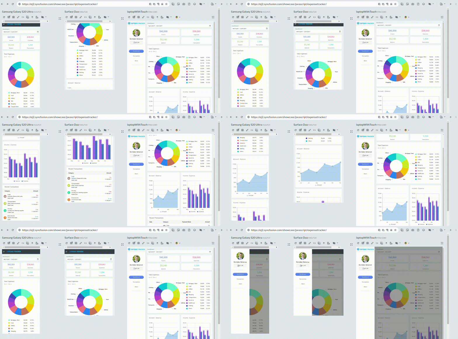
Responsively App’s live reload feature instantly reflects code changes across all devices. This saves the time usually used for manual device refreshes. Real-time updates let you optimize your site on the fly. Pair live reload with a code editor to see changes and adjust layouts faster. This speeds up your workflow and improves iteration efficiency.
Tailor device profiles to fit your project
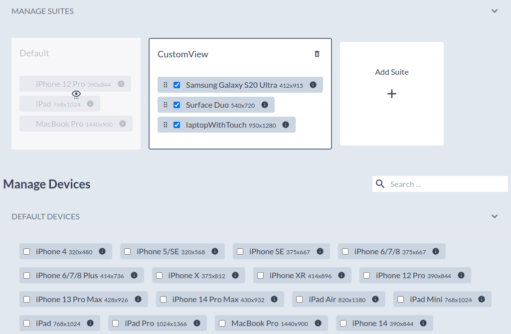
Responsively App allows you to customize device profiles to match your project’s specific needs. Tailor screen sizes, resolutions, and orientations for popular regional devices for more relevant testing. This helps simulate the exact user experience your site will provide.
Debug layout issues with the responsive inspector
The responsive inspector in the Responsively App shows how elements adjust to screen size and resolution changes. It helps identify issues like broken grids, overlapping text, or misaligned content. Use it in the final stages of development to ensure your design works well across all breakpoints. This prevents layout shifts and creates a smoother, more polished user experience.
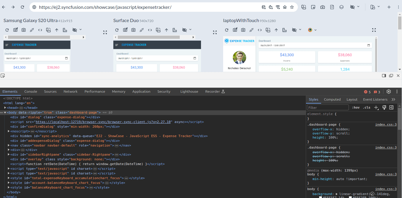
Test interactivity on real devices
Responsively App lets you test interactivity directly on devices, simulating touch gestures, scrolling, and other mobile actions. This ensures that touch gestures, swipes, and clicks function as expected. Testing with real-world interactions helps guarantee a smooth user experience.
Actionable tip: Regularly check your site’s functionality on touch devices during development. This ensures that your mobile-first designs are intuitive and optimized for real users.
Conclusion
Thanks for reading! Optimizing your workflow with the Responsively.app can transform the way you approach responsive design and testing. From real-time device testing to advanced features like network simulation and interactivity testing, the Responsively App allows you to streamline your process, catch issues early, and deliver a more polished user experience. By integrating Responsively App into your development routine, you’ll improve both the speed and quality of your responsive web design projects.
If you have questions, you can reach us through our support forum, support portal, or feedback portal. As always, we are happy to assist you!

