
 Ezhilarasan Elangovan
TL;DR: Learn to create multi-category bar charts with Syncfusion .NET MAUI Charts. Compare the use of generative AI for creating media and obtaining information. Steps include gathering and preparing data, defining the layout, configuring the charts, and customizing the appearance. Follow our step-by-step guide to visualize trends effectively and make data-driven decisions!
Welcome to our Chart of the Week blog series!
Today, we’ll create multi-category Bar Charts to compare media creation and information retrieval applications of generative AI using the Syncfusion .NET MAUI Charts control.
Bar Charts (Transposed column charts) are versatile tools for comparing categorical data. They clearly show differences between categories. Here are a few common use cases:
- Survey results
- Usage trends
- Performance metrics
- Market analysis
Imagine you’re analyzing how people use generative AI tools. You need a chart representing the percentage of users engaging in media creation versus information retrieval. A bar chart is perfect for this purpose. It visually differentiates the two applications, making the data easy to understand and compare. This helps in drawing insights and making informed decisions. Since we need to explain two categories, we can create two multi-category bar charts. You can easily see the differences and similarities by displaying both categories aside. This visual representation allows for more effective communication of your findings.
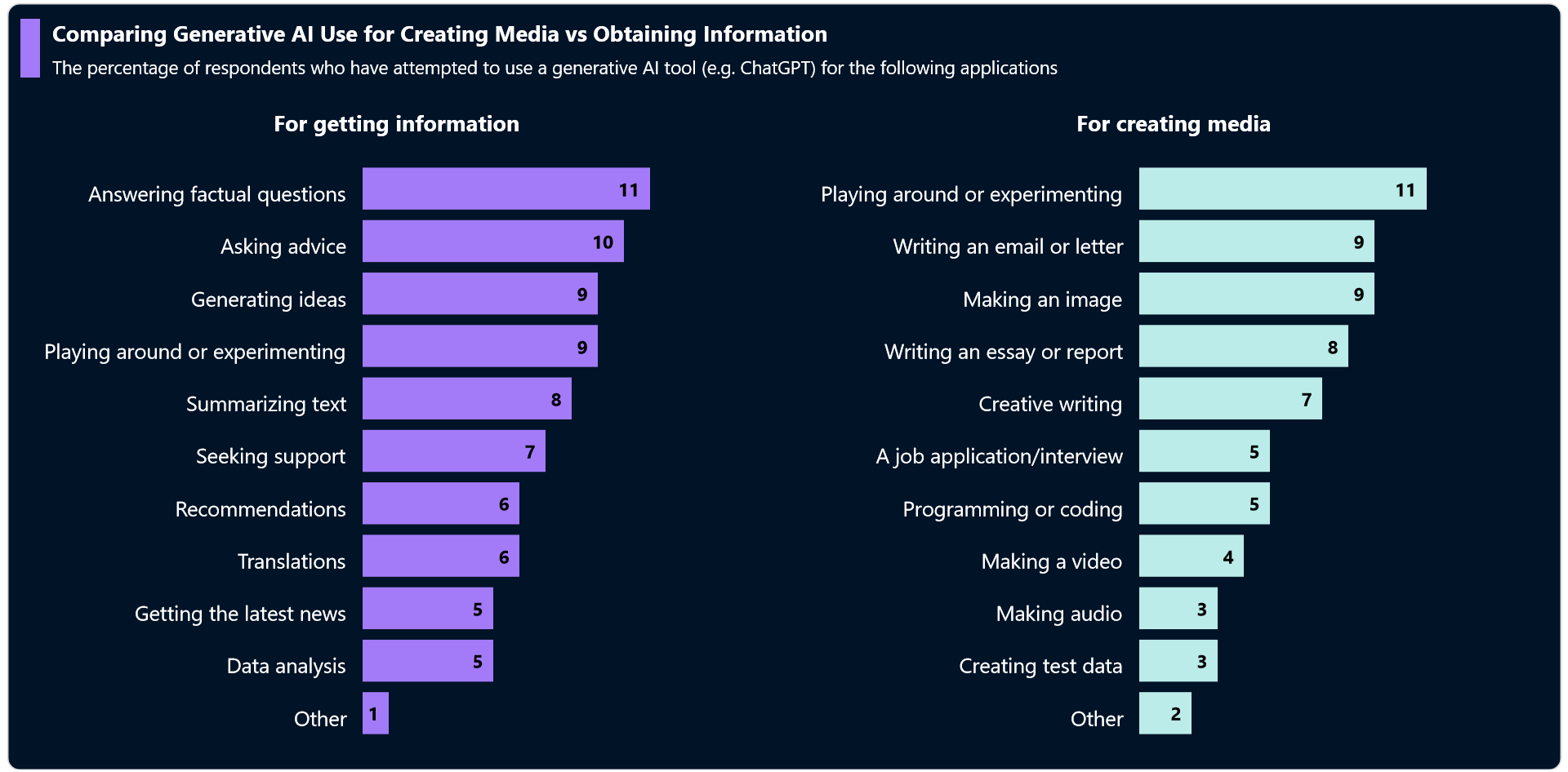
The following image shows the multi-category Bar Charts we’ll create.
 Let’s get started!
Step 1: Gather data
Before creating the chart, let’s gather data from page No. 12 of the generative AI usage data source.
Step 2: Prepare the data for the chart
Create a Model class that includes the properties to store the details, such as the purpose of using AI and overall usage percentage.
public class Model
{
   public string Purpose { get; set; }
   public double Percentage { get; set; }
   public Model(string purpose, double percentage)
   {
       Purpose = purpose;
       Percentage = percentage;
   }
}
Next, we will create a ViewModel to hold the collection of data for both creating media and obtaining information.
public class ViewModel
{
    public ObservableCollection<Model> GettingInformationDetails { get; set; }
    public ObservableCollection<Model> CreatingMediaDetails { get; set; }
    public ViewModel()
    {
        GettingInformationDetails = new ObservableCollection<Model>()
        {
            new Model("Answering factual questions",11),
            new Model("Asking advice",10),
            new Model("Generating ideas",9),
            new Model("Playing around or experimenting",9),
            new Model("Summarizing text",8),
            new Model("Seeking support",7),
            new Model("Recommendations",6),
            new Model("Translations",6),
            new Model("Getting the latest news",5),
            new Model("Data analysis",5),
            new Model("Other",1),
        };
        CreatingMediaDetails = new ObservableCollection<Model>()
        {
            new Model("Playing around or experimenting",11),
            new Model("Writing an email or letter",9),
            new Model("Making an image",9),
            new Model("Writing an essay or report",8),
            new Model("Creative writing",7),
            new Model("A job application/interview",5),
            new Model("Programming or coding",5),
            new Model("Making a video",4),
            new Model("Making audio",3),
            new Model("Creating test data",3),
            new Model("Other",2),
        };
    }
}
Step 3: Layout definition
Define the layout using a Border element. Inside the border, we’ll utilize a Grid to place our content.
<Border Stroke="Lightgray" StrokeThickness="1" Margin="{OnPlatform Default='5,15,5,5', iOS='25,0,20,25'}" >
 <Border.StrokeShape>
  <RoundRectangle CornerRadius="10" />
 </Border.StrokeShape>
 <Grid BackgroundColor="#011327">
  <Grid.ColumnDefinitions>
   <ColumnDefinition/>
   <ColumnDefinition/>
  </Grid.ColumnDefinitions>
  <Grid.RowDefinitions>
   <RowDefinition Height="1*"></RowDefinition>
   <RowDefinition Height="9*"></RowDefinition>
  </Grid.RowDefinitions>
             ….
 </Grid>
</Border>
Step 4: Configure the Syncfusion .NET MAUI Charts
Let’s configure the Syncfusion.NET MAUI Charts control using the documentation.
Refer to the following code example.
<Grid>
 <chart:SfCartesianChart Grid.Column="0" Grid.Row="1" IsTransposed="True">
  <chart:SfCartesianChart.XAxes>
   <chart:CategoryAxis></chart:CategoryAxis>
  </chart:SfCartesianChart.XAxes>
  <chart:SfCartesianChart.YAxes>
   <chart:NumericalAxis></chart:NumericalAxis>
  </chart:SfCartesianChart.YAxes>
      …
 </chart:SfCartesianChart>
 <chart:SfCartesianChart Grid.Column="1" Grid.Row="1" IsTransposed="True">
  <chart:SfCartesianChart.XAxes>
   <chart:CategoryAxis></chart:CategoryAxis>
  </chart:SfCartesianChart.XAxes>
  <chart:SfCartesianChart.YAxes>
   <chart:NumericalAxis></chart:NumericalAxis>
  </chart:SfCartesianChart.YAxes>
         ….
 </chart:SfCartesianChart>
</Grid>
Step 5: Bind the data to the .NET MAUI Bar Charts
To compare the data on the usage of generative AI for creating media vs. obtaining information effectively, we’ll use two separate Bar Charts. We’ll also set the ColumnSeries’ IsTransposed property to True to replicate the Bar Charts and bind the CreatingMediaDetails and GettingInformationDetails collections to the charts.
Refer to the following code example.
<chart:SfCartesianChart IsTransposed="True">
  . . .
   <chart:ColumnSeries ItemsSource="{Binding GettingInformationDetails}"
                        XBindingPath="Purpose"
                        YBindingPath="Percentage">
   </chart:ColumnSeries>
</chart:SfCartesianChart>
<chart:SfCartesianChart IsTransposed="True">
  . . .
   <chart:ColumnSeries ItemsSource="{Binding CreatingMediaDetails}"
                        XBindingPath="Purpose"
                        YBindingPath="Percentage">
   </chart:ColumnSeries>
</chart:SfCartesianChart>
In the above code example, the GettingInformationDetails and CreatingMediaDetails collections from the ViewModel are bound to the ItemSource property for each chart. The XBindingPath is bound with the Purpose property, and the YBindingPath is bound with the Percentage property.
Step 6: Customize the .NET MAUI Bar Charts’ appearance
Let’s customize the elements of the .NET MAUI Bar Charts to enhance their readability.
Adding the title
Adding a Title helps users understand the content of the chart more effectively.
Refer to the following code example to add a title to the chart.
. . .
<HorizontalStackLayout Grid.Row="0" Grid.Column="0" Grid.ColumnSpan="2">
 <StackLayout Margin="{OnPlatform Default='10,14,10,5',Android='7,12,5,3',MacCatalyst='10,-10,10,5'}" WidthRequest="{OnPlatform Default=16,Android=10,iOS=10}" HeightRequest="{OnPlatform Default=48,Android=33,iOS=31}" BackgroundColor="#a37bf8"/>
 <VerticalStackLayout>
  <Label Margin="{OnPlatform Default='0,14,0,8', Android='0,0,0,4',iOS='0,5,0,2'}" Text="Comparing Generative AI Use for Creating Media vs Obtaining Information."
         TextColor="White"
         FontSize="{OnPlatform Android=15, WinUI=18, iOS=14, MacCatalyst=18}"
         FontFamily="TimeSpan"
         FontAttributes="Bold"/>
  <Label Text="The percentage of respondents who have attempted to use a generative AI tool (e.g. ChatGPT) for the following applications."
         TextColor="White"
         FontSize="{OnPlatform Android=12, WinUI=15, iOS=11, MacCatalyst=15}"
         FontFamily="TimeSpan"/>
 </VerticalStackLayout>
</HorizontalStackLayout>
. . .
Refer to the following code example to customize the chart title.
. . .
<chart:SfCartesianChart.Title>
 <HorizontalStackLayout Margin="{OnPlatform Default='0,0,0,20', iOS ='0,0,0,10', Android='0,0,0,10'}"  HorizontalOptions="Center">
  <Label Text="For getting information" FontFamily="TimeSpan" TextColor="White" FontAttributes="Bold" FontSize="{OnPlatform Android=15, WinUI=18, iOS=15, MacCatalyst=18}" HorizontalOptions="Center" ></Label>
 </HorizontalStackLayout>
</chart:SfCartesianChart.Title>. . .
<chart:SfCartesianChart.Title>
 <HorizontalStackLayout Margin="{OnPlatform Default='0,0,0,20', iOS='0,0,0,10', Android='0,0,0,10'}" HorizontalOptions="Center" >
  <Label Text="For creating media" FontFamily="TimeSpan" TextColor="White" FontAttributes="Bold" FontSize="{OnPlatform Android=15, WinUI=18, iOS=15, MacCatalyst=18}" HorizontalOptions="Center" ></Label>
 </HorizontalStackLayout>
</chart:SfCartesianChart.Title>
. . .
Customize the chart axis
Let’s customize the chart’s x- and y-axes using properties such as LabelStyle, AxisLineStyle, and MajorTickStyle.
Refer to the following code example.
<chart:SfCartesianChart.XAxes>
 <chart:CategoryAxis IsInversed="True" ShowMajorGridLines="False">
  <chart:CategoryAxis.AxisLineStyle>
   <chart:ChartLineStyle Stroke="#011327"/>
  </chart:CategoryAxis.AxisLineStyle>
  <chart:CategoryAxis.MajorTickStyle>
   <chart:ChartAxisTickStyle Stroke="#011327"/>
  </chart:CategoryAxis.MajorTickStyle>
  <chart:CategoryAxis.LabelStyle>
   <chart:ChartAxisLabelStyle FontSize="{OnPlatform Default=17,Android=8,iOS=8}" TextColor="White"></chart:ChartAxisLabelStyle>
  </chart:CategoryAxis.LabelStyle>
 </chart:CategoryAxis>
</chart:SfCartesianChart.XAxes>
<chart:SfCartesianChart.YAxes>
 <chart:NumericalAxis ShowMajorGridLines="False" IsVisible="False"  >
  <chart:NumericalAxis.AxisLineStyle>
   <chart:ChartLineStyle Stroke="#011327"/>
  </chart:NumericalAxis.AxisLineStyle>
  <chart:NumericalAxis.MajorTickStyle>
   <chart:ChartAxisTickStyle Stroke="#011327"/>
  </chart:NumericalAxis.MajorTickStyle>
 </chart:NumericalAxis>
Customize the series appearance and data labels
Now, use the Fill property to apply color to each series and customize the data labels using the LabelStyle, LabelPlacement, and UseSeriesPalette properties.
<chart:SfCartesianChart IsTransposed="True">
    . . .
    <chart:ColumnSeries ItemsSource="{Binding GettingInformationDetails}"
                        ShowDataLabels="True"
                        Fill="#a37bf8"
                        XBindingPath="Purpose"
                        YBindingPath="Percentage">
        <chart:ColumnSeries.DataLabelSettings>
            <chart:CartesianDataLabelSettings UseSeriesPalette="False" LabelPlacement="Inner">
                <chart:CartesianDataLabelSettings.LabelStyle>
                    <chart:ChartDataLabelStyle FontSize="{OnPlatform Default=15,Android=10,iOS=10}" FontAttributes="Bold" TextColor="Black" ></chart:ChartDataLabelStyle>
                </chart:CartesianDataLabelSettings.LabelStyle>
            </chart:CartesianDataLabelSettings>
        </chart:ColumnSeries.DataLabelSettings>
    </chart:ColumnSeries>
</chart:SfCartesianChart>
    . . .
<chart:SfCartesianChart IsTransposed="True">
    . . .
    <chart:ColumnSeries ItemsSource="{Binding CreatingMediaDetails}"
                        ShowDataLabels="True"
                        Fill="#bbece9"
                        XBindingPath="Purpose"
                        YBindingPath="Percentage">
        <chart:ColumnSeries.DataLabelSettings>
            <chart:CartesianDataLabelSettings UseSeriesPalette="False" LabelPlacement="Inner">
                <chart:CartesianDataLabelSettings.LabelStyle>
                    <chart:ChartDataLabelStyle FontSize="{OnPlatform Default=15,Android=10,iOS=10}" FontAttributes="Bold" TextColor="Black" ></chart:ChartDataLabelStyle>
                </chart:CartesianDataLabelSettings.LabelStyle>
            </chart:CartesianDataLabelSettings>
        </chart:ColumnSeries.DataLabelSettings>
    </chart:ColumnSeries>
</chart:SfCartesianChart>
After executing these code examples, we will get the output that resembles the following image.
GitHub reference
For more details, refer to the runnable project on GitHub.

Conclusion
Thanks for reading! In this blog, we’ve seen how to create multi-category .NET MAUI Bar Charts to compare the usage of generative AI for creating media and obtaining information. Please follow the steps outlined in this blog and share your thoughts in the comments below.
The existing customers can download the new version of Essential Studio® on the License and Downloads page. If you are not a Syncfusion customer, try our 30-day free trial to check out our incredible features.
You can also contact us through our support forums, support portal, or feedback portal. We are always happy to assist you!


Related blogs
- Design a Timer App using .NET MAUI Radial Gauge and Timer Picker
- Making Payments Easy: Using .NET MAUI Radio Button for Payment Apps and Digital Wallets
- How to Zoom and View the Desired Area in a PDF using .NET MAUI PDF Viewer?
- Chart of the Week: Creating the .NET MAUI Radial Bar to Visualize Apple’s Revenue Breakdown
 No spam, just valuable updates.