
TL;DR: Visualize the global market cap distribution by country using the Syncfusion .NET MAUI Bubble Chart. With integrated images and tooltips, this chart boosts interactivity. Customizable axes, titles, and tooltips enhance its design, providing a clear and engaging representation of market cap data worldwide.
Welcome to the Chart of the Week blog series!
Today, we’ll visualize market cap distribution across different countries using the Syncfusion .NET MAUI Bubble Chart.
This chart will effectively visualize data points based on each country’s GDP and the number of companies, providing valuable insights into global market comparisons. We’ll highlight how to customize bubble sizes to accurately represent market cap while incorporating images to enhance each data point, creating a more intuitive and visually engaging representation.
Why use a Bubble Chart?
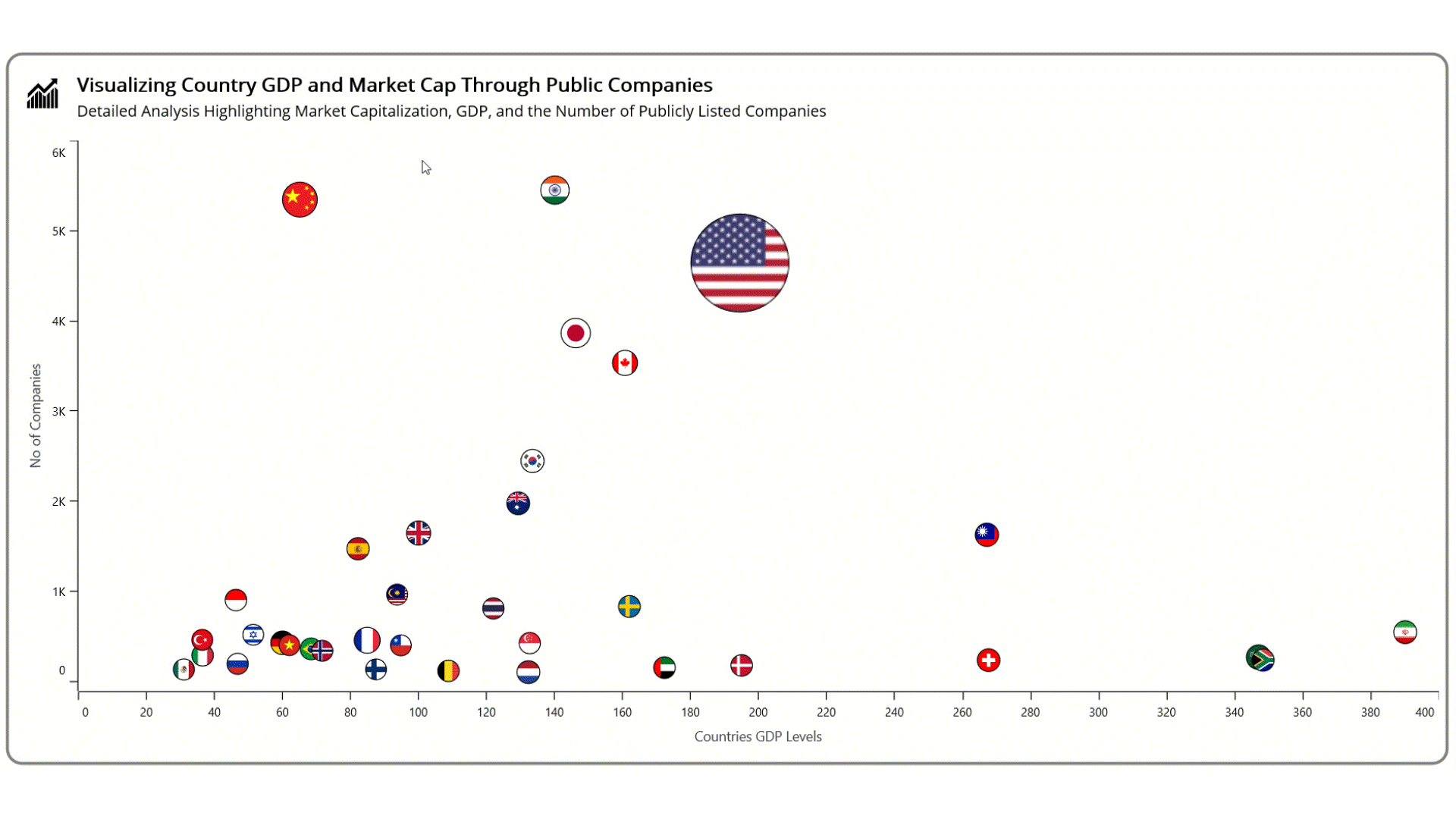
One of the unique aspects of the Bubble Chart is its ability to illustrate market cap variations effectively. For example, the United States market, represented with the largest bubble, signifies its dominant position in terms of market capitalization. In contrast, a smaller bubble representing Vietnam highlights its position as an emerging market with a lower market cap.
Enhancing the chart appearance with customizations
Additionally, we’ll explore various customization techniques, such as customizing tooltips to display detailed information about each country’s market cap. The chart will provide a clear visual comparison of market cap distribution, making it easier to interpret each country’s economic landscape.
The .NET MAUI Bubble Chart, with customized images and tooltips, will serve as a powerful tool to analyze the global market cap distribution. It will highlight key insights into the economic strengths of different countries and their relative positions in the global market.
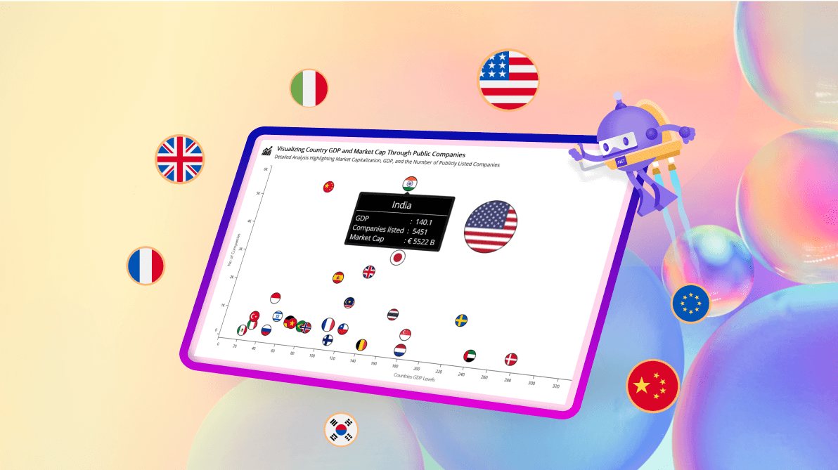
Refer to the following image.
Let’s explore the steps involved in analyzing the details of market cap distribution by country using the .NET MAUI Bubble Chart!
Step 1: Collecting data
First, we’ll gather data on market capitalization distribution across countries, focusing on companies and GDP. This data is sourced from Wikipedia’s List of countries by stock market capitalization.
Step 2: Preparing the data for the chart
Before creating the Bubble Chart, it’s essential to structure the data properly. This involves defining the MarketCapModel to manage data manipulation and MarketCapViewModel to communicate between the model and the bubble chart.
public class MarketCapModel
{
    public string Name { get; set; }
    public IImage? ImageIcon { get; set; }
    public double Company { get; set; }
    public double Size { get; set; }
    public double Gdp { get; set; }

    public MarketCapModel()
    {
    }

    public MarketCapModel(double value, double size, double weight, string name, Microsoft.Maui.Graphics.IImage imageIcon)
    {
        Name = name;
        ImageIcon = imageIcon;
        Company = value;
        Size = size;
        Gdp = weight;
    }
}
Next, create a MarketCapViewModel to hold the data collection. Refer to the following code example.
public class MarketCapViewModel
{
    public List MarketCapData { get; set; }

    public MarketCapViewModel()
    {
        MarketCapData = new List(ReadCSV());
    }

    public static IEnumerable ReadCSV()
    {
        Assembly executingAssembly = typeof(App).GetTypeInfo().Assembly;
        Stream inputStream = executingAssembly.GetManifestResourceStream("MarketCap.Resources.Raw.MarketData.csv");

        if (inputStream == null)
        {
            throw new FileNotFoundException("CSV file not found.");
        }

        string line;
        List lines = new();

        using StreamReader reader = new(inputStream);
        // Skip the header line
        reader.ReadLine();

        while ((line = reader.ReadLine()) != null)
        {
            lines.Add(line);
        }

        return lines.Select(line =>
        {
            string[] data = line.Split(',');

            return new MarketCapModel
            {
                Size = Convert.ToDouble(data[1]),
                Gdp = Convert.ToDouble(data[2]),
                Company = Convert.ToInt32(data[3]),
                Name = data[0],
                ImageIcon = GetImage(data[4]) // Assuming the ImageIcon is the 5th column
            };
        });
    }
}
Step 3: Retrieve the image using the resource stream
In this project, we’ll add images to enhance the visual clarity of the chart. This will allow us to associate data points with specific countries or categories quickly. This approach makes the data more intuitive and easier to interpret, as visual elements communicate information faster than text.
To integrate images efficiently, add them to the project’s resources as embedded resources to ensure they’re packaged with the app. Then, create a method that streams these images as key-value pairs, linking each image to the market cap data for seamless visualization within the chart.
Refer to the following code example.
private IImage? GetImage(string resourcePath)
{
    Assembly assembly = typeof(MainPage).GetTypeInfo().Assembly;
    using Stream? stream = assembly.GetManifestResourceStream("MarketCap.Resources.Images." + resourcePath + "1.png");

    if (stream != null)
    {
        return PlatformImage.FromStream(stream);
    }

    return null;
}
Step 4: Configure the Syncfusion .NET MAUI Charts
Let’s configure the Syncfusion .NET MAUI Charts control using this documentation. Both the XAxis and YAxis will be set as Numerical axes to represent the GDP and Number of companies, respectively.
Refer to the following code example.
<chart:SfCartesianChart>
  <chart:SfCartesianChart.XAxes>
    <chart:NumericalAxis />
  </chart:SfCartesianChart.XAxes>

  <chart:SfCartesianChart.YAxes>
    <chart:NumericalAxis />
  </chart:SfCartesianChart.YAxes>
</chart:SfCartesianChart>
Step 5: Binding data to the .NET MAUI Bubble series
The Syncfusion .NET MAUI Bubble Chart offers extensive customization options for series representation. Developers can tailor the chart’s visual aspects to convey data insights better. One notable feature is the ability to incorporate images within the bubble segments, enhancing the chart’s interactivity and visual appeal.
Create the class BubbleExt that inherits from BubbleSeries. Then, create a BubbleSegmentExt class that inherits from BubbleSegment. Override the Draw method in BubbleSegmentExt to add an image to every segment.
public class BubbleExt : BubbleSeries
{
    protected override ChartSegment CreateSegment()
    {
        return new BubbleSegmentExt();
    }
}

public class BubbleSegmentExt : BubbleSegment
{
    protected override void Draw(ICanvas canvas)
    {
        base.Draw(canvas);

        if (Series is BubbleExt && Series.BindingContext is MarketCapViewModel viewModel)
        {
            float imageX = CenterX - (Radius / 2);
            float imageY = CenterY - (Radius / 2);

            float diameter = Radius * 2; // Since radius is half of the diameter
            canvas.DrawImage(
                viewModel.MarketCapData[Index].ImageIcon,
                CenterX - Radius,
                CenterY - Radius,
                diameter,
                diameter
            );
        }
    }
}
We’ll use BubbleExt instances to design the bubble chart. Ensure the ViewModel class is configured correctly to bind its properties to the chart’s BindingContext.
Refer to the following code example, where the bubble series is updated with the respective ItemSource, XBindingPath, and YBindingPath properties.
<ContentPage xmlns="http://schemas.microsoft.com/dotnet/2021/maui"
             xmlns:x="http://schemas.microsoft.com/winfx/2009/xaml"
             xmlns:chart="clr-namespace:Syncfusion.Maui.Charts;assembly=Syncfusion.Maui.Charts"
             xmlns:model="clr-namespace:MarketCap"
             x:Class="MarketCap.MainPage">

    <chart:SfCartesianChart>

        <chart:SfCartesianChart.BindingContext>
            <model:MarketCapViewModel/>
        </chart:SfCartesianChart.BindingContext>

        <model:BubbleExt XBindingPath="Gdp"
                         YBindingPath="Company"
                         SizeValuePath="Size"
                         ItemsSource="{Binding MarketCapData}">
        </model:BubbleExt>

    </chart:SfCartesianChart>

</ContentPage>
Step 6: Customizing the chart
Let’s enhance the appearance of the .NET MAUI Bubble Chart by customizing its elements, such as the title, axis, and tooltip.
Adding chart title
The Title property serves as a crucial element for enhancing the overall clarity and context of the chart. This property allows you to define a descriptive title that succinctly conveys the purpose or subject of the visualization, making it easier for users to understand the data being presented.
<chart:SfCartesianChart HorizontalOptions="Fill" VerticalOptions="FillAndExpand">
    <chart:SfCartesianChart.Title>
        <Grid>
            <Grid.RowDefinitions>
                <RowDefinition Height="{OnPlatform Android=68,Default=80,iOS=68}"/>
            </Grid.RowDefinitions>
            <Grid.ColumnDefinitions>
                <ColumnDefinition Width="55"/>
                <ColumnDefinition Width="Auto"/>
            </Grid.ColumnDefinitions>

            <Path Data="{StaticResource UpTrendIcon}" Fill="#FF000000" Margin="10,15,10,0">
                <Path.RenderTransform>
                    <TransformGroup>
                        <TransformGroup.Children>
                            <RotateTransform Angle="0"/>
                            <ScaleTransform ScaleX="1" ScaleY="1"/>
                        </TransformGroup.Children>
                    </TransformGroup>
                </Path.RenderTransform>
            </Path>
            <StackLayout Grid.Column="1" Grid.Row="0" Margin="7,7,0,0">
                <Label Text="Visualizing Country GDP and Market Cap Through Public Companies" FontSize="{OnPlatform Android=12,Default=20,iOS=12}" FontAttributes="Bold" TextColor="Black"/>
                <Label Text="Detailed Analysis Highlighting Market Capitalization, GDP, and the Number of Publicly Listed Companies" FontSize="{OnPlatform Android=10,Default=16,iOS=10}" TextColor="Black" Margin="0,2,0,0"/>
            </StackLayout>
        </Grid>
    </chart:SfCartesianChart.Title>
</chart:SfCartesianChart>
Customizing the chart axis
Syncfusion .NET MAUI Charts offer extensive customization options for both XAxes and YAxes, allowing users to define ranges, titles, and label styles for clarity. You can set properties such as interval settings and plot offsets to enhance data representation, making comparisons more intuitive. Additionally, controlling grid lines and tick styles contributes to a clean and professional appearance. These features allow users to tailor their charts for optimal data interpretation and visual impact.
<chart:SfCartesianChart.XAxes>
    <chart:NumericalAxis Minimum="0" Maximum="400" ShowMajorGridLines="False">
        <chart:NumericalAxis.Title>
            <chart:ChartAxisTitle Text="Countries GDP Levels"/>
        </chart:NumericalAxis.Title>
        <chart:NumericalAxis.LabelStyle>
            <chart:ChartAxisLabelStyle TextColor="Black"/>
        </chart:NumericalAxis.LabelStyle>
        <chart:NumericalAxis.AxisLineStyle>
            <chart:ChartLineStyle Stroke="black"/>
        </chart:NumericalAxis.AxisLineStyle>
        <chart:NumericalAxis.MajorTickStyle>
            <chart:ChartAxisTickStyle Stroke="black"/>
        </chart:NumericalAxis.MajorTickStyle>
    </chart:NumericalAxis>
</chart:SfCartesianChart.XAxes>

<chart:SfCartesianChart.YAxes>
    <chart:NumericalAxis Minimum="0" Maximum="6000" Interval="1000" ShowMajorGridLines="False" LabelCreated="OnLabelCreated" PlotOffsetStart="10">
        <chart:NumericalAxis.Title>
            <chart:ChartAxisTitle Text="No of Companies"/>
        </chart:NumericalAxis.Title>
        <chart:NumericalAxis.LabelStyle>
            <chart:ChartAxisLabelStyle TextColor="Black"/>
        </chart:NumericalAxis.LabelStyle>
        <chart:NumericalAxis.AxisLineStyle>
            <chart:ChartLineStyle Stroke="black"/>
        </chart:NumericalAxis.AxisLineStyle>
        <chart:NumericalAxis.MajorTickStyle>
            <chart:ChartAxisTickStyle Stroke="black"/>
        </chart:NumericalAxis.MajorTickStyle>
    </chart:NumericalAxis>
</chart:SfCartesianChart.YAxes>
Refer to the following code example to format the axis labels in thousands.
private void OnLabelCreated(object sender, Syncfusion.Maui.Charts.ChartAxisLabelEventArgs e)
{
    // Check if the value is in thousands
    if (e.Position is double value && value <= 1000)
    {
        // Divide by 1000 and append "k"
        e.Label = (value / 1000).ToString("0") + "K";
    }
}
This method modifies the labels on the Y-axis to display values in thousands for better readability.
Bubble customization
Let’s adjust the bubble sizes for improved visual clarity and data representation. By setting the MaximumRadius and MinimumRadius properties, users can maintain a consistent scale for the bubbles, facilitating easier comparison and interpretation of data across various categories.
<model:BubbleExt MaximumRadius="28" MinimumRadius="10" </model:BubbleExt>
Enable tooltip
Then, customize the tooltips to enhance data interactivity and user experience. Tooltips can present detailed information about each data point, making it easier for users to understand the underlying data.
Refer to the following code example to customize tooltips to display specific metrics related to each country’s market cap, GDP, and the number of companies.
<chart:BubbleSeries.TooltipTemplate>
    <DataTemplate>
        <Grid BackgroundColor="Black">
            <Grid.RowDefinitions>
                <RowDefinition Height="Auto"/>
                <RowDefinition Height="Auto"/>
                <RowDefinition Height="Auto"/>
            </Grid.RowDefinitions>
            <Grid.ColumnDefinitions>
                <ColumnDefinition Width="Auto"/>
            </Grid.ColumnDefinitions>
            <Grid Grid.Row="0" Grid.Column="0" Margin="3,5,10,3">
                <HorizontalStackLayout HorizontalOptions="Center">
                    <Label Text="{Binding Item.Name}" FontSize="18" TextColor="White" HorizontalTextAlignment="Center" Margin="0,0,0,0"/>
                </HorizontalStackLayout>
            </Grid>
            <BoxView Grid.Row="1" Grid.Column="0" VerticalOptions="Center" BackgroundColor="White" HeightRequest="1"/>
            <Grid Grid.Row="2" Grid.Column="0" Margin="3,5,10,3">
                <StackLayout>
                    <Label Text="{Binding Item.Gdp,StringFormat='GDP                         :  {0}  '}" TextColor="White" VerticalTextAlignment="Center" HorizontalTextAlignment="Start"/>
                    <Label Text="{Binding Item.Company,StringFormat='Companies listed  :  {0}  '}" TextColor="White" VerticalTextAlignment="Center" HorizontalTextAlignment="Start"/>
                    <Label Text="{Binding Item.Size,StringFormat='Market Cap            : € {0} B '}" TextColor="White" VerticalTextAlignment="Center" HorizontalTextAlignment="Start"/>
                </StackLayout>
            </Grid>
        </Grid>
    </DataTemplate>
</chart:BubbleSeries.TooltipTemplate>
After executing the above code examples, the output will resemble the following image.

GitHub reference
For more details, refer to the project on GitHub.

Conclusion
Thanks for reading! In this blog, we’ve seen how to visualize market cap distribution across countries using the Syncfusion .NET MAUI Bubble Chart. We strongly encourage you to follow the steps outlined in this blog and share your feedback in the comments section below.
If you require assistance, please don’t hesitate to contact us via our support forum, support portal, or feedback portal. We are always eager to help you!


 No spam, just valuable updates.