TL;DR: Let’s see how to create a Tornado Chart using Syncfusion Flutter Bar Chart. Start by populating data for male and female populations, then implement the Bar series and align them. Customize axis labels, data labels, and tooltips, and add a title and legend to complete the chart. This guide helps you build a polished and informative Tornado Chart.
What is a Tornado Chart?
A Tornado Chart, also known as a Butterfly Chart, is a type of bar chart used to compare different variables. It is particularly useful in sensitivity analysis to display the effect of various uncertainties on a particular outcome. The chart is named so because the bars are arranged in descending order from top to bottom, creating a shape that resembles a tornado or butterfly.
Key characteristics of a Tornado Chart
- Horizontal bars: The chart consists of horizontal bars that extend to the left and right of a central axis, representing two different variables or groups.
- Symmetrical appearance: It often has a symmetrical appearance, with the central axis acting as the dividing line between two opposing data sets, such as the male vs. female population or different scenarios in a sensitivity analysis.
- Descending order: The bars are typically arranged in descending order based on their absolute values.
Use cases of a Tornado Chart
- Sensitivity analysis: Widely used to illustrate the relative impact of different variables on a key outcome.
- Comparative analysis: Effective for comparing two groups or data sets, such as the male vs. female population across different age groups.
- Decision making: Assists in identifying and understanding the most significant impact factors, supporting informed decision-making.
Visualizing the world population with a Tornado Chart in Flutter
In this blog, we’ll see how to create an interactive Tornado Chart using Syncfusion Flutter Bar Chart to visualize the distribution of male and female populations of the world across various age groups. The chart will offer a clear, comparative view of demographic patterns.
Chart design overview:
- The central axis represents different age groups.
- Horizontal bars extend to the left for females and to the right for males.
- The length of each bar indicates the population size for each age group.
By leveraging Flutter Bar Chart’s capabilities, you can create a dynamic and visually engaging Tornado Chart that provides valuable insights into population demographics.
Let’s get started!
Step 1: Populate data
First, we need to set the data source for two bar series with the same x-axis values. In this case, we’re preparing a demo to display population data for females and males across different age groups. The age groups are specified as the common x-axis values, and separate y-axis values are provided for each gender.
We’ve taken real-time data from the Population Pyramids of the World from 1950 to 2100 and downloaded the 2023 population data for South America in CSV format.
The following is the sample data list extracted from the CSV file for use in the chart.
List<_PopulationData> data = [
  _PopulationData('0-4', 15687321, 15039014),
  _PopulationData('5-9', 16577877, 15890115),
  _PopulationData('10-14', 16888377, 16197733),
  _PopulationData('15-19', 17136711, 16484380),
  _PopulationData('20-24', 17472667, 16960958),
  _PopulationData('25-29', 17616377, 17303882),
  _PopulationData('30-34', 17318629, 17186302),
  _PopulationData('35-39', 16836127, 16902230),
  _PopulationData('40-44', 15723691, 16027059),
  _PopulationData('45-49', 13959888, 14450695),
  _PopulationData('50-54', 12313479, 13002373),
  _PopulationData('55-59', 11037894, 11955793),
  _PopulationData('60-64', 9388603, 10557282),
  _PopulationData('65-69', 7297733, 8619037),
  _PopulationData('70-74', 5269323, 6634432),
  _PopulationData('75-79', 3357561, 4560921),
  _PopulationData('80-84', 1911079, 2936309),
  _PopulationData('85-89', 781112, 1481688),
  _PopulationData('90-94', 209008, 541978),
  _PopulationData('95-99', 37879, 137868),
  _PopulationData('100+', 4440, 23175),
];

final double _totalPopulation = 439719008;
Step 2: Implement the Flutter Bar series
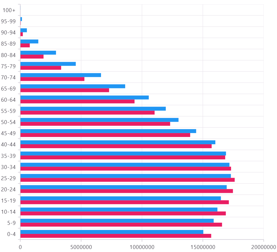
The Flutter BarSeries represents data with horizontal bars, where the length of each bar corresponds to the value of the data point. This visualization makes it easy to compare different categories in detail.
First, we should create a Flutter Cartesian Chart and define two BarSeries, each representing a distinct data set (e.g., male and female populations).
You can also customize the appearance of each series, such as their colors using the color property within the BarSeries.
Refer to the following code example.
…
SfCartesianChart(
  series: <CartesianSeries<_PopulationData, String>>[
    BarSeries<_PopulationData, String>(
      dataSource: data,
      xValueMapper: (_PopulationData population, int index) => population.x,
      yValueMapper: (_PopulationData population, int index) => population.y1,
      name: 'Female',
      color: Colors.pink,
    ),
    BarSeries<_PopulationData, String>(
      dataSource: data,
      xValueMapper: (_PopulationData population, int index) => population.x,
      yValueMapper: (_PopulationData population, int index) => population.y2,
      name: 'Male',
      color: Colors.blue,
    ),
  ],
);
….
After executing the above code example, we’ll get the following output.
Step 3: Align the Flutter Bar series in parallel to create the Tornado Chart
When we use multiple bar series in a single chart, all bar series can be rendered in parallel to visualize the multiple series values easily.
The enableSideBySideSeriesPlacement property is used to control whether the bar or column series should be placed side-by-side or overlap with each other.
Refer to the following image. Our tornado chart bar series overlaps with each other because all values are set to positive.
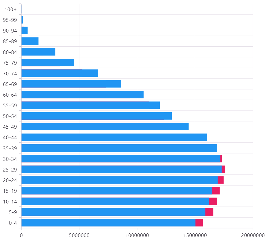
For our Flutter Tornado Chart, we need to set the enableSideBySideSeriesPlacement property to false to render the female values on the left side and the male values on the right side.
Refer to the following code example. Here, we’ll set the negative values for the Female bar series y-axis value because a tornado chart is plotted using both negative and positive values.
class _PopulationData {
  _PopulationData(this.x, this.y1, this.y2) {
    y1 = -y1;
  }

  final String x;
  double y1;
  double y2;
}
After executing the above code example, we’ll get the following output.

Step 4: Disable the Gridlines’ appearance
As per the Tornado Chart behavior, we need to disable the axis gridlines to visualize and compare the horizontal bars clearly. We can disable the gridlines in Flutter Charts by setting the width to 0 in the majorGridLines property in the Flutter Charts axis.
Refer to the following code example.
…
primaryXAxis: const CategoryAxis(
majorGridLines: MajorGridLines(
width: 0,
),
),
primaryYAxis: const NumericAxis(
majorGridLines: MajorGridLines(
width: 0,
),
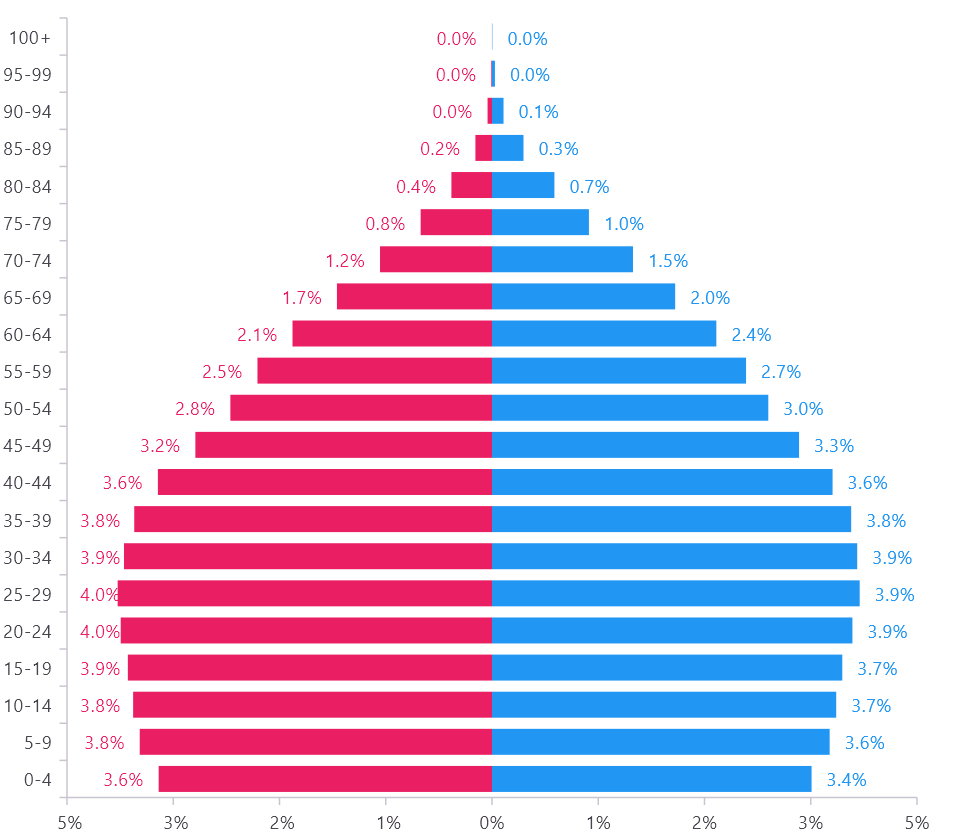
…Step 5: Customize axis labels
We’ve taken the Female vs. Male population data with age groups to display the Flutter Tornado Chart. As per the tornado chart behavior, we have passed negative values for the Female bar series, so our axis range will include negative values.
To remove the negative symbol from the y-axis labels, use the axisLabelFormatter and compute the percentage value based on the total population. Using this callback, we can customize the text and text style using the ChartAxisLabel class and return it.
Refer to the following code example.
primaryYAxis: NumericAxis(
   ….
   axisLabelFormatter: (AxisLabelRenderDetails args) {
     int value = ((args.value / _totalPopulation) * 100).round();
     String text = '${value.toString().replaceAll('-', ' ')}%';
     return ChartAxisLabel(
        text,
        args.textStyle,
     );
   },
),
….
Refer to the following output image.

Step 6: Customize data label
To display the data labels on both sides of the bar series, we need to enable the data label feature using the dataLabelSettings property. Customize the data label color to match the series color using the textStyle property. Then, render the data labels outside the series by setting the labelPosition to ChartDataLabelPosition.outside to improve the look and feel of the Flutter Tornado Chart.
To remove the negative symbol from the Females series data labels, use the onDataLabelRender callback in Flutter Charts. This callback allows us to customize the text, text style, text color, and data label offsets. Refer to the following code example.
onDataLabelRender: (DataLabelRenderArgs dataLabelArgs) {
  if (dataLabelArgs.text != null) {
    double population =
        ((dataLabelArgs.dataPoints[dataLabelArgs.pointIndex].y /
                    _totalPopulation) *
                100) /
            100;
    String percentageString =
        NumberFormat("##0.0%").format(population);
    dataLabelArgs.text = percentageString.replaceAll('-', ' ');
  }
},
series: <CartesianSeries<_PopulationData, String>>[
    BarSeries<_PopulationData, String>(
     ….
      dataLabelSettings: const DataLabelSettings(
        isVisible: true,
        labelPosition: ChartDataLabelPosition.outside,
        labelIntersectAction: LabelIntersectAction.none,
        textStyle: TextStyle(
          color: Colors.pink,
        ),
      ),
    ),
    BarSeries<_PopulationData, String>(
      ……
      dataLabelSettings: const DataLabelSettings(
        isVisible: true,
        labelPosition: ChartDataLabelPosition.outside,
        labelIntersectAction: LabelIntersectAction.none,
        textStyle: TextStyle(
          color: Colors.blue,
        ),
      ),
    ),
  ],
…
Refer to the following output image.
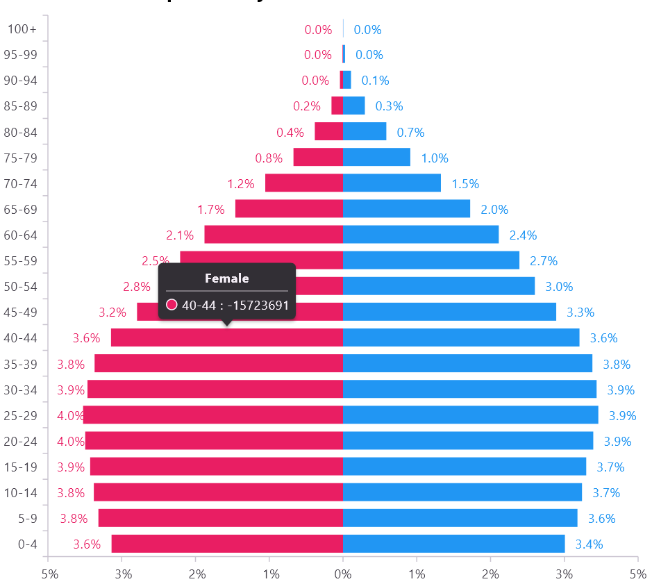
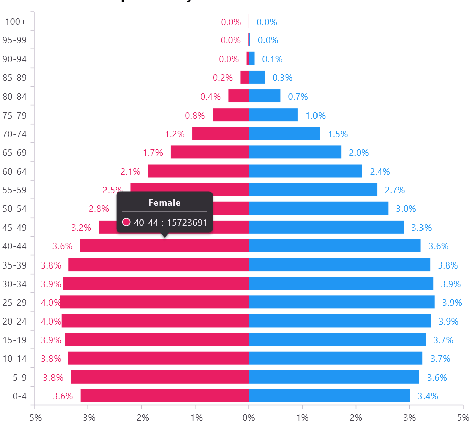
Step 7: Customize tooltip label
When we enable tooltips in the Tornado Chart, the Female series tooltip value will be displayed with a negative symbol. You can customize the tooltips to eliminate any negative symbols using the onTooltipRender callback.
Refer to the following code example.
tooltipBehavior: TooltipBehavior(enable: true),
  onTooltipRender: (TooltipArgs tooltipArgs) {
    if (tooltipArgs.text != null) {
     tooltipArgs.text = tooltipArgs.text!.replaceAll(' -', ' ');
    }
  },
 …
By applying this change, you ensure that the tooltips display data without negative signs, creating a more polished and professional appearance for your chart.
| Before | After |
 |  |
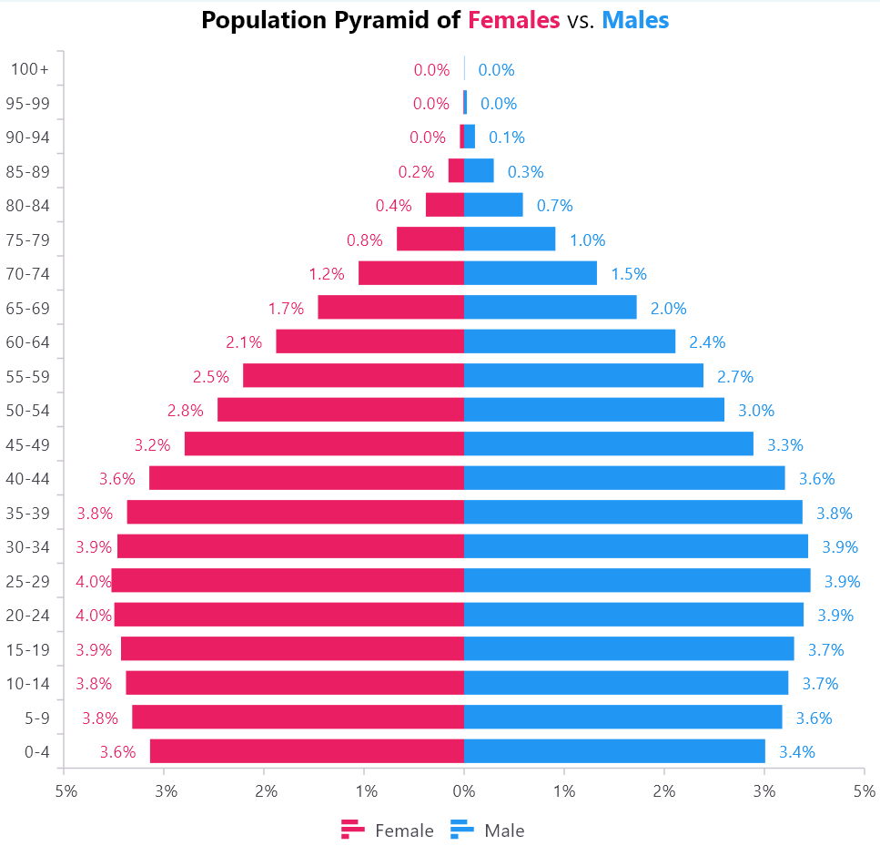
Step 8: Customize legends and title
To further refine your Tornado Chart, consider adding a title to give context to the data and enabling the legend to help users differentiate between the male and female series. These enhancements will complete your chart, making it both informative and visually appealing.
Refer to the following code example.
@override
Widget build(BuildContext context) {
 return Scaffold(
   body: Column(
     children: [
       RichText(
         text: const TextSpan(children: [
           TextSpan(
             text: 'Population Pyramid of ',
             style: TextStyle(
                 color: Colors.black,
                 fontSize: 18,
                 fontWeight: FontWeight.bold),
           ),
           TextSpan(
             text: 'Females',
             style: TextStyle(
                 color: Colors.pink,
                 fontSize: 18,
                 fontWeight: FontWeight.bold),
           ),
           TextSpan(
             text: ' vs. ',
             style: TextStyle(color: Colors.black, fontSize: 18),
           ),
           TextSpan(
             text: 'Males',
             style: TextStyle(
                 color: Colors.blue,
                 fontSize: 18,
                 fontWeight: FontWeight.bold),
           ),
         ]),
       ),
       Expanded(
         child: SfCartesianChart(
           legend: const Legend(
             isVisible: true,
             position: LegendPosition.bottom,
           ),
           …
          ),
       ),
     ],
   ),
 );
}
After implementing these adjustments, our Flutter Tornado Chart will be fully rendered, as shown in the following image.
GitHub reference
For more details, refer to the Flutter Tornado Chart for visualizing the world population data demo on GitHub.

Conclusion
Thanks for reading! In this blog, we’ve seen how to create and customize a tornado chart using the Syncfusion Flutter Bar Chart. We hope you find the outlined steps helpful in achieving similar results.
If you’re an existing customer, you can download the latest version of Essential Studio® from the License and Downloads page. For those new to Syncfusion, try our 30-day free trial to explore all our features.
For queries, you can contact us through our support forum, support portal, or feedback portal. We’re always happy to help you!


 No spam, just valuable updates.