
TL;DR: Automating flowchart creation is easy with Syncfusion Blazor Diagram’s automatic layout algorithm. Instead of manually positioning elements, focus on your data and let the diagram do the rest. This guide shows how to create flowcharts using external data and customize the layout efficiently.
Manually assigning coordinates to each element in a flowchart is tedious and error-prone. Fortunately, Syncfusion’s Blazor Diagram library simplifies this process with a few configuration settings, allowing you to focus on data instead of precise positioning.
This blog explains how to automate flowchart creation using the Blazor Diagram Library. This will eliminate manual placement by leveraging its built-in automatic layout algorithm.
What is a flowchart?
Flowcharts visually represent processes, workflows, systems, or algorithms. They use distinct symbols to denote different actions or steps, connected by arrows to indicate the flow of control. The Blazor Diagram library allows you to easily generate these diagrams from external data, streamlining your workflow and improving clarity.
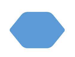
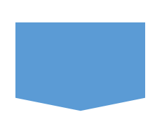
Common flowchart symbols and their meanings
Flowchart symbols are crucial for visualizing various stages of a process. Each symbol represents a specific meaning, such as a task, decision, or data operation.
The following table outlines the most commonly used flowchart symbols and their functions.
Symbol | Name | Description |
 | Terminator | Indicates the beginning or end of a process. |
 | Data | Represents the input or output of data within a process. |
 | Process | Denotes an operation, task, or data manipulation performed within the process. |
 | Decision | Indicates a decision point where the process can branch into two or more paths based on conditions. |
 | Document | Represents a single document or report generated or referenced in the process. |
 | Predefined process | Signifies a predefined set of operations, often represented elsewhere, that completes a specific task. |
 | Direct data | Represents a dataset that can be searched, sorted, or filtered for information. |
 | Stored data | Indicates a step where data is stored within the process for future use or reference. |
 | Manual input | Represents manual data entry at a specific point in the process. |
 | Manual operation | Represents an action or task that requires manual execution, rather than an automated process. |
 | Preparation | Indicates a setup or preparatory phase before transitioning to another step. |
 | Off-page reference | Links parts of a flowchart that continue on another page, often used in complex processes. |
 | Multi-document | Represents multiple documents or reports involved at a given point in the process. |
 | Flowline | Depicts the flow or direction from one step to the next. These lines are automatically created based on relationships between parent and child elements. |
Getting started with a simple flowchart creation
This section walks you through creating a simple flowchart using the Syncfusion Blazor Diagram library. Its built-in automatic layout algorithm eliminates manual positioning and focuses solely on your data.
Step 1: Define the data source
To populate the flowchart in the diagram, we first need to define a data source or a collection of nodes. Let’s start by creating a model class to structure the data source.
This class will define fields such as Id, ParentId, Shape, Description, and LineText. Additionally, you can include properties like Color, Width, and Height to enhance the UI design, along with any custom fields that fit your requirements.
Refer to the following code example.
public class NodeInfo
{
    public string Id { get; set; }
    public string Description { get; set; }
    public List<string> ParentId { get; set; }
    public List<string> LineText { get; set; }
    public string Shape { get; set; }
    public double Width { get; set; }
    public double Height { get; set; }
    public string Color { get; set; }
}
Next, create a data source for the flowchart and populate it with records as nodes. The parent-child relationships are essential in establishing the flowchart structure, so ensure each node properly references its parent using the ParentId field. Refer to the following code example.
public List<NodeInfo> DataSource = new List<NodeInfo>()
{
    new NodeInfo() { Id = "1", Description = "Start", Shape = "StartOrEnd", Width = 100, Height = 30, Color = "#8E44CC" },
    new NodeInfo() { Id = "2", Description = "Open Gmail site in browser", ParentId = new List<string> { "1" }, Shape = "Rectangle", Width = 120, Height = 50, Color = "#1759B7" },
    new NodeInfo() { Id = "3", Description = "Existing \nor \nnew user?", ParentId = new List<string> { "2" }, Shape = "Decision", Width = 130, Height = 80, Color = "#2F95D8" },
    new NodeInfo() { Id = "4", LineText = new List<string> { "New" }, Description = "Create an account", ParentId = new List<string> { "3" }, Shape = "Rectangle", Width = 120, Height = 50, Color = "#1759B7" },
    new NodeInfo() { Id = "5", Description = "Sign in", LineText = new List<string> { "Existing" }, ParentId = new List<string> { "3" }, Shape = "Rectangle", Width = 120, Height = 50, Color = "#1759B7" },
    new NodeInfo() { Id = "6", Description = "Enter username \nand password", LineText = new List<string> { "", "No" }, ParentId = new List<string> { "5", "7" }, Shape = "Data", Width = 150, Height = 50, Color = "#70AF16" },
    new NodeInfo() { Id = "7", Description = "Authorized?", ParentId = new List<string> { "6" }, Shape = "Decision", Width = 120, Height = 70, Color = "#2F95D8" },
    new NodeInfo() { Id = "8", Description = "Login successful!!", LineText = new List<string> { "Yes" }, ParentId = new List<string> { "7" }, Shape = "Rectangle", Width = 120, Height = 50, Color = "#1759B7" },
    new NodeInfo() { Id = "9", Description = "Enter first name \nand last name", ParentId = new List<string> { "4" }, Shape = "Data", Width = 150, Height = 50, Color = "#70AF16" },
    new NodeInfo() { Id = "10", Description = "Enter username \nand password", LineText = new List<string> { "", "Yes" }, ParentId = new List<string> { "9", "11" }, Shape = "Data", Width = 150, Height = 50, Color = "#70AF16" },
    new NodeInfo() { Id = "11", Description = "Username \nalready\n exists?", ParentId = new List<string> { "10" }, Shape = "Decision", Width = 130, Height = 80, Color = "#2F95D8" },
    new NodeInfo() { Id = "12", Description = "Registration Successful!!", LineText = new List<string> { "No" }, ParentId = new List<string> { "11" }, Shape = "Process", Width = 120, Height = 50, Color = "#1759B7" },
    new NodeInfo() { Id = "13", Description = "Open inbox", ParentId = new List<string> { "8", "12" }, Shape = "Process", Width = 120, Height = 50, Color = "#1759B7" },
    new NodeInfo() { Id = "14", Description = "End", ParentId = new List<string> { "13" }, Shape = "StartOrEnd", Width = 100, Height = 30, Color = "#8E44CC" },
};
Step 2: Binding the data source to the layout
Once the data source is ready, bind it to the Blazor Diagram component using DataSourceSettings. This will automatically map the nodes to the diagram and establish connections based on parent-child relationships.
<SfDiagramComponent>
 <DataSourceSettings DataSource="DataSource" ID="ID" ParentID="ParentId"></DataSourceSettings>
</SfDiagramComponent>
Next, apply the Layout element to specify the automatic layout properties and define the flowchart type.
<Layout Type="LayoutType.Flowchart"></Layout>Step 3: Customize spacings and margin
You can customize the layout to meet your design requirements. For example, the HorizontalSpacing and VerticalSpacing properties control the spacing between nodes, while LayoutMargin adds padding around the layout. These values can be bound to the UI for real-time updates.
Refer to the following code example.
<Layout Type="LayoutType.Flowchart" HorizontalSpacing="30" VerticalSpacing="30">
    <LayoutMargin Top="10" Bottom="10" Right="10" Left="10"></LayoutMargin>
</Layout>
Finally, the Razor file will look like the following.
@page "/"
@using Syncfusion.Blazor.Diagram
@using System.Collections.ObjectModel
<SfDiagramComponent @ref="Diagram" Width="100%" Height="900px" ConnectorCreating="@OnConnectorCreating" NodeCreating="@OnNodeCreating" DataLoaded="@OnDataLoaded">
<DataSourceSettings ID="Id" ParentID="ParentId" DataSource="DataSource"></DataSourceSettings>
<Layout @bind-Type="@Type" @bind-HorizontalSpacing="@HorizontalSpacing" @bind-Orientation="@OrientationType" @bind-VerticalSpacing="@VerticalSpacing" FlowchartLayoutSettings="@flowchartSettings">
</Layout>
<SnapSettings Constraints="SnapConstraints.None"></SnapSettings>
</SfDiagramComponent>
@code {
FlowchartLayoutSettings flowchartSettings = new FlowchartLayoutSettings()
{
//Set the decision YES branch direction.
YesBranchDirection = BranchDirection.LeftInFlow,
//Set the decision NO branch direction.
NoBranchDirection = BranchDirection.RightInFlow,
//Set the custom YES branch values.
YesBranchValues = new List { "Yes", "Existing" },
//Set the custom NO branch values.
NoBranchValues = new List { "No", "New" },
};
public SfDiagramComponent Diagram;
public int? HValue { get; set; } = 60;
public int? VValue { get; set; } = 40;
public LayoutType Type = LayoutType.Flowchart;
public LayoutOrientation OrientationType = LayoutOrientation.TopToBottom;
public int HorizontalSpacing = 50;
public int VerticalSpacing = 50;
private void OnDataLoaded(object obj)
{
for (int i = 0; i < Diagram.Connectors.Count; i++)
{
var connector = Diagram.Connectors[i];
var node = Diagram.GetObject(connector.TargetID) as Node;
var srcNode = Diagram.GetObject(connector.SourceID) as Node;
if (node.Data != null && node.Data is NodeInfo NodeInfo)
{
if (NodeInfo.LineText != null && NodeInfo.LineText.Count > 0)
{
if (NodeInfo.ParentId.IndexOf((srcNode.Data as NodeInfo).Id) != -1)
{
var parentIndex = NodeInfo.ParentId.IndexOf((srcNode.Data as NodeInfo).Id);
if (NodeInfo.LineText.Count > parentIndex)
{
connector.Annotations = new DiagramObjectCollection<PathAnnotation>()
{
new PathAnnotation() { Content = NodeInfo.LineText[parentIndex], Style=new TextStyle(){Fill="White" } }
};
}
}
}
}
}
}
private void OnConnectorCreating(IDiagramObject obj)
{
if (obj is Connector connector)
{
connector.Type = ConnectorSegmentType.Orthogonal;
}
}
private void OnNodeCreating(IDiagramObject obj)
{
Node node = obj as Node;
if (node.Data != null && node.Data is NodeInfo)
{
NodeInfo employeeDetails = node.Data as NodeInfo;
node.Width = employeeDetails.Width;
node.Height = employeeDetails.Height;
if (employeeDetails.Shape == "Rectangle")
{
node.Shape = new FlowShape() { Shape = NodeFlowShapes.Process };
}
else if (employeeDetails.Shape == "StartOrEnd")
{
node.Shape = new FlowShape() { Shape = NodeFlowShapes.Terminator };
}
else
node.Shape = new FlowShape() { Shape = (NodeFlowShapes)Enum.Parse(typeof(NodeFlowShapes), employeeDetails.Shape.ToString()) };
node.Style.Fill = employeeDetails.Color;
node.Style.StrokeColor = employeeDetails.Color;
node.Annotations = new DiagramObjectCollection<ShapeAnnotation>()
{
new ShapeAnnotation(){ Content = employeeDetails.Description, Style = new TextStyle(){ Color="white"} }
};
}
}
public List DataSource = new List()
{
new NodeInfo() { Id = "1", Description = "Start", Shape = "StartOrEnd", Width = 100, Height = 30, Color = "#8E44CC" },
new NodeInfo() { Id = "2", Description = "Open Gmail site in browser", ParentId = new List { "1" }, Shape = "Rectangle", Width = 120, Height = 50, Color = "#1759B7" },
new NodeInfo() { Id = "3", Description = "Existing \nor \nnew user?", ParentId = new List { "2" }, Shape = "Decision", Width = 130, Height = 80, Color = "#2F95D8" },
new NodeInfo() { Id = "4", LineText = new List { "New" }, Description = "Create an account", ParentId = new List { "3" }, Shape = "Rectangle", Width = 120, Height = 50, Color = "#1759B7" },
new NodeInfo() { Id = "5", Description = "Sign in", LineText = new List { "Existing" }, ParentId = new List { "3" }, Shape = "Rectangle", Width = 120, Height = 50, Color = "#1759B7" },
new NodeInfo() { Id = "6", Description = "Enter username \nand password", LineText = new List { "", "No" }, ParentId = new List { "5", "7" }, Shape = "Data", Width = 150, Height = 50, Color = "#70AF16" },
new NodeInfo() { Id = "7", Description = "Authorized?", ParentId = new List { "6" }, Shape = "Decision", Width = 120, Height = 70, Color = "#2F95D8" },
new NodeInfo() { Id = "8", Description = "Login successful!!", LineText = new List { "Yes" }, ParentId = new List { "7" }, Shape = "Rectangle", Width = 120, Height = 50, Color = "#1759B7" },
new NodeInfo() { Id = "9", Description = "Enter first name \nand last name", ParentId = new List { "4" }, Shape = "Data", Width = 150, Height = 50, Color = "#70AF16" },
new NodeInfo() { Id = "10", Description = "Enter username \nand password", LineText = new List { "", "Yes" }, ParentId = new List { "9", "11" }, Shape = "Data", Width = 150, Height = 50, Color = "#70AF16" },
new NodeInfo() { Id = "11", Description = "Username \nalready\n exists?", ParentId = new List { "10" }, Shape = "Decision", Width = 130, Height = 80, Color = "#2F95D8" },
new NodeInfo() { Id = "12", Description = "Registration Successful!!", LineText = new List { "No" }, ParentId = new List { "11" }, Shape = "Process", Width = 120, Height = 50, Color = "#1759B7" },
new NodeInfo() { Id = "13", Description = "Open inbox", ParentId = new List { "8", "12" }, Shape = "Process", Width = 120, Height = 50, Color = "#1759B7" },
new NodeInfo() { Id = "14", Description = "End", ParentId = new List { "13" }, Shape = "StartOrEnd", Width = 100, Height = 30, Color = "#8E44CC" },
};
public class NodeInfo
{
public string Id { get; set; }
public string Description { get; set; }
public List<string> ParentId { get; set; }
public List<string> LineText { get; set; }
public string Shape { get; set; }
public double Width { get; set; }
public double Height { get; set; }
public string Color { get; set; }
}
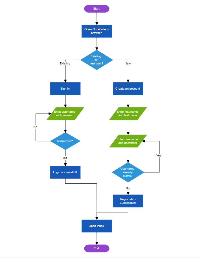
}Once the code is executed, a fully functional flowchart with automated node arrangement will be generated, as shown in the following image.
Flowchart orientation customization
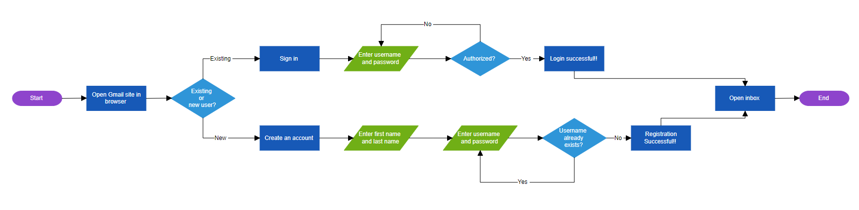
We can easily customize the flowchart’s orientation using the Blazor Diagram library. Depending on your layout requirements, you can set the flow direction to vertical (TopToBottom) or horizontal (LeftToRight).
You can manage this flexibility through the Orientation property of the Layout class. By default, the flow direction is vertical (top to bottom), but you can easily change it to horizontal using the following code example.
<Layout Type="LayoutType.Flowchart" Orientation="LayoutOrientation.LeftToRight">
</Layout>
Refer to the following image.
Customize the decision symbol branch directions
In flowcharts, decision symbols represent branching points where a choice is made between two paths. By default, the flowchart engine automatically determines the direction of these branches. However, with the Blazor Diagram component, you can customize the direction of both the Yes and No branches to suit your needs.
You can use the YesBranchDirection and NoBranchDirection properties of the FlowchartLayoutSettings to control the path direction for each branch.
The following example demonstrates how to customize the Yes branch to follow the flow direction while the No branch diverges to the right.
<Layout Type="LayoutType.Flowchart" FlowchartLayoutSettings="@flowchartSettings"></Layout>
@code
{
    FlowchartLayoutSettings flowchartSettings = new FlowchartLayoutSettings()
    {
            //Set the decision Yes branch direction.
            YesBranchDirection = BranchDirection.SameAsFlow,
            //Set the decision No branch direction.
            NoBranchDirection = BranchDirection.RightInFlow,
    };
}
Refer to the following image.
Customize Yes and No branch line text
Decision branches are typically labeled “Yes” and “No,” but you can customize these labels to fit your process flow better.
Syncfusion’s Blazor Diagram component allows you to define custom values for Yes and No branches using the YesBranchValues and NoBranchValues properties of the FlowchartLayoutSettings.
By default, the YesBranchValues property will contain Yes and True string values, and the NoBranchValues property will contain No and False string values.
For example, if you want to customize the connector text to say “Existing” for the Yes branch and “New” for the No branch, you can do so, as shown in the following code example.
<Layout Type="LayoutType.Flowchart" FlowchartLayoutSettings="@flowchartSettings"></Layout>
@code
{
    FlowchartLayoutSettings flowchartSettings = new FlowchartLayoutSettings()
    {
        //Set the custom Yes branch values.
        YesBranchValues = new List<string> { "Yes", "Existing" },
        //Set the custom No branch values.
        NoBranchValues = new List<string> { "No", "New" },
    };
}
Zoom and pan
Navigating and viewing large diagrams, such as complex flowcharts, on a small screen can be pretty challenging. However, the zooming and panning features of the Blazor Diagram component simplify this process, allowing for detailed exploration of extensive diagrams.
To enable zooming and panning in your Blazor Diagram, just set the InteractionController property to ZoomPan. This allows users to zoom in and out using the Ctrl + mouse wheel and pan by clicking and dragging the diagram.
<SfDiagramComponent @ref="@Diagram" InteractionController="@DiagramInteractions.ZoomPan">
     ………
     ………
</SfDiagramComponent>
Serialization and state persistence
Syncfusion Blazor Diagram also provides serialization capabilities, enabling users to easily save the diagram’s state as a JSON string for later retrieval. This feature is particularly beneficial for users who need to revisit, edit, or share diagrams in the future.
A simple function call can save the diagram’s state, including nodes, connectors, and layout settings. The SaveDiagram() method serializes the diagram into a JSON string, which can be stored or passed to a server for future use. Later, the LoadDiagramAsync() method restores the diagram from the saved data, allowing for seamless work continuation.
To implement serialization, use two-way binding (@bind) for key properties like Type and FlowchartLayoutSettings to maintain diagram configurations, as shown in the following code example.
<SfDiagramComponent @ref="@Diagram">
   <Layout @bind-Type="@type" @bind-FlowchartLayoutSettings="@flowchartSettings"></Layout>
</SfDiagramComponent>

@code
{
    SfDiagramComponent Diagram;
    LayoutType type = LayoutType.Flowchart;
    FlowchartLayoutSettings flowchartSettings = new FlowchartLayoutSettings()
    {
        //Set the custom yes branch values
        YesBranchValues = new List<string> { "Yes", "Existing" },
        //Set the custom no branch values
        NoBranchValues = new List<string> { "No", "New" },
    };

    private async void Serialization()
    {
        //Returns the serialized string of the Diagram.
        string data = Diagram.SaveDiagram();
        //Loads the Diagram from saved data.
        await Diagram.LoadDiagram(data);
    }
}
References
For more details, refer to the Flowchart layout in Blazor Diagram documentation and web and GitHub demos.

Conclusion
Thanks for reading! In this blog, we’ve seen how to automate flowchart creation from external data without specifying coordinates and customize it using the Syncfusion Blazor Diagram component. This feature is available in our 2024 Volume 3 release. The diagram control also offers more built-in automatic layouts, such as hierarchical and radial trees.
Try out these features and share your feedback as comments on this blog. You can also reach us through our support forums, support portal, or feedback portal. We are always happy to assist you!