The WinUI DataGrid is used for efficiently displaying and manipulating tabular data. Its rich feature set includes data binding, editing, sorting, filtering, grouping, and data virtualization.
It provides various built-in columns to easily edit the values in a cell. While editing a cell, an editor will be loaded based on the data type of its column. DataGrid columns are automatically generated based on the type of data object bound to the DataGrid.
The following table shows the data type and its corresponding column type.
| Data Type | Column |
| string, object, dynamic | GridTextColumn |
| double and it’s nullable | GridNumericColumn |
| DateTimeOffset and its nullable | GridDateColumn |
| Uri, Uri? | GridHyperLinkColumn |
| bool, bool? | GridCheckBoxColumn |
You can also disable the AutoGenerateColumns property in the WinUI DataGrid and manually create columns instead. The following code demonstrates this.
<dataGrid:SfDataGrid AutoGenerateColumns="False"
                ItemsSource="{Binding Employees}">
    <dataGrid:SfDataGrid.Columns>
        <dataGrid:GridCheckBoxColumn MappingName="EmployeeStatus" />
        <dataGrid:GridNumericColumn MappingName="EmployeeID"/>
        <dataGrid:GridTextColumn MappingName="Name" />
        <dataGrid:GridTextColumn MappingName="Gender" />
        <dataGrid:GridDateColumn MappingName="HireDate" />
    </dataGrid:SfDataGrid.Columns>
</dataGrid:SfDataGrid>
In this blog, we are going to see how to use the different column types in the WinUI DataGrid with code examples.
Types of columns
The following are the built-in column types in the WinUI DataGrid. Each column has properties to handle different types of data:
- Text column
- Numeric column
- Date column
- Time column
- Combo box column
- Checkbox column
- Hyperlink column
- Image column
- Toggle switch column
- Template column
- Unbound column
Text column
The text column holds textual content in its cells. The framework TextBox control is loaded as the editor to edit the cell values.
Refer to the following code example.
<dataGrid:SfDataGrid AutoGenerateColumns="False"
                ItemsSource="{Binding Employees}">
    <dataGrid:SfDataGrid.Columns>
        ……
        <dataGrid:GridTextColumn HeaderText="Employee Name" MappingName="Name" />
        <dataGrid:GridTextColumn MappingName="Gender" />
        ……
    </dataGrid:SfDataGrid.Columns>
</dataGrid:SfDataGrid>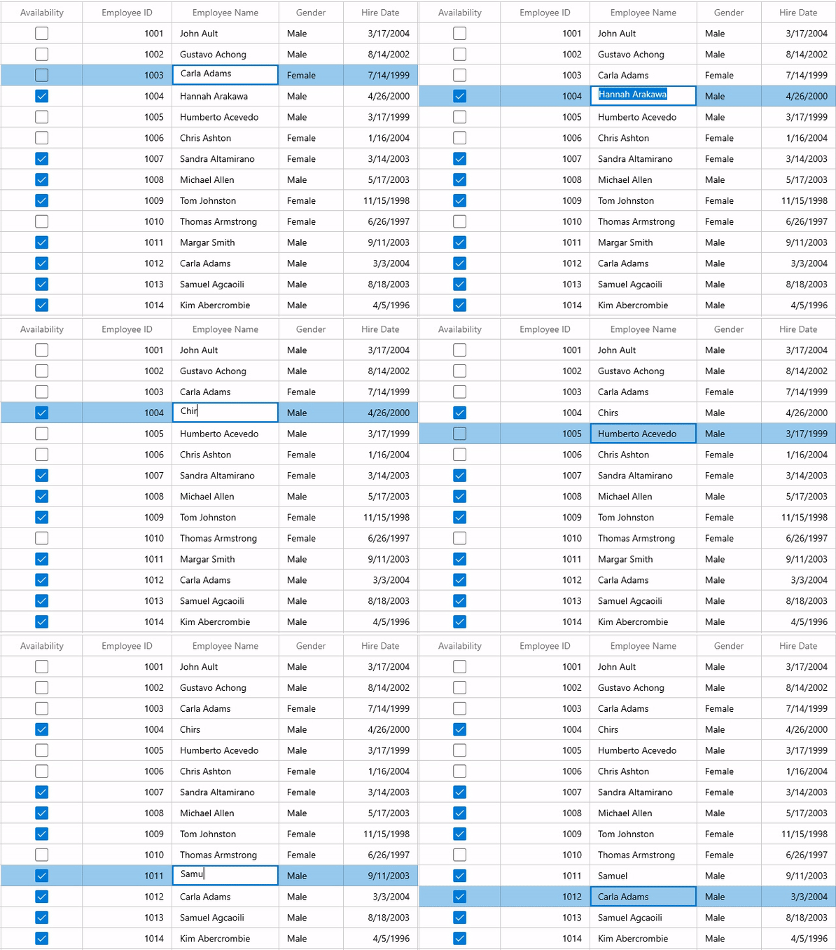
Note: For more information, refer to the GridTextColumn documentation.
Numeric column
The numeric column displays numeric values in its cells. The Syncfusion SfNumberBox control is loaded as the editor to edit the cell values.
The numeric column supports formatting the values using the DisplayNumberFormat or NumberFormatter. You can show the values in currency, decimal, and percentage formats.
Refer to the following code example.
<dataGrid:SfDataGrid
                AllowEditing="True"
                AutoGenerateColumns="False"
                ItemsSource="{Binding Employees}">
    <dataGrid:SfDataGrid.Columns>
        ……
        <dataGrid:GridNumericColumn HeaderText="Employee ID" MappingName="EmployeeID" TextAlignment="Right" />
        ……
    </dataGrid:SfDataGrid.Columns>
</dataGrid:SfDataGrid>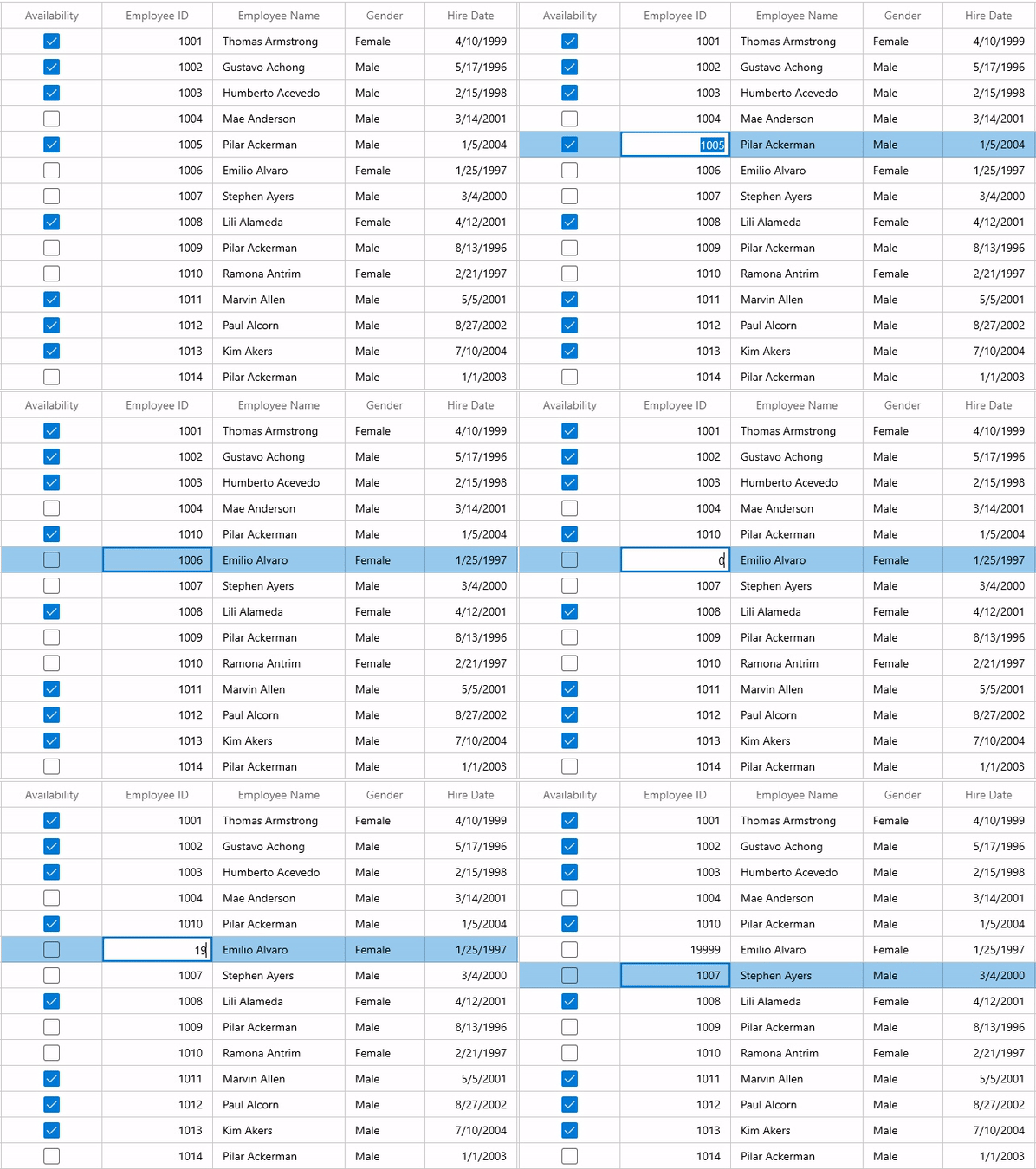
Note: For more information, refer to the GridNumericColumn documentation.
Date column
The date column shows date values in its cells. The Syncfusion SfCalanderDatePicker control is loaded as the editor to edit the cell values.
The date column supports formatting the values using the DisplayDateFormat property. Using this, you can show the values in date, month, and year formats.
Refer to the following code example.
<dataGrid:SfDataGrid
                AllowEditing="True"
                AutoGenerateColumns="False"
                ItemsSource="{Binding Employees}">
    <dataGrid:SfDataGrid.Columns>
        ……

        <dataGrid:GridDateColumn MappingName="HireDate"
                        HeaderText="Hire Date"
                        TextAlignment="Right" />
        ……
    </dataGrid:SfDataGrid.Columns>
</dataGrid:SfDataGrid>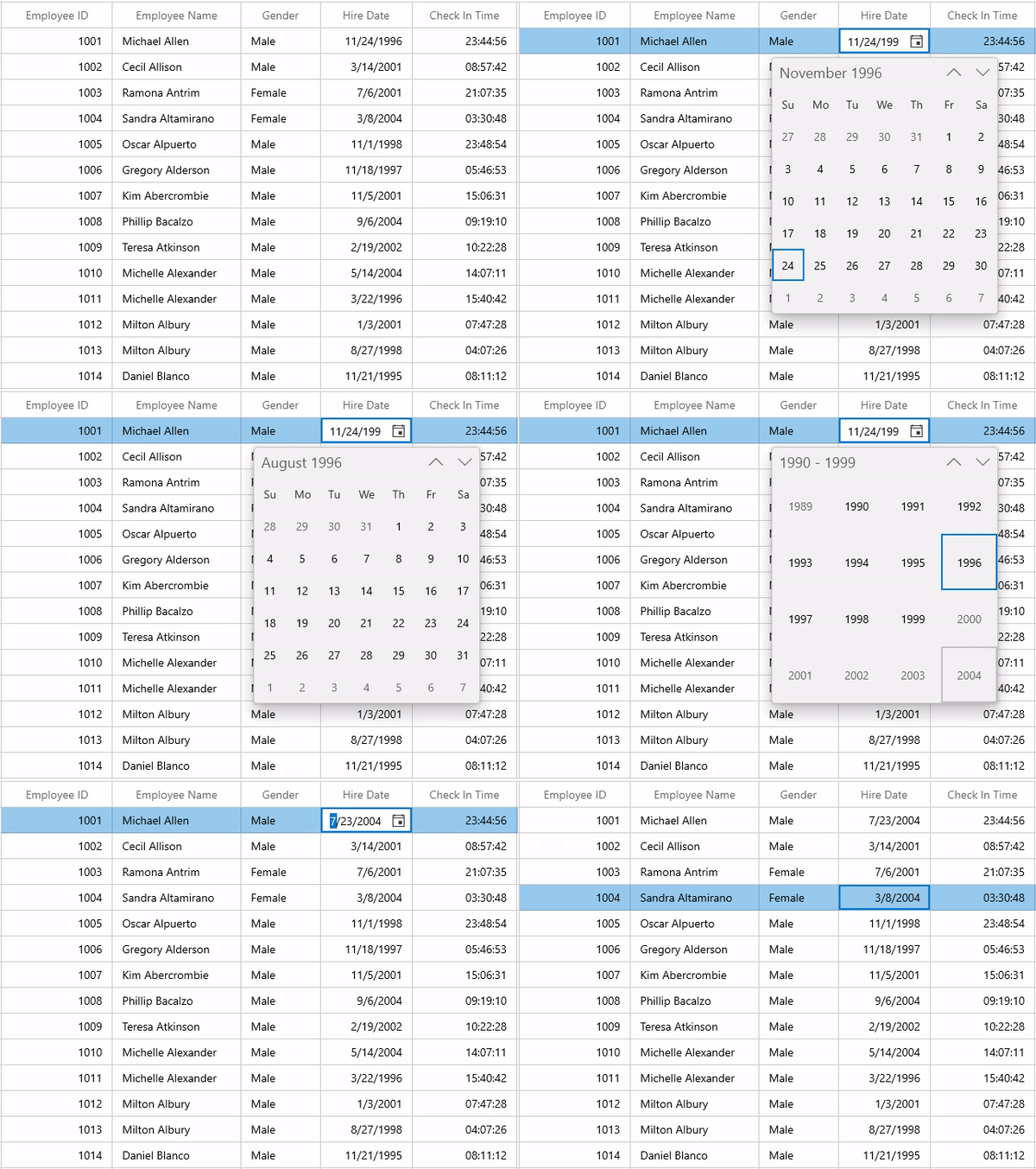
Note: For more details, refer to the GridDateColumn documentation.
Time column
The time column holds a time value in its cells. The Syncfusion SfTimePicker control is loaded as the editor to edit the cell values.
The time column supports formatting the values using the DisplayTimeFormat property. With this, you can show the time in hours, minutes, seconds, meridian, 12-Hour, and 24-Hour formats.
Note: This is not an autogenerated column. You can create the column manually and add it to the DataGrid.
<dataGrid:SfDataGrid
                AllowEditing="True"
                AutoGenerateColumns="False"
                ItemsSource="{Binding Employees}">
    <dataGrid:SfDataGrid.Columns>
        ……
        <dataGrid:GridTimeColumn MappingName="CheckInTime" HeaderText="Check In Time"
                                 AllowNull="True"
                                 DisplayTimeFormat="HH:mm:ss"
                                 EditMode="Mask"
                                 PlaceholderText="Enter a Time"
                                 TextAlignment="Right"/>
        ……
    </dataGrid:SfDataGrid.Columns>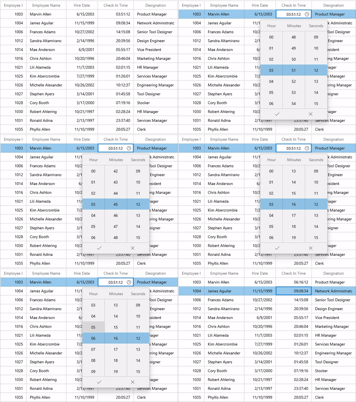
Note: For more details, refer to the GridTimeColumn documentation.
Combo box column
The combo box column holds the IEnumerable type value and displays the selected value in its cells. The framework ComboBox control is loaded as the editor to select and change the values in the cell. You can set the data source of the ComboBox using the GridComboBoxColumn.ItemsSource property. By default, the GridComboBoxColumn displays the value using the MappingName property.
Refer to the following code example.
<dataGrid:SfDataGrid
                AllowEditing="True"
                AutoGenerateColumns="False"
                ItemsSource="{Binding Employees}">
    <dataGrid:SfDataGrid.Columns>
            ……
        <dataGrid:GridComboBoxColumn HeaderText="Designation"
                                     MappingName="Title"
                                     ItemsSource="{Binding TitleCollection, Source={StaticResource employeeViewModel}}" />
             ……
    </dataGrid:SfDataGrid.Columns>
</dataGrid:SfDataGrid>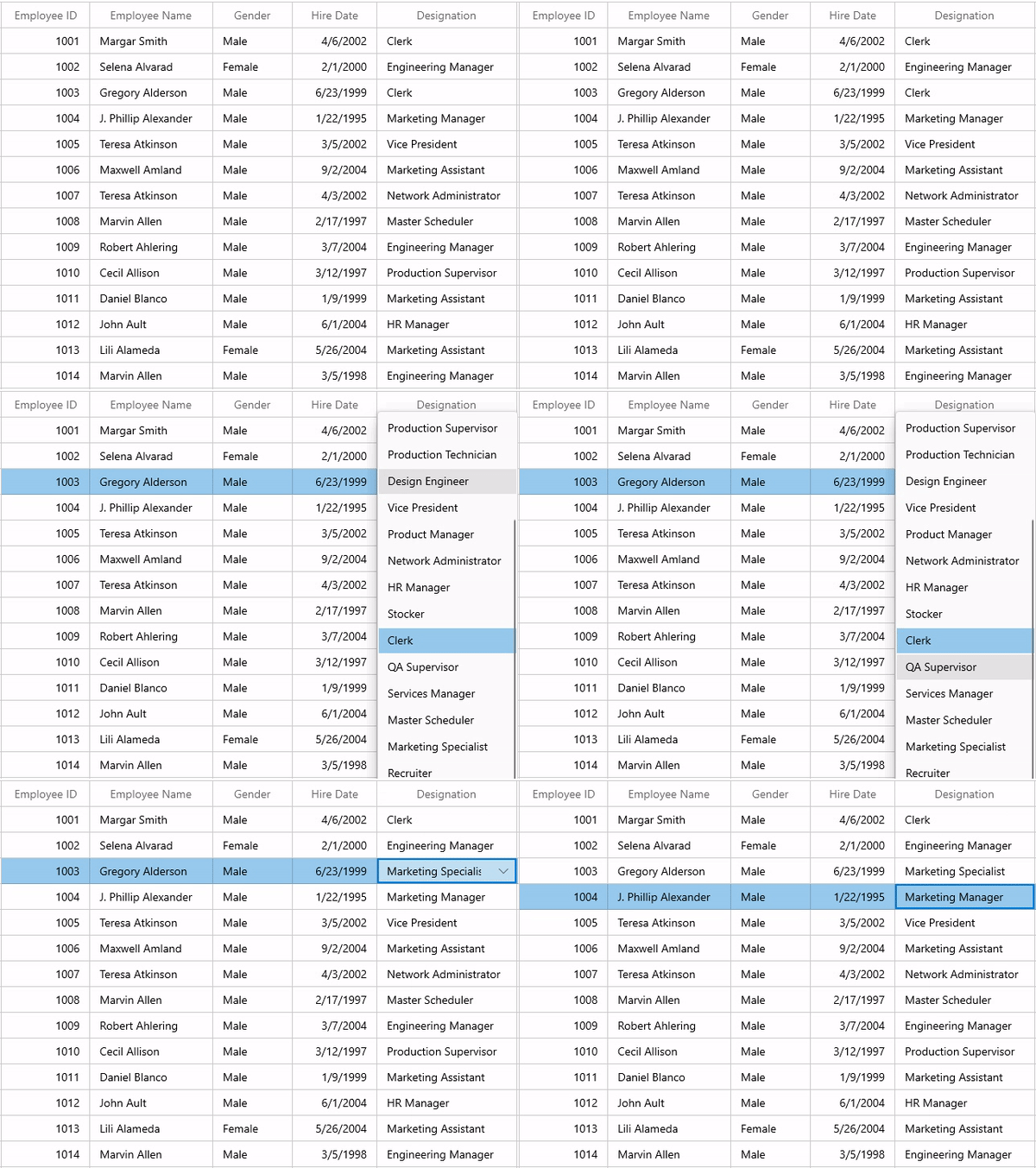
Note: For more details, refer to the GridComboBoxColumn documentation.
Checkbox column
The check box column holds Boolean values in its cells. Here, we will load the framework CheckBox control as the editor to edit the cell values.
By default, the checked and unchecked states represent a true or false value, respectively. If you set the IsThreeState property to true, the checkbox will have an intermediate state. This will work when you set the type of the property to nullable Boolean.
Refer to the following code example.
<dataGrid:SfDataGrid AutoGenerateColumns="False"
                AllowEditing="True"
                ItemsSource="{Binding Employees}">
    <dataGrid:SfDataGrid.Columns>
            ……
        <dataGrid:GridCheckBoxColumn HeaderText="Availability" MappingName="EmployeeStatus"/>
            ……
    </dataGrid:SfDataGrid.Columns>
</dataGrid:SfDataGrid>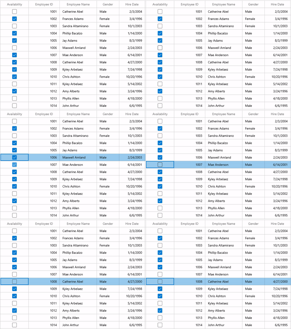
Note: For more details, refer to the GridCheckBoxColumn documentation.
Hyperlink column
The hyperlink column holds the URI data in its cells. Here, we will load the framework HyperlinkButton control as the editor to edit the cell values. You can navigate to the corresponding URI using the CurrentCellRequestNavigate event in the DataGrid.
Refer to the following code example.
<dataGrid:SfDataGrid
                 AllowEditing="True"
                 AutoGenerateColumns="False"
                 ItemsSource="{Binding Employees}">
     <dataGrid:SfDataGrid.Columns>
            ……
         <dataGrid:GridHyperlinkColumn MappingName="City"/>
            ……
     </dataGrid:SfDataGrid.Columns>
 </dataGrid:SfDataGrid>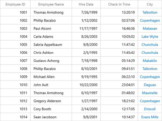
Note: For more details, refer to the GridHyperlinkColumn documentation.
Image column
This image column holds the image in its cells. The framework Image control is loaded to display the grid cell content.
Note: This is not an autogenerated column. You can create the column manually and add it to the DataGrid.
<dataGrid:SfDataGrid x:Name="dataGrid"
               AutoGenerateColumns="False"
               ItemsSource="{Binding Orders}">
    <dataGrid:SfDataGrid.Columns>
            ……
        <dataGrid:GridImageColumn MappingName="ImageLink"
                            HeaderText="Flag"
                            Stretch="Uniform"
                            TextAlignment="Center" />
            ……
    </dataGrid:SfDataGrid.Columns>
</dataGrid:SfDataGrid>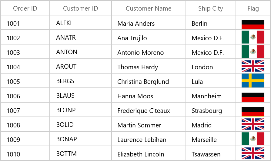
Note: Refer to the GridImageColumn documentation for more details.
Toggle switch column
This toggle switch column holds Boolean value in its cells. We will load the framework ToggleSwitch control to display the cell values. With this, you can display both text and toggle switches.
Note: This is not an autogenerated column. You can create the column manually and add it to the DataGrid.
<dataGrid:SfDataGrid
                AllowEditing="True"
                AutoGenerateColumns="False"
                ItemsSource="{Binding Employees}">
    <dataGrid:SfDataGrid.Columns>
            ……
        <dataGrid:GridToggleSwitchColumn HeaderText="Availability"
                                         MappingName="EmployeeStatus"
                                         AllowEditing="True"/>
            ……
    </dataGrid:SfDataGrid.Columns>
</dataGrid:SfDataGrid>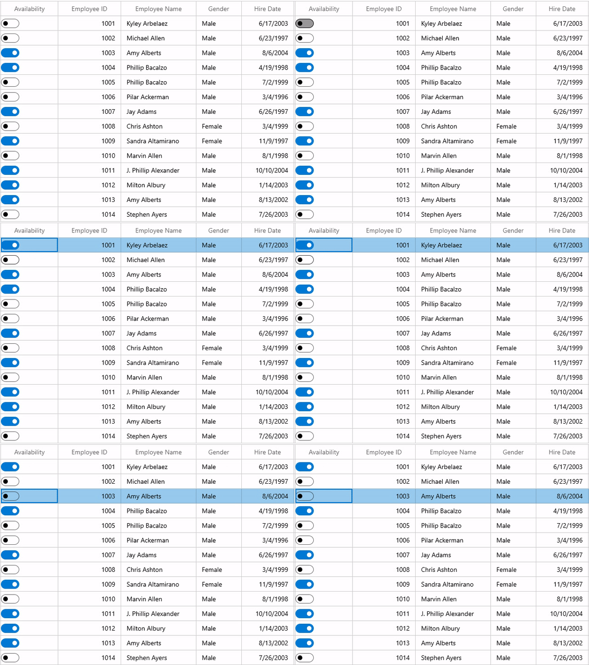
Note: Refer to the GridToggleSwitchColumn documentation for more information.
Template column
This column displays template-specified cell content. You can load any kind of WinUI control in the display and edit modes for all columns by setting the CellTemplate and EditTemplate properties, respectively.
By default, the underlying record is DataContext for CellTemplate. So, you have to define the template for each column to display values based on the MappingName property.
Refer to the following code example.
<dataGrid:SfDataGrid AutoGenerateColumns="False"
                       AllowEditing="True"
                       ItemsSource="{Binding Orders}">
    <dataGrid:SfDataGrid.Columns>
            ……
        <dataGrid:GridTemplateColumn MappingName="Name" HeaderText="Employee Name" >
            <dataGrid:GridTemplateColumn.CellTemplate>
                <DataTemplate>
                    <TextBlock Text="{Binding Name}" />
                </DataTemplate>
            </dataGrid:GridTemplateColumn.CellTemplate>
            <dataGrid:GridTemplateColumn.EditTemplate>
                <DataTemplate>
                    <TextBox Text="{Binding CustomerName, Mode=TwoWay}" FontStyle="Italic" FontWeight="Bold" />
                </DataTemplate>
            </dataGrid:GridTemplateColumn.EditTemplate>
        </dataGrid:GridTemplateColumn>
            ……
    </dataGrid:SfDataGrid>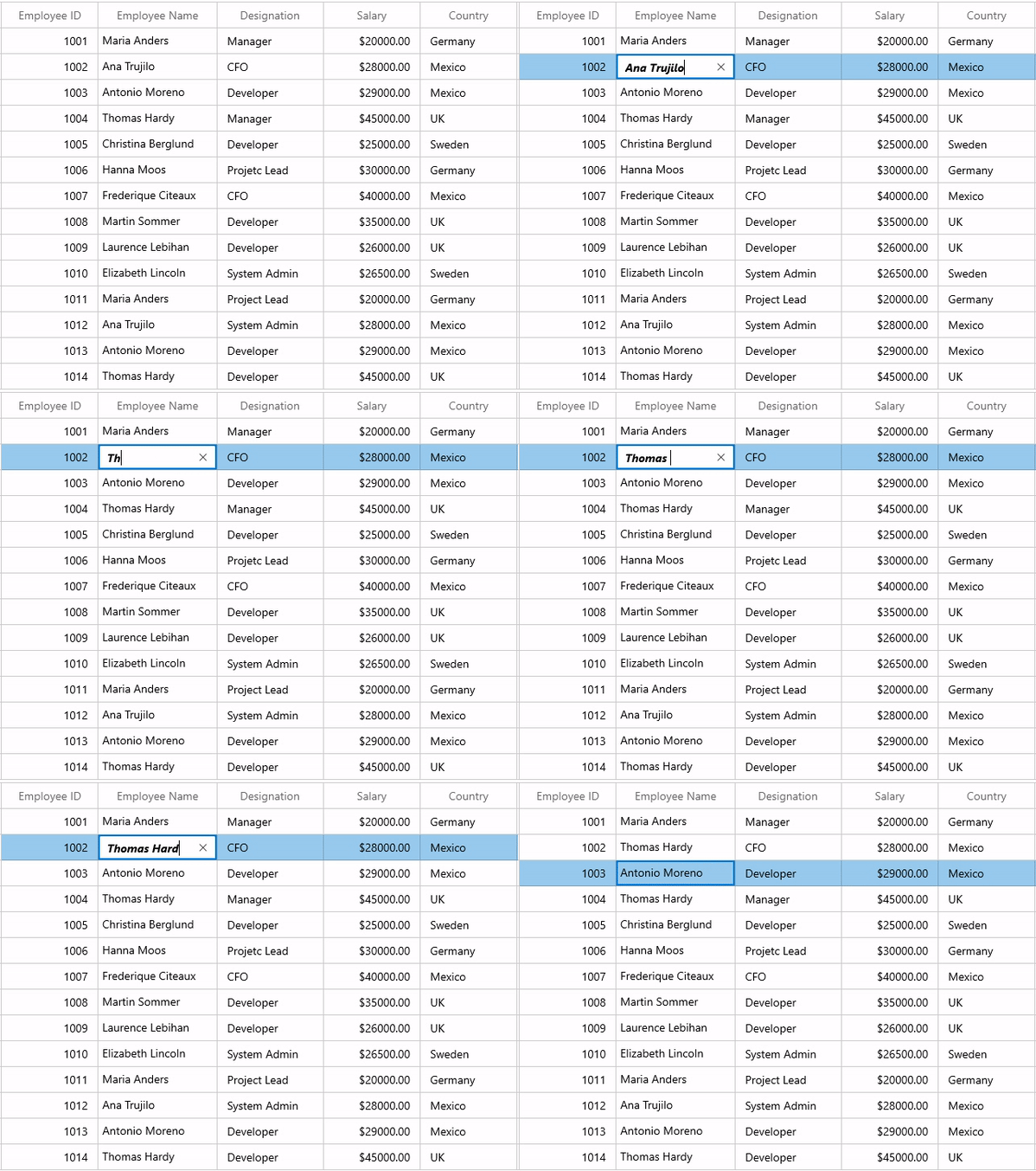
Note: Refer to the GridTemplateColumn documentation for more information.
Unbound column
The WinUI DataGrid also allows you to add additional columns that are not bound with the data object from the underlying data source. You can add an unbound column using the GridUnboundColumn class. The data for an unbound column is populated by setting the Expression or Format property or through the QueryUnboundColumnValue event.
Refer to the following code.
<dataGrid:SfDataGrid
                AllowEditing="True"
                AutoGenerateColumns="False"
                ItemsSource="{Binding Employees}">
    <dataGrid:SfDataGrid.Columns>
            ……
        <dataGrid:GridUnboundColumn MappingName="CurrentSalary"
                                    Expression="Salary*Rating/100"
                                    HeaderText="Hike Salary"
                                    TextAlignment="Right" />
            ……
    </dataGrid:SfDataGrid.Columns>
</dataGrid:SfDataGrid>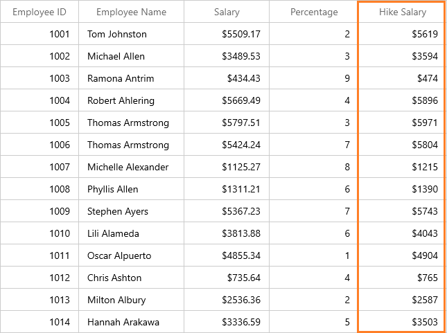
Note: Refer to the Unbound Column in the WinUI DataGrid for more information.
Conclusion
Thanks for reading! I hope you now have enough information about the various column types in the WinUI DataGrid. Try out these column types and leave your feedback in the comments section below!
Browse our WinUI documentation for complete details about our WinUI controls. Also, don’t miss our demo app in the Microsoft Store.
For current customers, the new version is available for download from the License and Downloads page. If you are not yet a Syncfusion customer, you can try our 30-day free trial to check out our newest features.
Also, you can contact us through our support forums, Direct-Trac, or feedback portal. We are always happy to assist you!
Related blogs
- Everything You Need to Know About WinUI 3 Linear Gauge
- New WinUI Segmented Control Is Here!
- Introducing the New WinUI 3 ComboBox
- Everything You Need to Know About the WinUI 3 Range Slider

