We at Syncfusion introduced our Flutter DataGrid in the 2020 Volume 2 release with a limited set of features. Now, we have added some more features to let you use the DataGrid widget with more customization options. The 2020 Volume 3 release brings the following features for the Flutter DataGrid:
Paging
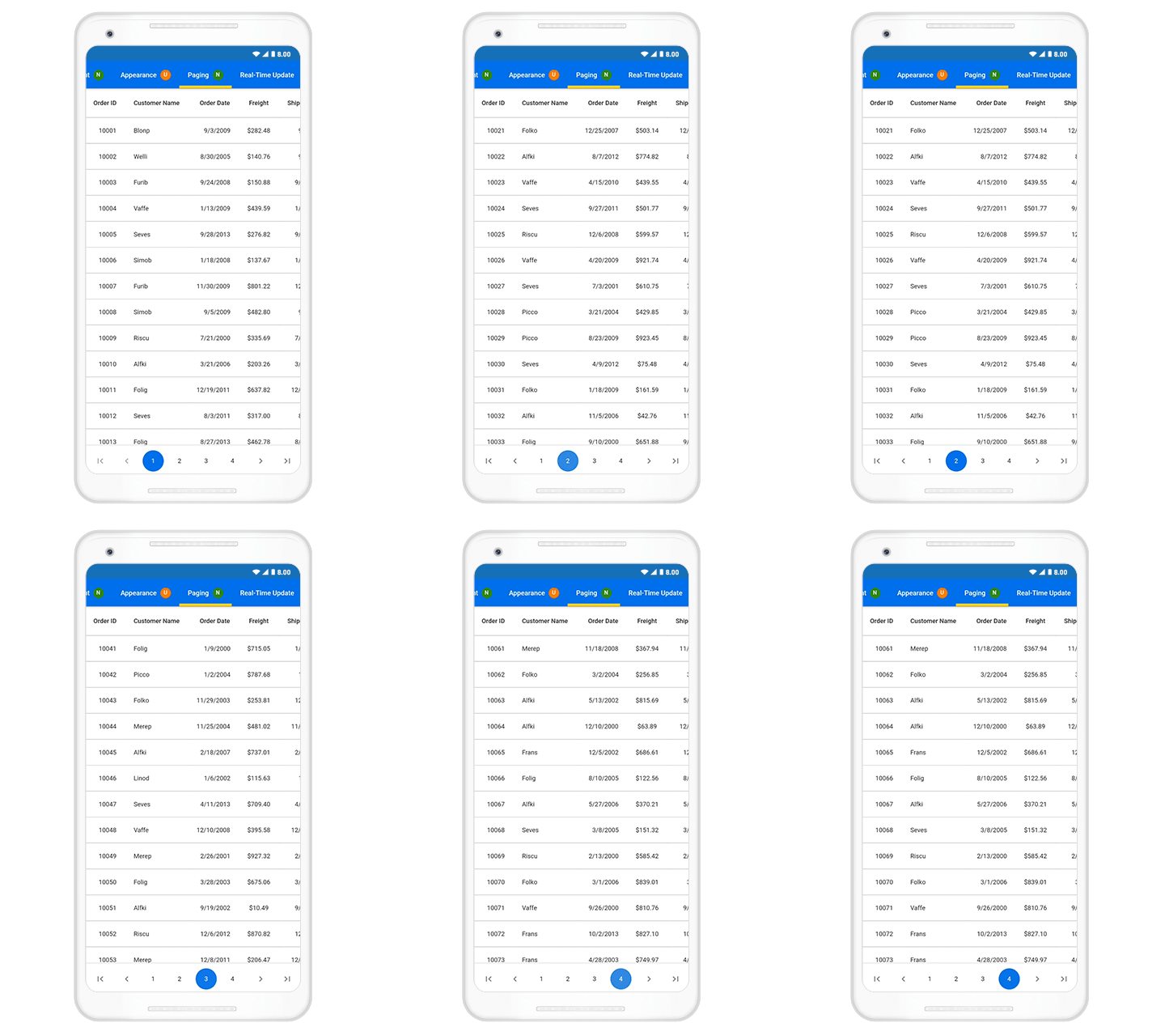
Paging is an essential feature to load a large amount of data in multiple pages. Our DataGrid already supported loading large amounts of data. But paging is useful when loading the data on demand based on the data availability. For that, we have introduced the DataPager widget. You can place this widget wherever you want to load data in pages. You can go through this UG documentation for getting started with the DataPager with DataGrid.
Refer to the following code example.
List<OrderInfo> paginatedDataSource = [];

final OrderInfoDataSource _orderInfoDataSource = OrderInfoDataSource();

@override
Widget build(BuildContext context) {
  return Scaffold(
    body: LayoutBuilder(
      builder: (context, constraint) {
        return Column(
          children: [
            SizedBox(
              height: constraint.maxHeight - 60,
              width: constraint.maxWidth,
              child: SfDataGrid(
                  source: _orderInfoDataSource,
                  columnWidthMode: ColumnWidthMode.fill,
                  columns: <GridColumn>[
                    GridNumericColumn(
                        mappingName: 'orderID', headerText: 'Order ID'),
                    GridTextColumn(
                        mappingName: 'customerID',
                        headerText: 'Customer Name'),
                    GridTextColumn(
                        mappingName: name, headerText: 'Name'),
                    GridNumericColumn(
                        mappingName: 'freight', headerText: 'Freight'),
                  ]),
            ),
            Container(
              height: 60,
              child: SfDataPager(
                delegate: _orderInfoDataSource,
                rowsPerPage: 20,
                direction: Axis.horizontal,
              ),
            )
          ],
        );
      },
    ),
  );
}

class OrderInfoDataSource extends DataGridSource<OrderInfo> {
  @override
  List<OrderInfo> get dataSource => paginatedDataSource;

  @override
  Object getValue(OrderInfo orderInfos, String columnName) {
    switch (columnName) {
      case 'orderID':
        return orderInfos.orderID;
        break;
      case 'customerID':
        return orderInfos.customerID;
        break;
      case 'freight':
        return orderInfos.freight;
        break;
      case `name`:
        return orderInfos.name;
        break;
      default:
        return '';
        break;
    }
  }

  @override
  int get rowCount => orderInfos.length;

  @override
  Future<bool> handlePageChange(int oldPageIndex, int newPageIndex,
      int startRowIndex, int rowsPerPage) async {
    int endIndex = startRowIndex + rowsPerPage;
    if (endIndex > orderInfos.length) {
      endIndex = orderInfos.length - 1;
    }

    paginatedDataSource = List.from(
        orderInfos.getRange(startRowIndex, endIndex).toList(growable: false));
    notifyDataSourceListeners();
    return true;
  }
}
Sorting
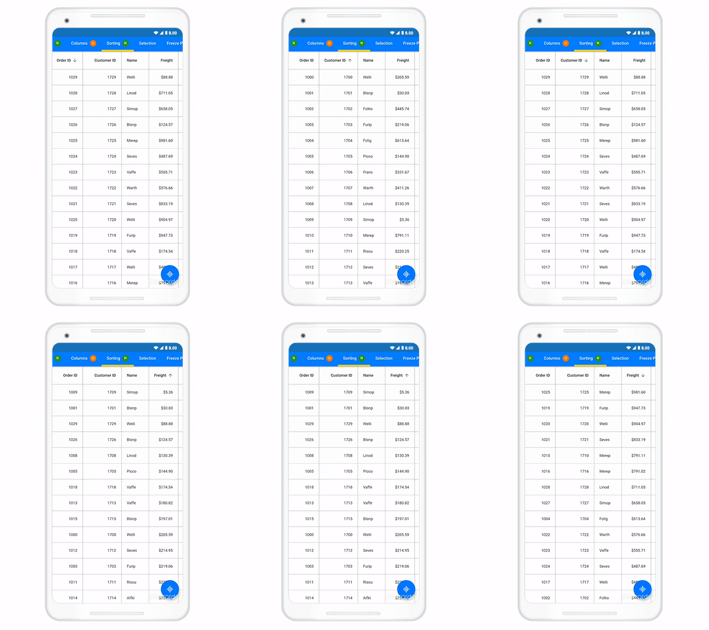
DataGrid provides built-in support to sort one or more columns in ascending or descending order. It also provides support to tri-state sorting, which helps you to unsort the data to get its original order. You can also show numbers along with the sort icon to indicate the sorted orders. You can go through this UG documentation for getting started with sorting.
Refer to the following code example.
@override
Widget build(BuildContext context) {
  return Scaffold(
      body: SfDataGrid(
    source: _employeeDataSource,
    allowSorting: true,
    allowMultiColumnSorting: true,
    columns: <GridColumn>[
                    GridNumericColumn(
                        mappingName: 'orderID', headerText: 'Order ID'),
                    GridTextColumn(
                        mappingName: 'customerID',
                        headerText: 'Customer Name'),
                    GridTextColumn(
                        mappingName: name, headerText: 'Name'),
                    GridNumericColumn(
                        mappingName: 'freight', headerText: 'Freight'),

    ],
  ));
}
Freeze panes
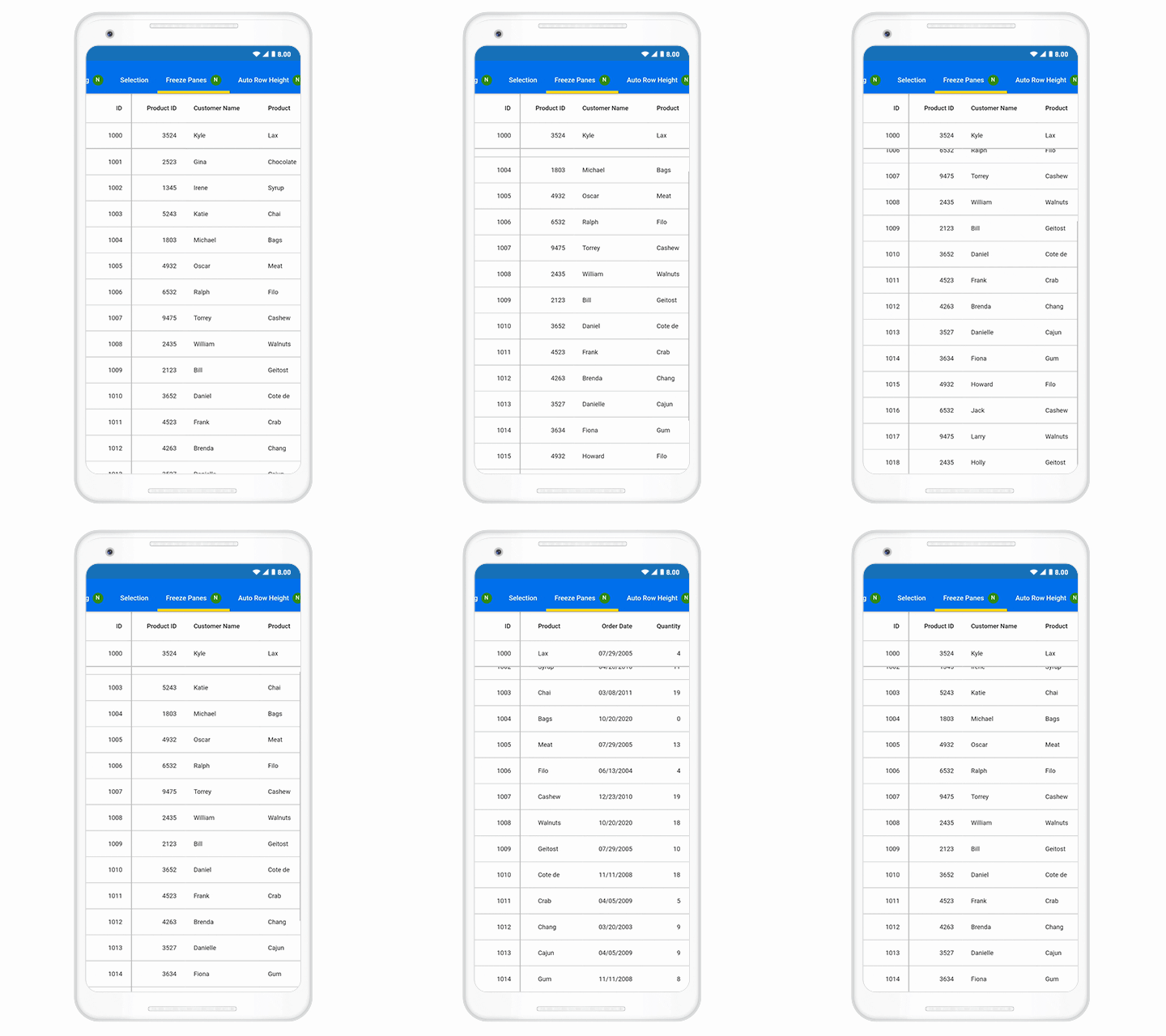
You can freeze rows and columns at the top, bottom, left, and right positions, similar to in an Excel worksheet. Horizontal and vertical scrolling can be performed, except on the fixed columns and rows. You can go through this UG documentation for getting started with freeze panes.
Refer to the following code example.
@override
Widget build(BuildContext context) {
    return Scaffold(
        body: SfDataGrid(
    columns: <GridColumn>[
                    GridNumericColumn(
                        mappingName: 'orderID', headerText: 'Order ID'),
                    GridTextColumn(
                        mappingName: 'customerID',
                        headerText: 'Customer Name'),
                    GridTextColumn(
                        mappingName: name, headerText: 'Name'),
                    GridNumericColumn(
                        mappingName: 'freight', headerText: 'Freight'),
    ],
        frozenColumnsCount: 1,
        frozenRowsCount: 1,
        ),
    );
}
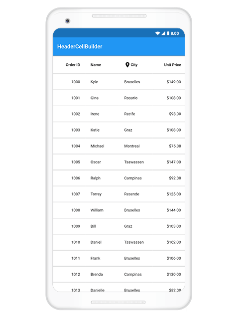
Header cell customization
These are the custom enhancements for header cells:
- Load any widget—Load any widget in a header cell to represent the column header. For example, users can load an image with header text.
- Text wrapping—Wrap the text when it exceeds the content area.
- Alignment—Set the alignment positions for the text in a header cell.
Conclusion
I hope you have a clear idea of the new features and custom enhancements available for the Syncfusion Flutter DataGrid widget in the 2020 Volume 3 release. You can check out the list of all the features in our release notes and on the What’s New page.
Browse our documentation to learn more about our Flutter widgets. You can also see Syncfusion’s Flutter app with many examples in this GitHub repo. Don’t miss our demo app in Google Play and the App Store.
If you aren’t a customer yet, you can try our 30-day free trial to check out these features.
Also, if you wish to send us feedback or would like to submit any questions, please feel free to post them in the comments section of this blog post. You can also contact us through our support forum, feedback portal, or Direct-Trac support system. We are always happy to assist you!

