TL;DR: Let’s see how to simulate and visualize real-time stock prices using the Syncfusion React Candle Chart. This tutorial covers generating market data, updating it in real-time, and displaying it through an interactive chart. You’ll also learn to customize axes, tooltips, and colors for better insights. By the end, you’ll have a fully functional chart that dynamically updates throughout a trading day!
Welcome to our latest post in the Weekly Data Visualization blog series!
In the realm of financial technology, the ability to simulate and visualize real-time stock prices is essential for developing interactive, dynamic applications. In this tutorial, we’ll guide you through the process of creating a real-time stock price simulation using Syncfusion React Candle Chart. You’ll learn how to generate random market data, update it in real time, and display it through an interactive chart.
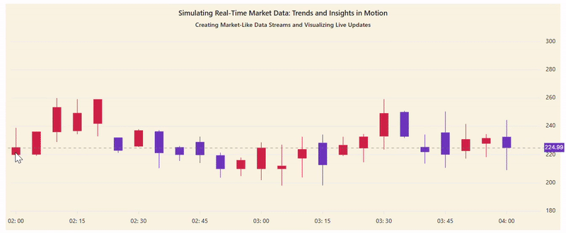
We aim to simulate real-time data updates for a seamless experience throughout a single trading day. Refer to the following image.
Let’s get started!
Step 1: Populating the data
The data for the React Candle Chart is randomly generated using JavaScript functions to simulate real-time updates. Each data point in the Chart typically consists of the following:
- Open: The opening price of the asset for a given period.
- High: The highest price during the period.
- Low: The lowest price during the period.
- Close: The closing price at the end of the period.
- Timestamp (x): The time corresponding to the data point.
Refer to the following code example to dynamically generate data for the React Candle Chart.
let getData = () => {
  let series = [];
  let point;
  for (let i = 0; i < 30; i++) {
    value = 200 + Math.random() * 25 * Math.sin((i * Math.PI) / 8); // Adjust the function as needed
    value = Math.max(140, Math.min(260, value));
    if (value > 280) {
      value = 280;
    }
    if (value < 210) {
      value = 210;
    }
    let open = value + Math.random() * 18;
    let low = Math.min(value, open) - Math.random() * 6;
    let high = Math.min(
      260,
      Math.max(value, open) + Math.round(Math.random() * 15)
    );
    point = {
      x: new Date(2024, 5, 2, 2, i * 5),
      close: value,
      open: open,
      low: low,
      high: high,
    };
    series.push(point);
  }
  return { series: series };
};
let data = getData().series;
In order to properly visualize the financial data using the React Candle Chart, the generated data must be bound to the appropriate properties within the SeriesDirective. Specifically, the data needs to be mapped to the xName, open, close, high, and low properties, ensuring that the chart accurately displays the candlestick values.
Step 2: Configuring the React Candle Chart to display stock data
By using the React Candle Chart, we can effectively visualize the stock price data. This chart component allows you to display key financial metrics, including Open, High, Low, and Close prices (OHLC), in a clear and easy-to-interpret format. This enables you to gain valuable insights into market trends, whether you’re tracking stock prices, cryptocurrency movements, or other time-series data. The Candle Chart is particularly useful for detecting trends and making informed decisions based on market behavior.
To properly render the Candle Chart, ensure that the CandleSeries module is injected into the chart’s services.
Refer to the following code example.
<ChartComponent>
  <Inject
     services={[
        CandleSeries,
        Tooltip,
        DateTime,
        Crosshair,
        ChartAnnotation,
     ]}
   />
   <SeriesCollectionDirective>
     <SeriesDirective
        type="Candle"
        dataSource={data}
        xName="x"
        low="low"
        high="high"
        open="open"
        close="close"
      />
   </SeriesCollectionDirective>
</ChartComponent>
Step 3: Customizing the React Candle Chart
Let’s customize the React Candle Chart’s elements to enhance its appearance and readability.
Adding title and subtitle to the chart
Let’s use the title and subtitle properties to add a title and description to the chart, respectively.
<ChartComponent
     id="stock"
     title="Real-Time USD/INR Exchange Rate Trends"
     subTitle="Visualizing Live Currency Fluctuations for Informed Financial Decisions"
</ChartComponent>
Customizing the chart axes
Let’s render the primaryYAxis in the opposite direction using the opposedPosition property. Then, remove the gridlines from the primaryXAxis by setting the width property to 0 in the majorGridLines.
primaryXAxis={{
     valueType: 'DateTime',
     majorGridLines: { width: 0 },
}}
primaryYAxis={{
     opposedPosition: true,
}}
Adding the crosshair in axes
Follow these steps to add and customize the crosshair feature in the React Candle Chart:
- Enable the crosshair: Use the enable property in the crosshair configuration to enable the crosshair feature.
- Customize the crosshair line: Use the dashArray property to customize the crosshair lines to replicate a dashed style.
- Add crosshair tooltip: Enable the crosshairTooltip in the primaryXAxis and/or primaryYAxis to show the tooltip when hovering over the crosshair.
- Inject the crosshair module: Make sure to inject the Crosshair module into the chart’s services.
Refer to the following code example.
primaryXAxis={{
    crosshairTooltip: { enable: true },
}}

primaryYAxis={{
    crosshairTooltip: { enable: true },
}}

crosshair={{ enable: true, dashArray: '5,5' }}
Customizing the fill color for the Candle series
To customize the fill color of the Candle series, we’ll use the bearFillColor and bullFillColor properties in the SeriesDirective.
- bearFillColor: This property sets the fill color for the bearish candles (when the closing price is lower than the opening price).
- bullFillColor: This property sets the fill color for the bullish candles (when the closing price is higher than the opening price).
Refer to the following code example.
<SeriesDirective
     type="Candle"
     bearFillColor="#2ecd71"
     bullFillColor="#e74c3d"
     dataSource={data}
     xName="x"
     low="low"
     high="high"
     open="open"
     close="close"
/>
Adding and customizing the tooltip
Let’s display the tooltip in the React Candle Chart by following these steps:
- Inject the tooltip module: Ensure that the Tooltip module is injected into the chart’s services.
- Enable tooltip: Set the enable property to true within the tooltip configuration to activate the tooltip functionality.
- Shared tooltip: Enable the shared property in the tooltip configuration to show data when hovering near a point.
- Fix the tooltip position: If you need a fixed position for the tooltip, set the x and y properties in the location property of the tooltip.
- Customize the tooltip: You can also use the Format property in the tooltip to show the details of the hovered data points as per your requirements.
Refer to the following code example.
tooltip={{
     enable: true,
     shared: true,
     format: "High: ${point.high}<br>Low: ${point.low}<br>Open: ${point.open}<br>Close: ${point.close}",
     location: { x: 50, y: 80 },
}}
Customizing the chart to update in real-time
To update the React Candle Chart with live data, begin by rendering the chart with initial data. Use JavaScript functions to dynamically generate new data (such as open, close, high, and low values). You can add the new data using the addPoint method or update the existing point using the setData method inside the chart’s load event. This approach allows continuous updates, simulating live market data and providing real-time insights.
Refer to the following code example.
const load = (args: ILoadEventArgs): void => {
   if (incVal < 10) {
      if (args.chart.series.length > 0) {
         args.chart.series[0].setData(newData);
         incVal++;
      }
   }
   if (lastDataPointIndex >= 0) {
      args.chart.series[0].addPoint({
          x: new Date(lastTimestamp + 300000),
          high: high,
          low: low,
          open: open,
          close: value,
      });
   }
};

<ChartComponent
      id="stock"
      load={load.bind(this)}
></ChartComponent>
In this example, we begin by rendering the React Candle Chart and then simulate real-time data updates by generating random values for the open, close, low, and high prices. These values are updated every five minutes to reflect the data for a full trading day. This process allows for an interactive and continuously updated chart, providing a realistic simulation of market data throughout the day.
After executing the above code examples, the output will appear as shown in the following image.
GitHub reference
For more details, refer to the visualization and simulation of the real-time stock price using the React Candle Chart demo on StackBlitz.

Conclusion
Thanks for reading! In this blog, we’ve seen how to simulate and visualize real-time market data using the Syncfusion React Candle Chart. We encourage you to apply the steps discussed here and share your thoughts or questions in the comments below. Happy coding, and we hope you enjoy building dynamic financial apps!
If you require assistance, please don’t hesitate to contact us via our support forum, support portal, or feedback portal. We are always eager to help you!


 No spam, just valuable updates.