TL;DR: Let’s see how to highlight key data points using annotations in Angular Charts. We’ll use text annotations to label peak and low rainfall periods and images for better visualization. These elements enhance readability and improve data interpretation. Follow the code examples to integrate annotations seamlessly!
Annotations are additional elements added to a chart to provide detailed information, highlight specific data points, or draw attention to areas of interest. They can be text, images, shapes, or even HTML elements that are positioned at specific coordinates within the chart. Annotations enhance the readability and interpretability of charts by providing context, emphasizing key insights, and making data more accessible to the viewer. They can be customized based on user requirements.
In this blog, we’ll demonstrate how to highlight key data points using annotations in Syncfusion Angular Charts. Here, we’ll show you how to add text and images as annotations.
Note: Before proceeding, refer to the getting started with Angular Charts documentation.
Adding text annotations in Angular Charts
By using annotations, you can enhance the readability and interpretability of your charts, making it easier for viewers to understand and analyze the data.
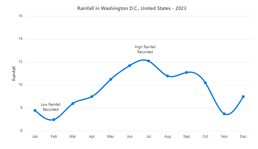
Refer to the following code example. Here, we’ll use the Angular Charts to display the rainfall pattern in Washington D.C., United States – 2023. To easily identify the periods of low and peak rainfall, we’ll add text annotations to highlight these key data points. This makes it simple to understand when the rainfall was at its lowest and highest.
<e-annotations>
  <e-annotation content="<div>High Rainfall <br> Recorded</div>" coordinateUnits="Point" x="Jul" y="13"></e-annotation>
  <e-annotation content="<div>Low Rainfall <br> Recorded</div>" coordinateUnits="Point" x="Feb" y="8"></e-annotation>
</e-annotations>
Refer to the following image.
Adding image annotations in Angular Charts
Adding images or icons as annotations allows us to add graphical elements that represent specific data points or insights. This method can make your chart more engaging and help emphasize important information more effectively.
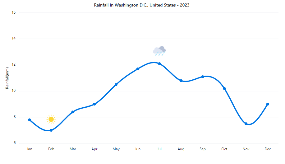
Refer to the following code example. Here, we’ve used two different images to represent the least and peak rainfall points.
<e-annotations>
   <e-annotation content="<div id="chart_cloud"><img src="./cloud.png" alt="Cloud Picture" style="width: 41px; height: 41px"/></div>"  coordinateUnits="Point" x="Jul" y="12.5"></e-annotation>
   <e-annotation content="<div id="chart_sun"><img src="./sun.png" alt="Sun Picture" style="width: 41px; height: 41px"/></div>" coordinateUnits="Point" x="Feb" y="7.25"></e-annotation>
</e-annotations>
Refer to the following image.
References
For more details, refer to the adding annotations in the Angular Charts demo on StackBlitz and documentation.

Conclusion
Thanks for reading! In this blog, we’ve seen how to highlight a data point by adding annotations in the Syncfusion Angular Charts for better data visualization. We encourage you to try these annotation options and leave your feedback in the comments below.
To try our Charts, please download our free trial. You can also check out our online demos for a more in-depth look at what you can do with the Charts component.
For questions, you can contact us through our support forums, support portal, or feedback portal. We are always happy to assist you!