TL;DR: Let’s create a bullet graph using the Syncfusion Flutter Charts widget to track performance metrics efficiently. Bullet graphs are ideal for visualizing achievements and comparing targets, particularly in financial and product performance dashboards. Follow these steps to implement, customize, and style your graph for an insightful display.
Data visualization is key to understanding performance metrics, especially when comparing actual results against targets. One of the most effective tools for this is the Bullet Graph. Whether analyzing financial data or monitoring product performance, bullet graphs provide a clear, concise way to visualize progress toward your goals.
In this blog, we’ll show you how to create a Bullet Graph using Syncfusion Flutter Charts, a powerful developer tool. With just a few steps, you can present performance data in a sleek and efficient format that can easily be integrated into dashboards and reports.
Let’s explore how to bring your data to life with a Bullet Graph!
What is a Bullet Graph?
A bullet graph is a compact visualization tool to display performance metrics against a goal or threshold. Often used in dashboards or reports, it’s a more streamlined alternative to traditional gauges or thermometers. The bullet graph offers a clear, concise way to see if performance falls short, meets, or exceeds expectations.
In this example, we’ll use a bullet graph to compare the performance of various products against their respective targets, visualizing different levels of achievement.
Key components of a Bullet Graph
A bullet graph comprises three primary components that offer a clear and concise performance data visualization.
- Performance bar (Actual value): This horizontal or vertical bar displays how much of something has been achieved or performed. It shows whether the performance is on track, ahead, or behind the goal.
- Target marker (Goal indicator): This line shows the target or goal value. It can be customized with shapes or images, like circles or icons.
- Performance ranges (Achievement levels): These are shaded areas behind the performance bar, divided into sections like poor, satisfactory, and excellent.
Implementing the Bullet Graph with Syncfusion Flutter Charts
This section will guide you through creating a bullet graph chart using the Syncfusion Flutter Charts package. We’ll explain each part of the code to show its role in building the chart.
Step 1: Adding dependencies
To get started, add the Syncfusion_flutter_charts package to your pubspec.yaml file with the latest version.
dependencies:
  syncfusion_flutter_charts: *.*.* // Replace with the latest version
Step 2: Populating the data source
Next, let’s populate the data. Here’s a code example of the StockData class that stores product performance data.
class _BulletChartState extends State<BulletChart> {
  late List<_StockData> data;

  @override
  void initState() {
    data = [
      _StockData('Product A', 135, 140, 100, 120, 150),
      _StockData('Product B', 190, 220, 150, 180, 210),
      _StockData('Product C', 175, 180, 130, 160, 190),
      _StockData('Product D', 195, 200, 130, 170, 210),
      _StockData('Product E', 125, 120, 50, 70, 100),
      _StockData('Product F', 205, 180, 140, 170, 210),
      _StockData('Product G', 132, 140, 100, 120, 150),
      _StockData('Product H', 88, 80, 50, 70, 100),
      _StockData('Product I', 215, 220, 150, 190, 220),
      _StockData('Product J', 185, 200, 140, 170, 210),
      _StockData('Product K', 208, 200, 150, 190, 220),
      _StockData('Product L', 128, 140, 100, 120, 150),
    ];
    super.initState();
  }
}
Step 3: Configure axes and disable gridline appearance
To enhance the bullet graph’s clarity, we’ll configure the primaryXAxis and primaryYAxis in Syncfusion Flutter Charts to display categories on the x-axis and numeric values on the y-axis.
Here’s how to do it:
- Disable gridlines: To make the x-axis cleaner, you can remove the gridlines by setting the width of the majorGridLines to 0.
- Customize axis labels: The y-axis labels can be customized using the axisLabelFormatter callback. For example, you can add a dollar sign ($) and ‘K’ to represent thousands, which is helpful for financial data. This customization uses the ChartAxisLabel class, allowing you to format and style the labels as needed.
Refer to the following code example.
SfCartesianChart(
  primaryXAxis: CategoryAxis(
    majorGridLines: MajorGridLines(width: 0),
  ),
  primaryYAxis: NumericAxis(
    axisLabelFormatter: (AxisLabelRenderDetails args) {
      return ChartAxisLabel('\$' + args.text + 'K', args.textStyle);
    },
  ),
),
Step 4: Setting up a Column series
Next, a ColumnSeries will be defined to visualize the StockData in the Flutter Cartesian Chart. This series will map each product’s name to the x-axis and its corresponding value to the y-axis, fetching data from the StockData source.
You can also customize the series’ appearance by adjusting the color using the color property in the ColumnSeries.
Refer to the following code example.
SfCartesianChart(
  …
  series: <CartesianSeries<_StockData, String>>[
    ColumnSeries(
      dataSource: data,
      xValueMapper: (_StockData data, int index) => data.product,
      yValueMapper: (_StockData data, int index) => data.current,
      color: Colors.blue.withOpacity(0.8),
      animationDuration: 0,
    ),
  ],
),
Step 5: Create and configure a custom Column series renderer
Then, create a custom renderer class by extending an existing series renderer. Configure the series to use this custom renderer through the onCreateRenderer property. The following are the major key factors of the renderer.
- createSegment: Creates segments for series based on data points.
- customizeSegment: Customizes the appearance of each segment based on its index or specific case.
- onPaint: Paints the series according to customizations, including the previously customized segments.
ColumnSeries(
    …
    onCreateRenderer: (ChartSeries<_StockData, String> series) {
        return _ColumnSeriesRenderer();
    },
),
Visualizing performance data using Flutter Bullet Graph
In this context, we will use the Flutter Bullet Graph to visualize the performance of various products, comparing their actual performance to targets and illustrating different levels of achievement. This will help us create a clear and informative visual representation of each product’s performance against its goals.
Step 1: Calculate performance ranges
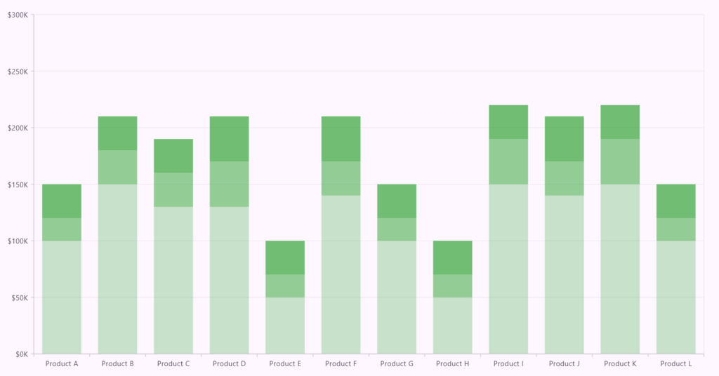
The first step in visualizing performance is calculating the different performance ranges: poor, satisfactory, and excellent. These are represented by rectangles on the graph. To achieve this, we will override the transformValues method in the _ColumnSegment class. This method defines the values for _lowRect, _midRect, and _highRect, which correspond to the different performance levels.
The necessary data is pulled from the dataSource field and is accessible through the segment series. Specifically, you will use the low, mid, and high values from _StockData to evaluate the product’s performance against its goal.
- Poor range: Calculate the “poor” range from the bottom using the low
- Satisfactory range: Next, calculate the “satisfactory” range, beginning where the “poor” range ends.
- Excellent range: Finally, calculate the “excellent” range, starting at the top of the “satisfactory” range.
Using these three ranges, you can visually distinguish how the product’s performance compares to its goal, making the graph intuitive and easy to understand.
Refer to the following code example.
class _ColumnSegment extends ColumnSegment<_StockData, String> {
  RRect? _highRect;
  RRect? _midRect;
  RRect? _lowRect;

  @override
  void transformValues() {
    if (series.dataSource == null || series.dataSource!.isEmpty) {
      return;
    }

    _reset();
    final Function(num x, num y) transformX = series.pointToPixelX;
    final Function(num x, num y) transformY = series.pointToPixelY;
    final _StockData data = series.dataSource![currentSegmentIndex];
    final num left = x + series.sbsInfo.minimum;
    final num right = x + series.sbsInfo.maximum;
    final num high = data.high;
    final num mid = data.mid;
    final num low = data.low;
    final double bottomX = transformX(right, bottom);
    final double bottomY = transformY(right, bottom);

    // Calculate a low range rectangle from the bottom.
    final double lowRectTop = transformY(left, low);
    final double lowRectBottom = bottomY;
    _lowRect = toRRect(transformX(left, low), lowRectTop, bottomX,
        lowRectBottom, borderRadius);

    // Calculate a mid-range rectangle from the low rect.
    final double midRectTop = transformY(left, mid);
    final double midRectBottom = lowRectTop;
    _midRect = toRRect(transformX(left, mid), midRectTop, bottomX,
        midRectBottom, borderRadius);

    // Calculate a high-range rectangle from the mid-rect.
    final double highRectTop = transformY(left, high);
    final double highRectBottom = midRectTop;
    _highRect = toRRect(transformX(left, high), highRectTop, bottomX,
        highRectBottom, borderRadius);
  }

  @override
  void onPaint(Canvas canvas) {
    Paint paint = getFillPaint();

    // Draws low range rectangle.
    if (_lowRect != null) {
      paint = Paint()
        ..color = Colors.grey.withOpacity(0.3)
        ..style = PaintingStyle.fill;
      if (paint.color != Colors.transparent && !_lowRect!.isEmpty) {
        canvas.drawRRect(_lowRect!, paint);
      }
    }

    // Draws a mid-range rectangle.
    if (_midRect != null) {
      paint = Paint()
        ..color = Colors.grey.withOpacity(0.6)
        ..style = PaintingStyle.fill;
      if (paint.color != Colors.transparent && !_midRect!.isEmpty) {
        canvas.drawRRect(_midRect!, paint);
      }
    }

    // Draws high range rect.
    if (_highRect != null) {
      paint = Paint()
        ..color = Colors.grey.withOpacity(0.8)
        ..style = PaintingStyle.fill;
      if (paint.color != Colors.transparent && !_highRect!.isEmpty) {
        canvas.drawRRect(_highRect!, paint);
      }
    }
  }
}
Refer to the following image.
Step 2: Calculate the current range
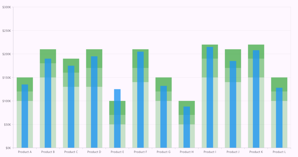
The current value shows where the product stands compared to the goal. To visualize this, calculate the current performance range using the segmentRect field in the ColumnSegment class.
Whether the chart is horizontal or vertical, the _deflate method ensures the current range is displayed correctly by adjusting the rectangle’s width or height, depending on the chart’s orientation.
Here’s how to calculate the current range:
@override
void transformValues() {
    // Calculate the current range segment from the bottom.
    final Rect deflatedRect = _deflate(transformX(left, y), transformY(left, y), bottomX, bottomY);
    segmentRect = toRRect(deflatedRect.left, deflatedRect.top, deflatedRect.right, deflatedRect.bottom, borderRadius);
}

Rect _deflate(double left, double top, double right, double bottom) {
   const double delta = 0.3;
   if (series.isTransposed) {
      final double height = (bottom - top) * delta;
      return Rect.fromLTRB(left, top - height, right, bottom + height);
   } else {
      final double width = (right - left) * delta;
      return Rect.fromLTRB(left + width, top, right - width, bottom);
   }
}

@override
void onPaint(Canvas canvas) {
  Paint paint = getFillPaint();
  // Draws current range segment.
  if (segmentRect != null) {
    paint = getFillPaint();
    if (paint.color != Colors.transparent && !segmentRect!.isEmpty) {
      canvas.drawRRect(segmentRect!, paint);
    }
  }
}
Refer to the following image.
Step 3: Calculate the target (Goal) range
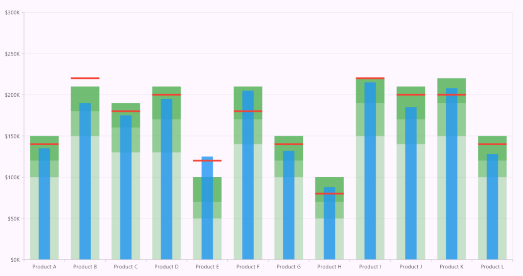
Finally, the goal range (target) is displayed as a line, showing the benchmark against which the product is compared. The goal range is calculated by transforming the X and Y coordinates of the goal value. This line lets users easily see if the product’s performance is below, meeting, or exceeding the target.
Here’s the code for adding the target line:
@override
void transformValues() {
// Calculate target range.
points
  ..add(Offset(transformX(left, goal), transformY(left, goal)))
  ..add(Offset(transformX(right, goal), transformY(right, goal)));
}

@override
void onPaint(Canvas canvas) {
  Paint paint = getFillPaint();
  // Draws target line.
  if (points.isNotEmpty && points.length == 2) {
    paint = Paint()
      ..color = Colors.red
      ..strokeWidth = 4
      ..style = PaintingStyle.stroke;
    canvas.drawLine(points[0], points[1], paint);
  }
}
Refer to the following image.
GitHub reference
For more details, refer to the Syncfusion Flutter Charts GitHub demos on rendering a Bullet Graph Chart.

Unlock the power of Syncfusion’s highly customizable Flutter widgets.
Conclusion
Thanks for reading! This blog shows how to create a Bullet Graph using the Syncfusion Flutter Charts. We hope you find the outlined steps helpful in achieving similar results.
If you’re an existing customer, you can download the latest version of Essential Studio® from the License and Downloads page. For those new to Syncfusion, try our 30-day free trial to explore all our features.
For queries, you can contact us through our support forum, support portal, or feedback portal. As always, we are happy to assist you!

