TL;DR: Let’s see how to integrate real-time data updates into your React apps using the Syncfusion React Data Grid component. Learn how to render dynamic grids, initiate and halt live data feeds, and customize grid styles for better data visualization. We’ll cover everything from connecting to data sources to configuring automatic refresh intervals, helping you deliver timely insights to users.
Syncfusion React Data Grid is a feature-rich component for displaying data in a tabular format. Its wide range of functionalities includes data binding, editing, Excel-like filtering, custom sorting, aggregating rows, selection, and support for Excel, CSV, and PDF formats.
In this blog, we’ll explore the process of integrating real-time data updates into the React Grid, enabling you to create dynamic, responsive grids that automatically refresh with the latest information.
Where is the real-time data used?
Live data refers to real-time updated data, providing users with the most current information. This type of data is commonly used in various apps where up-to-date information is critical, such as,
- Financial dashboards / Stock market tracking – Live data allows users to monitor stock prices, currency exchange rates, and market trends as they happen. This enables traders and investors to make informed decisions based on the latest market conditions.
- Real-time monitoring systems – In real-time monitoring systems, live data tracks various metrics and events in the manufacturing, healthcare, and transportation industries.
- Collaborative editing platforms – Like Google Docs, collaborative editing platforms rely on live data to enable multiple users to edit documents simultaneously. Changes made by one user are instantly reflected on others, ensuring everyone has access to the most current version of the document.
Overall, live data enhances user experiences by providing timely and relevant information, leading to better decision-making and increased productivity.
Rendering a basic React Data Grid
Let’s examine the steps to create a simple React Data Grid and demonstrate how the Grid component is used in the React environment.
Creating a React app
The best and easiest way to create a React app is to use the create-react-app command. It sets up your development environment in JavaScript and improves your app for production. Refer to the installation instructions of create-react-app.
npx create-react-app my-app
cd my-app
npm start
Adding Syncfusion React Data Grid packages
All the available Essential JS 2 packages are published in the NPM public registry. Use the following command to install the React Data Grid component.
npm install @syncfusion/ej2-react-grids --save
The—save command instructs NPM to include the React Grid package in the dependencies section of the package.json file.
Adding CSS reference
The following CSS files are available in the ../node_modules/@syncfusion package folder. Add them as a reference in the src/index.css file.
@import '../node_modules/@syncfusion/ej2-base/styles/material.css';
@import '../node_modules/@syncfusion/ej2-buttons/styles/material.css';
@import '../node_modules/@syncfusion/ej2-calendars/styles/material.css';
@import '../node_modules/@syncfusion/ej2-dropdowns/styles/material.css';
@import '../node_modules/@syncfusion/ej2-inputs/styles/material.css';
@import '../node_modules/@syncfusion/ej2-navigations/styles/material.css';
@import '../node_modules/@syncfusion/ej2-popups/styles/material.css';
@import '../node_modules/@syncfusion/ej2-splitbuttons/styles/material.css';
@import '../node_modules/@syncfusion/ej2-notifications/styles/material.css';
@import "../node_modules/@syncfusion/ej2-react-grids/styles/material.css";
To refer to index.css in the app, import it into the src/index.tsx file.
Adding React Data Grid component
You can now start adding the React Data Grid component to the src/index.js file, as shown in the following code example.
import { createRoot } from 'react-dom/client';
import './index.css';
import * as React from 'react';
import { GridComponent, ColumnsDirective, ColumnDirective } from '@syncfusion/ej2-react-grids';
import { getTradeData } from './data';

function LiveStream() {
    // Store the grid instance.
    let grid;

    const data = getTradeData;

    return (<div className='control-pane'>
        <div className='control-section-pane' style={{ marginLeft: '10px', marginRight: '10px' }}>
            <GridComponent id="livestream" dataSource={data} enableVirtualMaskRow={false} enableHover={false} rowHeight={38} height={400} ref={(g) => {
                grid = g;
            }} allowSelection={false} >
                <ColumnsDirective>
                    <ColumnDirective field="id" headerText="ID" width="140" isPrimaryKey={true} visible={false} />
                    <ColumnDirective field="CountryCode" headerText="Ticker" width="100" />
                    <ColumnDirective field="Net" headerText="Net" width="100" format="C2" type="number" textAlign="Right" />
                    <ColumnDirective field="NetIncome" headerText="Net Income" width="150" format="C2" type="number" textAlign="Right" />
                    <ColumnDirective field="Sector" width="160" headerText="Sector" />
                    <ColumnDirective field="EmployeeCount" width="130" headerText="Employee Count" textAlign="Right" />
                </ColumnsDirective>
            </GridComponent>
        </div>

    </div>);
}
export default LiveStream;

const root = createRoot(document.getElementById('sample'));
root.render(<LiveStream />);
The complete data source is available in the data.js file in the GitHub sample. The data source is defined in the following format in the data.js file.
let stringData = JSON.stringify([
   {
        'OrderID': 10248,
        'CustomerID': 'VINET',
        'OrderDate': '1996-07-04T00:00:00.000Z',
        'ShippedDate': '1996-07-16T00:00:00.000Z',
        'Freight': 32.38,
        'ShipName': 'Vins et alcools Chevalier',
        'ShipAddress': '59 rue de l\'Abbaye',
        'ShipCity': 'Reims',
        'ShipRegion': null,
        'ShipCountry': 'France'
    },
    {
        'OrderID': 10249,
        'CustomerID': 'TOMSP',
        'OrderDate': '1996-07-05T00:00:00.000Z',
        'ShippedDate': '1996-07-10T00:00:00.000Z',
        'Freight': 11.61,
        'ShipName': 'Toms Spezialitäten',
        'ShipAddress': 'Luisenstr. 48',
        'ShipCity': 'Münster',
        'ShipRegion': null,
        'ShipCountry': 'Germany'
    },
    . . . .
    . . . .
];
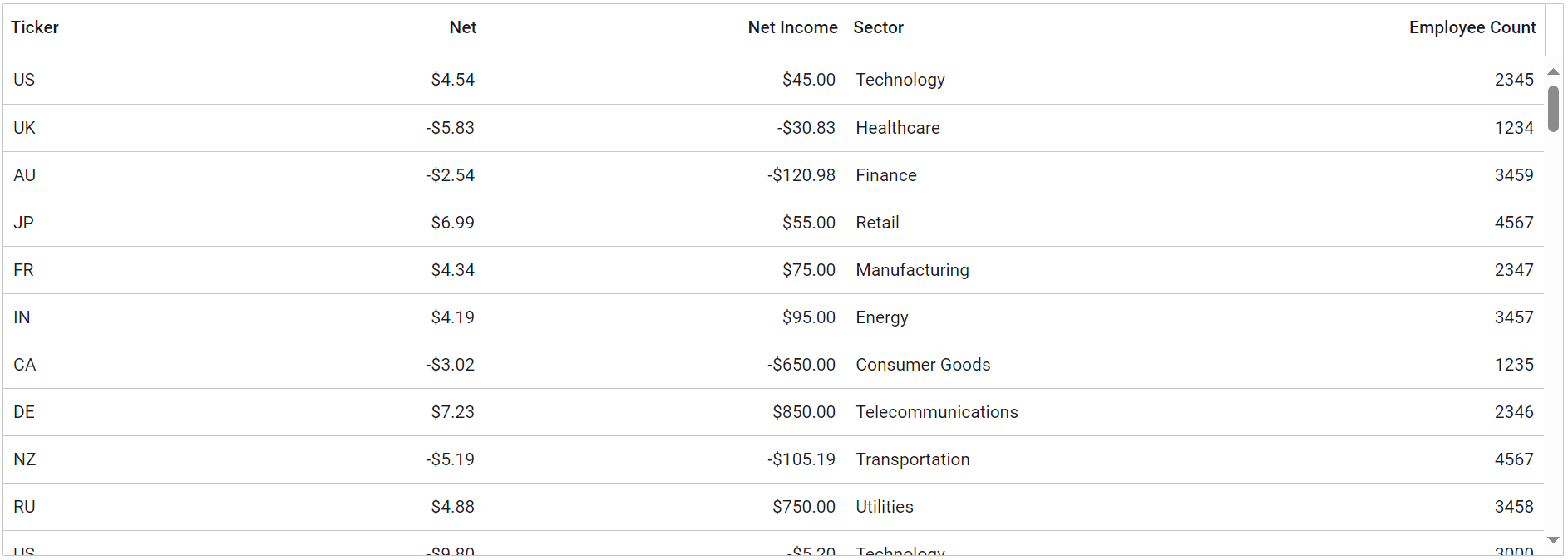
The above code shows the flat data source. Refer to the following image.

Let’s see how the data will be updated as live data.
Initiating and halting real-time data feeds
In this demo, we’ll provide functionality for initiating and halting real-time data feeds within the React Data Grid. Users are presented with the Start Data Update and Stop Data Update buttons, enabling them to control the flow of real-time data updates. Additionally, an input field allows users to define the interval at which cells are updated. This setup empowers users to customize the frequency of data updates according to their specific requirements.
We use the React Numeric TextBox component to get the frequency and the Button component to initiate and halt the data feeds.
To install the React Button component, use the following command.
npm install @syncfusion/ej2-react-buttons --save
To install the React Numeric TextBox component, use the following command.
npm install @syncfusion/ej2-react-inputs –save
Then, we need to import the necessary component in the src/index.js file.
import { createRoot } from 'react-dom/client';
import './index.css';
import * as React from 'react';
import { GridComponent, ColumnsDirective, ColumnDirective } from '@syncfusion/ej2-react-grids';
import { getTradeData } from './data';
import { ButtonComponent } from '@syncfusion/ej2-react-buttons';
import { NumericTextBoxComponent } from '@syncfusion/ej2-react-inputs';

function LiveStream() {
    // Store the grid instance.
    let grid;
     // start timer button.
    let updateButton;
    // Stop timer button.
    let clearButton;
    // Time delay.
    let feedDelayInput;
    // Initiate the timer.
    let timerID;

    const data = getTradeData;

    };
    return (<div className='control-pane'>
        <div className='control-section-pane' style={{ marginLeft: '10px', marginRight: '10px' }}>
            <div style={{ marginBottom: '10px' }}>
                <h4 style={{ display: 'inline-block', fontSize: '14px', paddingLeft: '5px' }}>
                    Feed Delay(ms):
                </h4>
                <NumericTextBoxComponent format="N0" value={1000} min={10} max={5000} step={1} width={'150px'} style={{ marginLeft: '7px' }} ref={(scope) => {
                    feedDelayInput = scope;
                }} />
                <ButtonComponent id="start" ref={(scope) => {
                    updateButton = scope;
                }} onClick={updateClick} style={{ marginLeft: '10px' }}>
                    Start Data Update
                </ButtonComponent>
                <ButtonComponent id="stop" ref={(scope) => {
                    clearButton = scope;
                }} onClick={clearClick} style={{ marginLeft: '10px' }}>
                    Stop Data Update
                </ButtonComponent>
            </div>
            <GridComponent id="livestream" dataSource={data} enableVirtualMaskRow={false} enableHover={false} rowHeight={38} height={400} ref={(g) => {
                grid = g;
            }} allowSelection={false} >
                <ColumnsDirective>
                    <ColumnDirective field="id" headerText="ID" width="140" isPrimaryKey={true} visible={false} />
                    <ColumnDirective field="CountryCode" headerText="Ticker" width="100" />
                    <ColumnDirective field="Net" headerText="Net" width="100" format="C2" type="number" textAlign="Right" />
                    <ColumnDirective field="NetIncome" headerText="Net Income" width="150" format="C2" type="number" textAlign="Right" />
                    <ColumnDirective field="Sector" width="160" headerText="Sector" />
                    <ColumnDirective field="EmployeeCount" width="130" headerText="Employee Count" textAlign="Right" />
                </ColumnsDirective>
            </GridComponent>
        </div>

    </div>);

export default LiveStream;

const root = createRoot(document.getElementById('sample'));
root.render(<LiveStream />);
In this demo, we implement the onClick event binding for both the Start and Stop buttons. When clicking the Start Data Update button, the Grid dynamically updates cell values using the Grid’s setCellValue method at regular intervals. By default, the grid updates cell values every 1000 milliseconds. We achieve this functionality by invoking the setCellValue method within the updateCellValues function.
Conversely, clicking the Stop Data Update button halts the dynamic cell updating process. Refer to the following code example.
const updateClick = () => {
    if (!timerID) {
        updateButton.disabled = true;
        feedDelayInput.enabled = false;
        clearButton.disabled = false;
        timerID = setInterval(updateCellValues, feedDelayInput.value);
    }
};
const clearClick = () => {
    if (timerID) {
        updateButton.disabled = false;
        feedDelayInput.enabled = true;
        clearButton.disabled = true;
        clearInterval(timerID);
        timerID = undefined;
    }
};
// Calculate the updated grid cell value.
    const updateCellValues = () => {
        let oldValue;
        let newNetValue;
        for (let i = 0; grid && i < grid?.currentViewData.length; i++) {
            if (grid?.currentViewData[i] === undefined) {
                return;
            }
            let num = Math.floor(Math.random() * 99) + 1;
            num *= Math.floor(Math.random() * 2) === 1 ? 1 : -1;
            oldValue = grid?.currentViewData[i]['Net'];
            if (i % 2 === 0) {
                num = num * 0.25;
            }
            else if (i % 3 === 0) {
                num = num * 0.83;
            }
            else if (i % 5 === 0) {
                num = num * 0.79;
            }
            else if (i % 4 === 0) {
                num = num * 0.42;
            }
            else {
                num = num * 0.51;
            }
            // Dynamically update the grid cell value.
            grid?.setCellValue(grid?.currentViewData[i]['id'], 'Net', parseFloat(num.toFixed(2)));
            newNetValue = parseFloat((grid?.currentViewData[i]['Net'] - oldValue).toString().substring(0, 2));
            const netIncome = num + newNetValue;
            grid?.setCellValue(grid?.currentViewData[i]['id'], 'NetIncome', netIncome);
        }
};
Updating real-time data on initial loading of the React Data Grid
Using the React Data Grid’s load event, we can programmatically simulate clicking the Start Data Update button during the grid’s initial rendering. It’s important to note that the Grid’s load event is only fired during the initial rendering phase. Refer to the following code example.
......
......
let initial = true;
    const load = function (args) {
        this.on('data-ready', () => {
            if (initial) {
                document.getElementById('start')?.click();
                initial = false;
                feedDelayInput.element.addEventListener('keypress', (e) => {
                    if (e && e.key === 'Enter' && feedDelayInput.element.parentElement.classList.contains('e-input-focus')) {
                        feedDelayInput.value = parseInt(feedDelayInput.element.value);
                        feedDelayInput.focusOut();
                        updateButton.element.click();
                    }
                });
            }
        });
        this.on('destroy', function () {
            if (timerID) {
                clearInterval(timerID);
                timerID = undefined;
            }
        });
    };

......
<GridComponent id="livestream" dataSource={data} enableVirtualMaskRow={false} enableHover={false} rowHeight={38} height={400} ref={(g) => {
                grid = g;
            }} allowSelection={false} load={load}>

......
......
......
Dynamically apply the custom styles to React Data Grid cells
The React Data Grid provides powerful capabilities for integrating real-time data updates into your React apps, enhancing user experience, and delivering valuable insights promptly. With the queryCellInfo event of the Data Grid component, you can dynamically apply custom styles to grid cells based on specific conditions or data values. This allows you to visualize data changes in real-time and highlight important information for users.
To implement real-time data updates, you can utilize the queryCellInfo event to access each grid cell and customize its appearance based on the corresponding data. By defining conditions or rules within this event handler, you can dynamically modify the style properties of grid cells, such as background color, font size, or text color, to reflect the current data state.
. . . . .
<GridComponent id="livestream" dataSource={data} enableVirtualMaskRow={false} enableHover={false} rowHeight={38} height={400} ref={(g) => {
                grid = g;
            }} allowSelection={false} queryCellInfo={queryCellInfo} load={load}>

. . . .
const queryCellInfo = (args) => {
        if (args.column?.field === 'NetIncome') {
            if (args.data['Net'] < 0) {
               // Add the custom class for the Net column.
                args.cell?.classList.remove('e-increase');
                args.cell?.classList.add('e-decrease');
            }
            else if (args.data['Net'] > 0) {
                // Add the custom class for teh Net column.
                args.cell?.classList.remove('e-decrease');
                args.cell?.classList.add('e-increase');
            }
        }
        else if (args.column?.field === 'Net') {
           if (args.data['Net'] < 0) {
               // Append the custom element to the Net column.
               updateCellDetails(args.cell, 'below-0');
           }
           else {
               // Append the custom element to the Net column.
                    updateCellDetails(args.cell, 'above-0');
           }}

};
// Dynamically append the span element with a custom style.
    const updateCellDetails = (cell, className) => {
        const div = document.createElement('div');
        const span1 = document.createElement('span');
        span1.classList.add('rowcell-left');
        div.classList.add(className);
        span1.innerHTML = cell.innerHTML;
        cell.innerHTML = '';
        div.appendChild(span1);
        cell.appendChild(div);
};
Then, add a custom class to apply a background to the grid cells of the Net column using the e-increase and e-decrease classes in the provided code example. Add the following code to apply a background style for the Net column in the index.css file.
.e-grid .e-rowcell.e-increase,
.e-grid .e-rowcell.e-increase:not(.e-editedbatchcell):not(.e-updatedtd) {
  background-color: #DFFFE2;
  color: #00A653;
}

.e-grid .e-rowcell.e-decrease:not(.e-editedbatchcell):not(.e-updatedtd) {
  background-color: #FFEBE9;
  color: #FF3740;
}
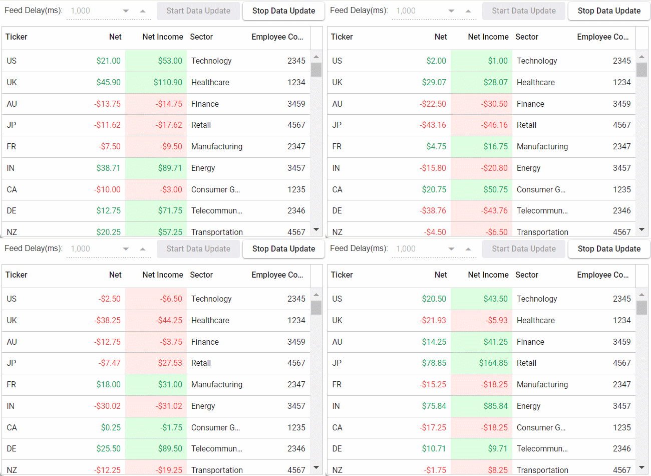
Refer to the following output image.

References
For more details, refer to updating real-time data in the React Data Grid demo on GitHub and web.

Explore the endless possibilities with Syncfusion’s outstanding React UI components.
Conclusion
Thanks for reading! In this blog, we’ve explored how to implement real-time data updates in your apps using the Syncfusion React Data Grid component. Follow these steps to achieve similar results, and feel free to share your thoughts or questions in the comments below.
If you’re an existing customer, you can download the latest version of Essential Studio® from the License and Downloads page. For those new to Syncfusion, try our 30-day free trial to explore all our features.
You can contact us through our support forum, support portal, or feedback portal. We are here to help you succeed!
Related blogs
- Enhancing Your Application with GraphQL-Based CRUD Operations in React Grid
- How to Deploy React App on Azure Static Web Apps
- React Hooks vs. Redux in 2024
- What’s New in React 19?
- How to Create an Employee Directory with the React MultiColumn ComboBox [Webinar Show Notes]


