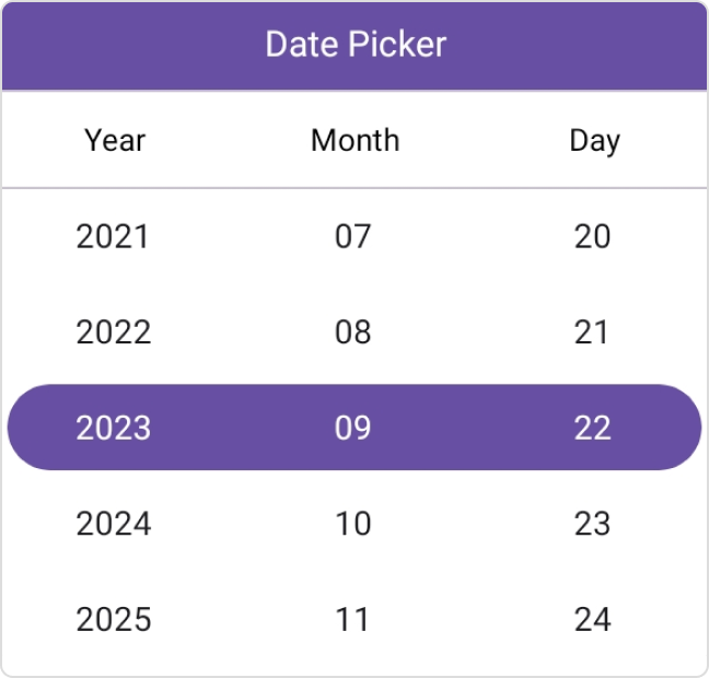
.NET MAUI Date Picker: A Quick and Interactive Date Picker
- Multiple picker modes and date formats.
- Minimum and maximum date restrictions.
- Customization options for the header, column header, footer, and selection view.
Trusted by the world’s leading companies

Overview
The Syncfusion® .NET MAUI Date Picker (SfDatePicker) is a fully customizable component that lets you easily select a date from a list of dates.
.NET MAUI Date Picker code example
Get started with the .NET MAUI Date Picker by using just a few lines of XAML and C# code, as demonstrated below. Also explore our .NET MAUI Date Picker example, which shows you how to render and configure the component.
<picker:SfDatePicker x:Name="picker">
    <picker:SfDatePicker.HeaderView>
      <picker:PickerHeaderView Text="Date Picker" Height="40" />
    </picker:SfDatePicker.HeaderView>
</picker:SfDatePicker>
SfDatePicker picker = new SfDatePicker();
picker.HeaderView = new PickerHeaderView()
{
Text = "Date Picker",
Height = 40,
};
this.Content = picker;Header view
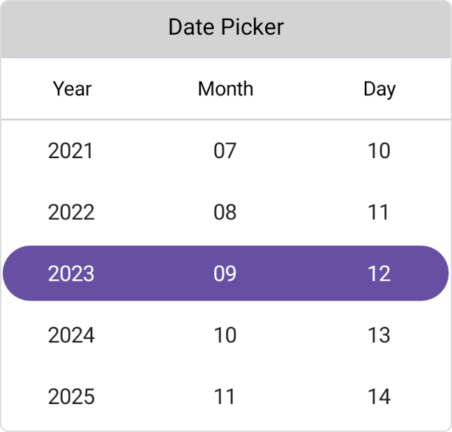
The .NET MAUI Date Picker allows users to add header text and customize it.

Column header view
The .NET MAUI Date Picker supports a customizable column header view to separate headings for each column.
Footer view
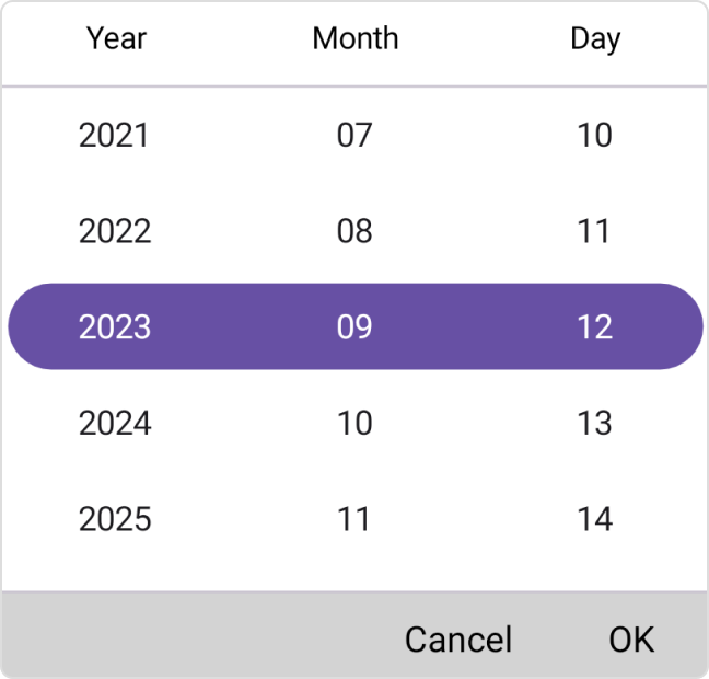
The .NET MAUI Date Picker provides validation buttons (OK and Cancel) in the footer view. The footer text and background color can be customized.
Selection view
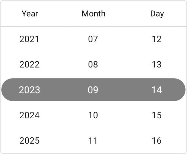
The .NET MAUI Date Picker selection view shows the selected date and is customizable.
Date format
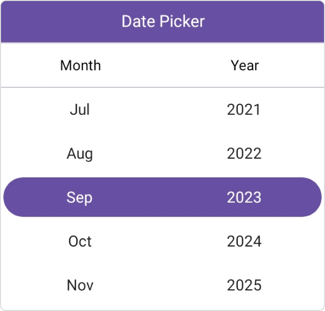
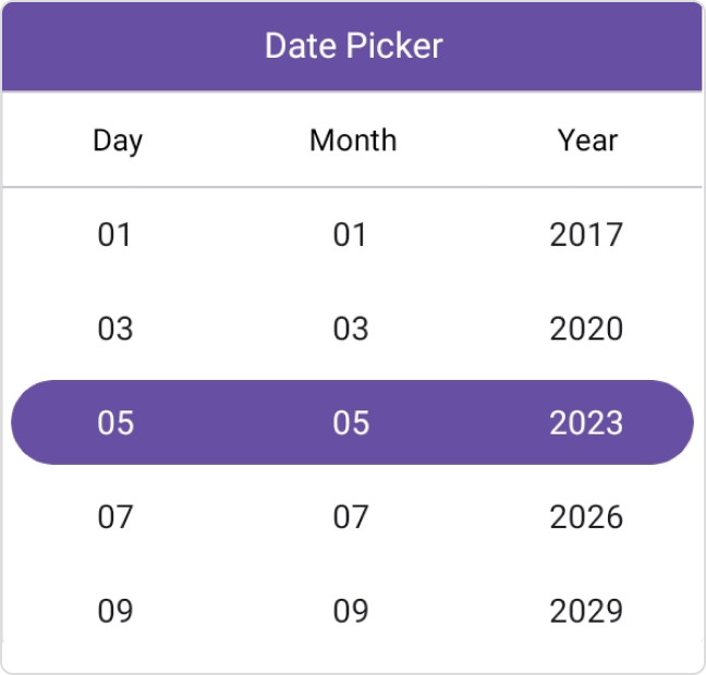
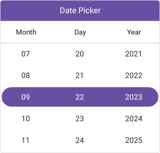
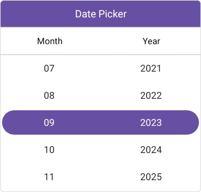
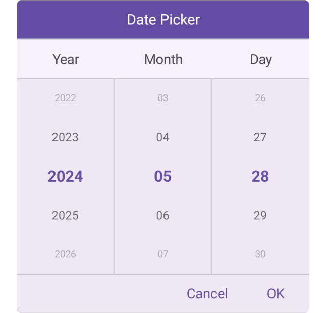
The .NET MAUI Date Picker offers 8 predefined formats to represent the date value in different string formats.
Picker modes
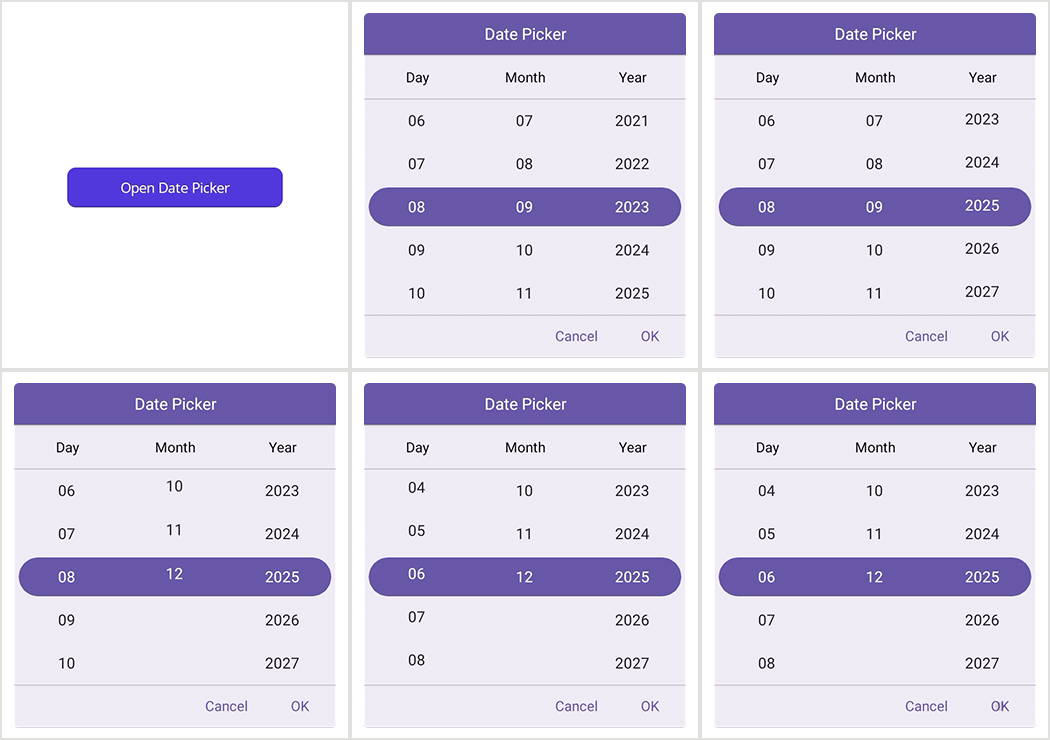
Show the picker in a pop-up by using dialog mode. The relative dialog mode is used to align the picker in a specific position that makes the control look better in the UI.
Text display mode
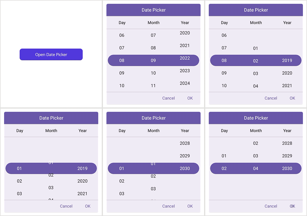
The .NET MAUI Date Picker allows users to display picker items based on the text display mode. It offers four modes: default, fade, shrink, and FadeAndShrink.
Date restriction
Restrict the selection of dates beyond specified minimum and maximum dates.
Intervals
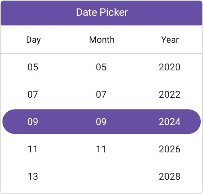
Date values can be populated with intervals for days, months, and years, individually.
Picker interactions
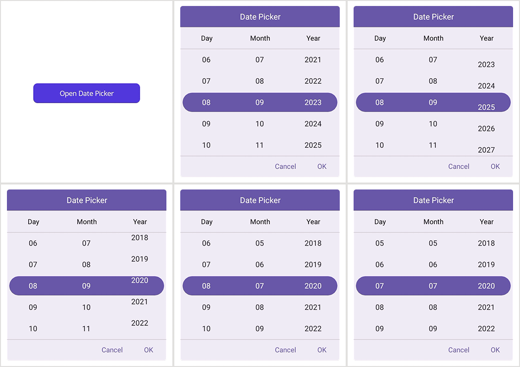
The .NET MAUI Date Picker allows you to select dates through tap and scroll interactions.
Looping
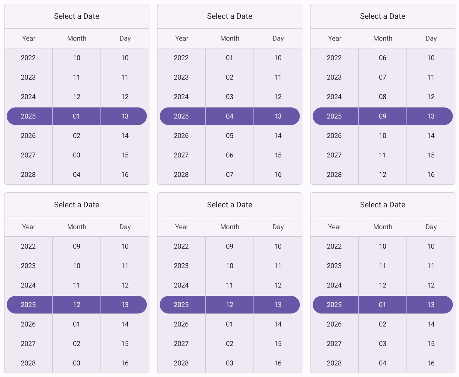
Looping allows users to scroll through dates continuously. When the end of the date range is reached, it loops back to the start, making date selection smooth and effortless.
Appearance customization
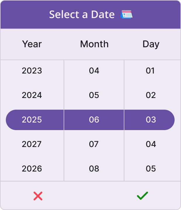
Enhance your Date Picker control’s appearance using a data template for the following UI elements:
- Header
- Column header
- Footer
Not sure how to create your first .NET MAUI Date Picker? Our documentation can help.
I’d love to read it nowFrequently Asked Questions
Why should you choose the Syncfusion® .NET MAUI Date Picker?
The Syncfusion® .NET MAUI Date Picker offers the following features:
Easy customization of header text, footer buttons, and background colors.
- 8 predefined formats for displaying dates, accommodating various regional or application-specific preferences.
- The picker can be displayed in a pop-up with a dialog or aligned in a specific position.
The selection of dates beyond specified minimum and maximum dates can be restricted.
- Users can select dates through tap and scroll actions.
Date values can be populated individually with intervals for days, months, and years for precise control over date selection.
Simple configuration and APIs.
- Touch-friendly UI.
Extensive demos, documentation, and videos help you get started quickly.
Where can I find the Syncfusion® .NET MAUI Date Picker demo?
You can find the .NET MAUI Date Picker demo here. It demonstrates how to render and configure the Date Picker.
Can I download and utilize the Syncfusion® .NET MAUI Date Picker for free?
No, this is a commercial product and requires a paid license. However, a free Community License is also available for companies and individuals whose organizations have less than $1 million USD in annual gross revenue, 5 or fewer developers, and 10 or fewer total employees.
How do I get started with the Syncfusion® .NET MAUI Date Picker?
A good place to start would be our comprehensive getting started documentation.
.NET MAUI DataViz & UI Controls
Our Customers Love Us


 Documentation
Awards
Greatness—it’s one thing to say you have it, but it means more when others recognize it. Syncfusion® is proud to hold the following industry awards.
