.NET MAUI Range Selector - A Highly Interactive Control
- Visualize a portion of a larger dataset that you have chosen.
- Integrate seamlessly with Charts, and others to show filtered data.
- Implement a rich set of features such as numeric and date-time ranges, labels, ticks, dividers, and tooltips.
Trusted by the world’s leading companies

Overview
The .NET MAUI Range Selector is a highly interactive UI control for selecting a smaller range from a larger data set. It provides a rich set of features such as labels, ticks, dividers, step duration, overlays, and tooltips. It also supports adding any type of control as its content.
.NET MAUI Range Selector Code Example
Easily get started with the .NET MAUI Range Selector using a few simple lines of XAML code example as demonstrated below. Also explore our .NET MAUI Range Selector Example that shows you how to render the Range Selector control in .NET MAUI.
<sliders:SfRangeSelector Minimum="0"
                    Maximum="20"
                    RangeStart="6"
                    RangeEnd="16"
                    ShowTicks="True"
                    ShowLabels="True"
                    ShowDividers="True"
                    Interval="2"
                    MinorTicksPerInterval="1">
    <chart:SfCartesianChart>
        <charts:SfCartesianChart.XAxes>
            <charts:NumericalAxis IsVisible="False"
                        ShowMajorGridLines="False" />
        </charts:SfCartesianChart.XAxes>
                <charts:SfCartesianChart.YAxes>
            <charts:NumericalAxis IsVisible="False"
                        ShowMajorGridLines="False" />
                </charts:SfCartesianChart.YAxes>
                    <charts:SfCartesianChart.Series>
                        <charts:SplineAreaSeries ItemsSource="{Binding Source}"
                            XBindingPath="X"
                            YBindingPath="Y">
                        </charts:SplineAreaSeries>
                    </charts:SfCartesianChart.Series>
    </charts:SfCartesianChart>
</sliders:SfRangeSelector>
Content
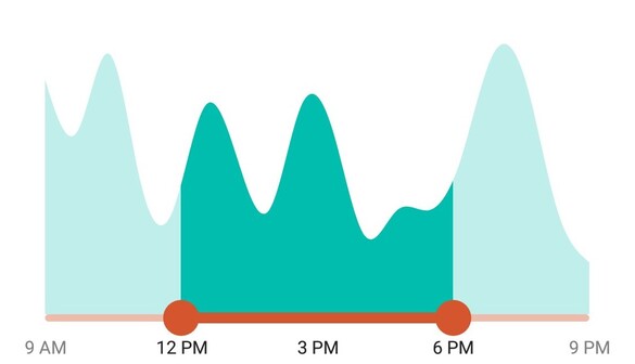
Add your content of choice, including any MAUI control. The Range Selector is smart enough to handle functions like segment selection and chart zooming based on the range specified.

Scales
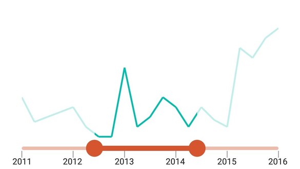
The Range Selector can be used for numeric values, and the Date-Time Range Selector can be used for date-time values. Both the Range Selector and Date-Time Range Selector share common features regardless of the underlying values.
Numeric Range Selector

Date-Time Range Selector


Ticks
Set both major and minor ticks in the track. Use major ticks to show the intervals clearly and minor ticks to help users choose values between two intervals easily.
Dividers
Render dividers in each interval to show the ranges accurately. Customize both the size and positioning of these dividers to enhance clarity and visual appeal.


Labels
Customize the labels easily. Change their format, render them at specific intervals, and add prefixes and suffixes.
Tooltips
Use tooltips to indicate the current selection during interaction. Customize the format, entire text, and visibility of the tooltip.


Region colors
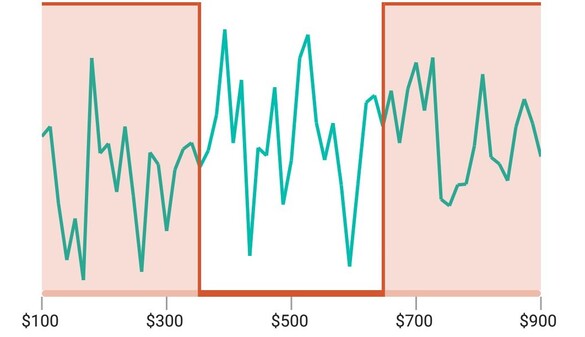
Use active and inactive regions to highlight selected and unselected portions. Customize the appearance of the active and inactive regions.
Binding selected data
Bind selected data from the Range Selector to any other data visualization control. Effectively visualize and analyze the filtered data.
Binding with the content

Binding with another control

Not sure how to create your first .NET MAUI Range Selector? Our tutorial videos and documentation can help.
I’d love to watch it now I’d love to read it nowFrequently Asked Questions
Why should you choose the Syncfusion .NET MAUI Range Selector?
The Syncfusion .NET MAUI Range Selector supports the following features:
- Add any type of control inside the Range Selector, like a chart control.
- Select a small range from a larger range.
- Display numeric and date-time ranges.
- Select linear or discrete values.
Show a tooltip to give more information about the selected values.
Can customize range selector track, divider, thumb and overlay.
- One of the best .NET MAUI Range Selector in the market, offering feature-rich UI to interact with the software.
Simple configuration and API.
- Mobile-touch friendly.
Extensive demos, documentation, and videos to let you get started quickly with the .NET MAUI Range Selector.
Where can I find the Syncfusion Blazor .NET MAUI Range Selector demo?
You can find our .NET MAUI Range Selector demo, which demonstrates how to render and configure the Range Selector.
Can I download and utilize the Syncfusion .NET MAUI Range Selector for free?
No, this is a commercial product and requires a paid license. However, a free community license is also available for companies and individuals whose organizations have less than $1 million USD in annual gross revenue, 5 or fewer developers, and 10 or fewer total employees.
How do I get started with Syncfusion .NET MAUI Range Selector?
A good place to start would be our comprehensive getting started documentation.
.NET MAUI DataViz & UI Controls
Our Customers Love Us


Awards
Greatness—it’s one thing to say you have it, but it means more when others recognize it. Syncfusion® is proud to hold the following industry awards.


