
The .NET MAUI Accordion control or Accordion Panels offers a vertically collapsible panel with stacked headers, allowing users to expand or collapse one or multiple items simultaneously to display content. This feature-rich control organizes and displays content in an easily accessible way, enhancing user experience by managing information in a compact space.
Easily get started with the .NET MAUI Accordion using a few simple lines of XAML code example as demonstrated below. Also, explore our .NET MAUI Accordion Example that shows you how to render and configure the .NET MAUI Accordion.
- <?xml version="1.0" encoding="utf-8" ?>
- <ContentPage xmlns="http://schemas.microsoft.com/dotnet/2021/maui"
- xmlns:x="http://schemas.microsoft.com/winfx/2009/xaml"
- xmlns:syncfusion="clr-namespace:Syncfusion.Maui.Accordion;assembly=Syncfusion.Maui.Expander"
- x:Class="SfAccordionDemo.MainPage">
- <ContentPage.Content>
- <syncfusion:SfAccordion x:Name="Accordion">
- <syncfusion:SfAccordion.Items>
- <syncfusion:AccordionItem>
- <syncfusion:AccordionItem.Header>
- <Grid>
- <Label Text="Header 1"/>
- </Grid>
- </syncfusion:AccordionItem.Header>
- <syncfusion:AccordionItem.Content>
- <Grid>
- <Label Text="Content comes here!"/>
- </Grid>
- </syncfusion:AccordionItem.Content>
- </syncfusion:AccordionItem>
- <syncfusion:AccordionItem>
- <syncfusion:AccordionItem.Header>
- <Grid>
- <Label Text="Header 2"/>
- </Grid>
- </syncfusion:AccordionItem.Header>
- <syncfusion:AccordionItem.Content>
- <Grid>
- <Label Text="Content comes here!"/>
- </Grid>
- </syncfusion:AccordionItem.Content>
- </syncfusion:AccordionItem>
- </syncfusion:SfAccordion.Items>
- </syncfusion:SfAccordion>
- </ContentPage.Content>
- </ContentPage>
The Accordion control allows the use of .NET MAUI BindableLayout to bind a data collection and populate the control.
The Accordion control allows users to interactively and programmatically customize the expand and collapse actions.
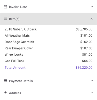
The Accordion control features built-in support for customizing the header’s appearance.
The Accordion control supports single and multiple expansion modes.In single expand mode, only one item can be expanded at a time, while in multiple expand mode, multiple items can be expanded simultaneously.


Enhances the user experience with animated transitions for item expansion and collapse. The animations can be customized by turning them on or off, adjusting the duration of the expanding and collapsing animations, and modifying the easing style.

Users can easily adjust the vertical spacing between items within the Accordion control.
The Accordion provides the flexibility to customize the placement of the header icon in accordion items.
![]()

The Accordion control lets you customize the scroll position of the expanded accordion item.
Modify the appearance of Accordion items according to their expanded and collapsed states by utilizing the visual state manager.
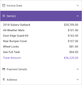
The Syncfusion .NET MAUI Accordion support the following features:
You can find our .NET MAUI Accordion demo, which demonstrates how to render and configure the Accordion.
No, this is a commercial product and requires a paid license. However, a free community license is also available for companies and individuals whose organizations have less than $1 million USD in annual gross revenue, 5 or fewer developers, and 10 or fewer total employees.
A good place to start would be our comprehensive getting started documentation.
Greatness—it’s one thing to say you have it, but it means more when others recognize it. Syncfusion® is proud to hold the following industry awards.