.NET MAUI Toolbar - Configurable Items for Instant Actions
- Toolbar items with icons, labels, and custom views.
- Seamless interaction with touch gestures and command execution.
- Orientation adaptive to horizontal and vertical layouts.
- Overflow support with scrolling, navigation buttons, and a menu.
Trusted by the world’s leading companies

Overview
The .NET MAUI Toolbar (SfToolbar) control is a flexible UI control that provides configurable action items for seamless user interaction, enhancing application usability.

.NET MAUI Toolbar Code Example
Easily get started with the .NET MAUI Toolbar using a few simple lines of C# code example as demonstrated below. Also, explore our .NET MAUI Toolbar Example that shows you how to render and configure the .NET MAUI Toolbar.
<ContentPage
xmlns:toolbar="clr-namespace:Syncfusion.Maui.Toolbar;assembly=Syncfusion.Maui.Toolbar">
<StackLayout>
<toolbar:SfToolbar />
</StackLayout>
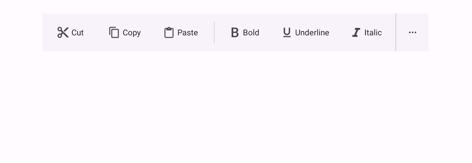
</ContentPage>Toolbar items
Add toolbar items with icons, labels, a combination of both, or custom views for quick access to key actions.
Icons
Render toolbar items with specified icons for quick recognition and accessibility.
Labels
Use text labels for toolbar items for better comprehension of their purpose.

Icons with labels
Combine an icon and text and position them in a toolbar item to enhance clarity.
Custom views
Integrate complex UI elements within the toolbar for enhanced functionality and customization.

Orientation
The Toolbar supports horizontal and vertical orientations to adapt to various devices and application layouts.
Horizontal orientation

Vertical orientation

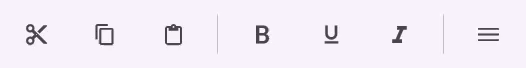
Overflow mode
Scrolling options, navigation buttons, and an overflow menu give users efficient management of excess toolbar items.
Scrolling
Enable scrolling when items exceed visible space, allowing users to swipe through toolbar items.
Navigation buttons
Display forward and backward buttons at the ends of the toolbar for easy navigation when items overflow.
More button
This button appears when the available space in the toolbar is insufficient to display all the defined toolbar items. When the more button is set in the toolbar, excess items move to an overflow menu.
Overlay toolbar
The overlay toolbar appears as a floating UI element above the main toolbar, offering quick access to essential actions while preserving screen space.
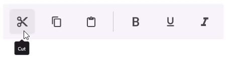
Tooltips
Each toolbar item can display a tooltip that describes its action, offering additional context when users hover over or long-press the item.
Themes
The Toolbar adapts to light and dark modes, enhancing readability.
Light

Dark

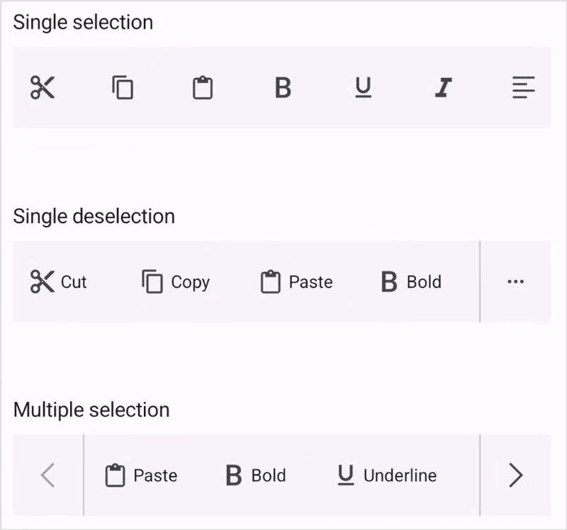
Selection modes
Toolbar selection modes define how users interact with toolbar items, offering flexibility for different use cases.
Single
Select one item at a time. Selecting a new item deselects the previous one.
Single deselection
Users can tap a selected item again to deselect it and return the toolbar to its default state.
Multiple
Select or deselect multiple items simultaneously for combined or grouped actions.
 95+ UI controls
200+ interactive .NET MAUI demos
1.8M+ downloads
95+ UI controls
200+ interactive .NET MAUI demos
1.8M+ downloads
Not sure how to create your first .NET MAUI Toolbar control? Our documentation can help.
I’d love to read it nowFrequently Asked Questions
Why should you choose the Syncfusion .NET MAUI Toolbar control?
The Syncfusion .NET MAUI Toolbar control supports the following features:
Provides toolbar items with icons, labels, and custom views.
- Instantly performs actions via touch gestures.
Adapts to horizontal and vertical layouts.
Manages overflow items with scrolling, navigation buttons, or a menu.
- One of the best .NET MAUI Toolbar in the market, offering feature-rich UI to interact with the software.
- Mobile-touch friendly UI.
Simple configuration and APIs.
Extensive demos and documentation, to let you get started quickly with .NET MAUI Toolbar.
Where can I find the Syncfusion .NET MAUI Toolbar demo?
You can find our .NET MAUI Toolbar demo, which demonstrates how to render and configure the Toolbar.
Can I download and utilize the Syncfusion .NET MAUI Toolbar control for free?
No, this is a commercial product and requires a paid license. However, a free community license is also available for companies and individuals whose organizations have less than $1 million USD in annual gross revenue, 5 or fewer developers, and 10 or fewer total employees.
How do I get started with the Syncfusion .NET MAUI Toolbar control?
A good place to start would be our comprehensive getting started documentation.
.NET MAUI DataViz & UI Controls
Our Customers Love Us


See Real Success Stories
Developers around the world trust Syncfusion’s Essential Studio to simplify complex projects and speed up delivery. With a vast library of UI controls, powerful SDKs, and reliable support, Essential Studio helps teams build enterprise-ready applications with confidence.
Explore Case StudiesIndustry
Software development
75% Cost reduction
50% Faster development
Industry
Utilities (oil and gas)
450+ hours saved
Streamlined processes and hours of development effort saved.
Advanced, flexible features
Empowered users through robust and versatile functionality.
Industry
Software and technology
1000+ of hours saved
Accelerated development with enterprise-ready UI components.
Efficient file management
Streamlined workflows with document libraries without building them from scratch.
Industry
Software and technology
2 Years of delay avoided
Two years of delays prevented with proactive planning.
On-time delivery
Projects delivered on schedule using trusted controls.
Industry
IT services and IT consulting
Improved performance
Large datasets handled with easy customization and quick debugging.
Highly customizable
Plug-and-play controls with quick template integration.
Industry
Professional services
Instant access
Quick availability of features and resources.
Reduced dependencies
Fewer dependencies for faster development.
Rated by users across the globe
 Documentation


 .NET MAUI UI Kit
Awards
Greatness—it’s one thing to say you have it, but it means more when others recognize it. Syncfusion® is proud to hold the following industry awards.

