
The .NET MAUI Busy Indicator control (activity indicator) lets users know when their application is busy.
Easily get started with the .NET MAUI Busy Indicator using a few simple lines of XAML code example as demonstrated below. Also, explore our .NET MAUI Busy Indicator Example that shows you how to render and configure the .NET MAUI Busy Indicator.
- <?xml version="1.0" encoding="utf-8" ?>
- <ContentPage xmlns="http://schemas.microsoft.com/dotnet/2021/maui"
- xmlns:x="http://schemas.microsoft.com/winfx/2009/xaml"
- xmlns:core="clr-namespace:Syncfusion.Maui.Core;assembly=Syncfusion.Maui.Core"
- x:Class="BusyIndicatorSample.MainPage">
- <ContentPage.Content>
- <core:SfBusyIndicator x:Name="busyIndicator"
- IsRunning="True"
- AnimationType="CircularMaterial" />
- </ContentPage.Content>
- </ContentPage>
The .NET MAUI Busy Indicator includes 7 pre-built animations that can be shown within the application.

The .NET MAUI Busy Indicator renders an Android-style material animation in a circular path.

The .NET MAUI Busy Indicator renders an Android-style material animation in a fixed horizontal line.

The .NET MAUI Busy Indicator renders an iOS-style animation.

The .NET MAUI Busy Indicator renders a single circle animation.

The .NET MAUI Busy Indicator renders a double circle animation.

The .NET MAUI Busy Indicator renders a globe animation.

The .NET MAUI Busy Indicator renders a horizontal pulsing box animation.
The title text indicates the busy status of the control.
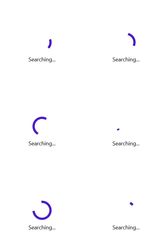

The .NET MAUI Busy Indicator animation speed can be customized using factor values 0 to 1.
The .NET MAUI Busy Indicator size can be customized using factor values 0 to 1.

The title can be customized in position, spacing, and fonts.

The title can be placed either at the top or bottom of the indicator animation of the .NET MAUI Busy Indicator.
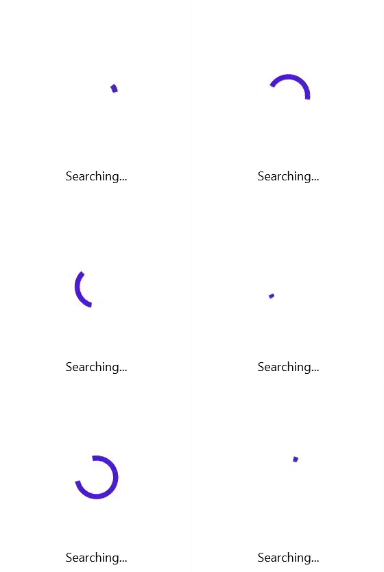
The .NET MAUI Busy Indicator provides support to customize the space between the title and the indicator animation.

Title fonts can be customized in the aspects of font family, font attributes, and font size.
The .NET MAUI Busy Indicator colors can be customized in the following aspects.

The .NET MAUI Busy Indicator color can be customized based on the requirement.

Required color can be set to the title in the .NET MAUI Busy Indicator.

Either solid or gradient color can be provided for the overlay of the .NET MAUI Busy Indicator.
The Syncfusion .NET MAUI Busy Indicator supports the following features:
You can find our .NET MAUI Busy Indicator demo, which demonstrates how to render and configure the Busy Indicator.
No, this is a commercial product and requires a paid license. However, a free community license is also available for companies and individuals whose organizations have less than $1 million USD in annual gross revenue, 5 or fewer developers, and 10 or fewer total employees.
A good place to start would be our comprehensive getting started documentation.
Greatness—it’s one thing to say you have it, but it means more when others recognize it. Syncfusion® is proud to hold the following industry awards.