.NET MAUI NumericUpDown: A Feature-Rich UI Control
- A simple, flexible interface for selecting numeric values.
- Supports various number formatting options based on culture and region.
- Restricts input within specified minimum and maximum values.
- Provides intuitive up and down buttons for changing the value.
Trusted by the world’s leading companies

Overview
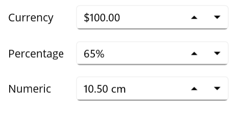
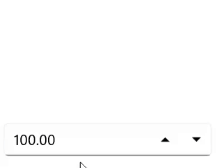
The .NET MAUI NumericUpDown control provides a user-friendly experience for capturing numeric input values. It features increment and decrement buttons for users to easily change the value and supports a wide range of numeric formats, including currency, percentage, decimal, and more. Its features enhance the user experience and facilitate input validation.
.NET MAUI NumericUpDown code example
Get started with the .NET MAUI NumericUpDown by using just a few lines of XAML code, as illustrated below. Additionally, check out our .NET MAUI NumericUpDown example that demonstrates how to implement the NumericUpDown control.
<?xml version="1.0" encoding="utf-8" ?>
<ContentPage xmlns="http://schemas.microsoft.com/dotnet/2021/maui"
xmlns:x="http://schemas.microsoft.com/winfx/2009/xaml"
x:Class="NumericUpdownGettingStarted.MainPage"
xmlns:inputs="clr-namespace:Syncfusion.Maui.Toolkit.NumericUpDown;assembly=Syncfusion.Maui.Toolkit">
<VerticalStackLayout VerticalOptions="Center">
<inputs:SfNumericUpDown x:Name="NumericUpDown"
WidthRequest="200"
Value="100"
CustomFormat="C2"
ShowClearButton="True"
Placeholder="Enter input here..."/>
</VerticalStackLayout>
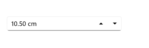
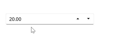
</ContentPage>Custom formats
Customize the display of numeric values by applying specific formats to control the number of decimal digits, as well as adding prefixes and suffixes to the input values.
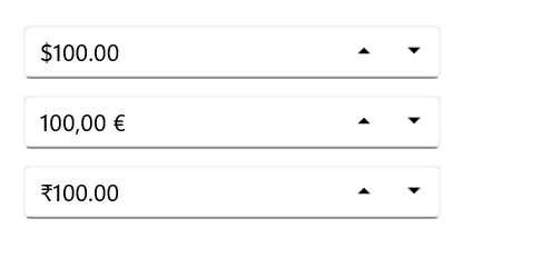
Globalization
The NumericUpDown control automatically formats its values according to the user’s regional or cultural settings, ensuring a localized experience.
Restriction
The .NET MAUI NumericUpDown control accepts only numerical inputs. However, as explained in the following sections, many more restrictions can be imposed.
Limit the number range
Easily set minimum and maximum values to restrict users from entering numbers outside the defined range.
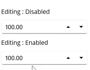
Disable editing
Use the IsEditable property to prevent users from directly modifying the numeric value in the editor.
Prevent an empty editor
Implement data validation and input handling techniques to ensure that users cannot leave the editor empty or enter null values.
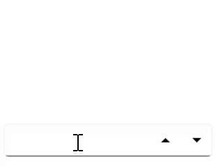
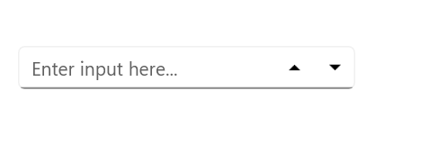
Placeholders
When the input is cleared, display helpful hints with placeholder text to guide users in the NumericUpDown control.
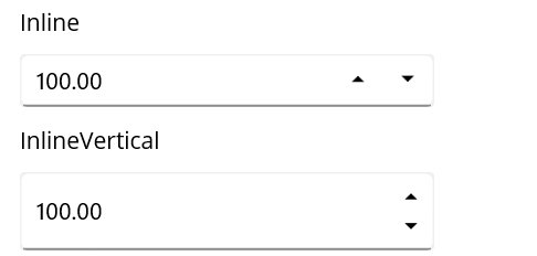
Up-down placement modes
Customize the position of the up and down buttons by setting the UpDownPlacementMode property to Inline for horizontal orientation and InlineVertical for vertical orientation.
Alignment of up and down buttons
Customize the alignment of the up and down buttons to position them to the left, right, or on both sides of the entry field for enhanced usability.

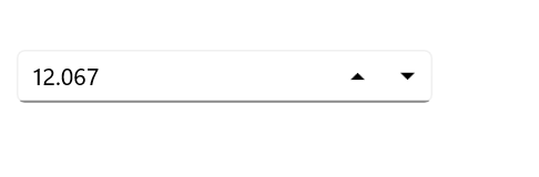
Set maximum decimal digits
Define the number of decimal places displayed in the NumericUpDown control.
Keyboard and mouse interactions
Users can easily adjust the value in the NumericUpDown control by using the arrow keys and the Page Up and Page Down keys. Additionally, while hovering over the control, users can modify the value by rotating the mouse wheel.
Percentage display mode
Users have the option to present values in the NumericUpDown control in various percentage formats:
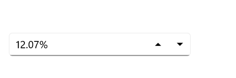
Value
Shows the actual numerical value followed by the percent sign.
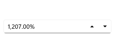
Compute
Displays the computed value along with a percent sign.
 95+ UI controls
200+ interactive .NET MAUI demos
1.8M+ downloads
95+ UI controls
200+ interactive .NET MAUI demos
1.8M+ downloads
.NET MAUI DataViz & UI Controls
Our Customers Love Us


See Real Success Stories
Developers around the world trust Syncfusion’s Essential Studio to simplify complex projects and speed up delivery. With a vast library of UI controls, powerful SDKs, and reliable support, Essential Studio helps teams build enterprise-ready applications with confidence.
Explore Case StudiesIndustry
Software development
75% Cost reduction
50% Faster development
Industry
Utilities (oil and gas)
450+ hours saved
Streamlined processes and hours of development effort saved.
Advanced, flexible features
Empowered users through robust and versatile functionality.
Industry
Software and technology
1000+ of hours saved
Accelerated development with enterprise-ready UI components.
Efficient file management
Streamlined workflows with document libraries without building them from scratch.
Industry
Software and technology
2 Years of delay avoided
Two years of delays prevented with proactive planning.
On-time delivery
Projects delivered on schedule using trusted controls.
Industry
IT services and IT consulting
Improved performance
Large datasets handled with easy customization and quick debugging.
Highly customizable
Plug-and-play controls with quick template integration.
Industry
Professional services
Instant access
Quick availability of features and resources.
Reduced dependencies
Fewer dependencies for faster development.
Rated by users across the globe


Awards
Greatness—it’s one thing to say you have it, but it means more when others recognize it. Syncfusion® is proud to hold the following industry awards.

