.NET MAUI Bottom Sheet Control
- Displays additional content without disrupting the main screen.
- Supports full-screen, half-screen, collapsed, and hidden states.
- Users can swipe to switch between states smoothly.
Trusted by the world’s leading companies

Overview
A bottom sheet control is a user interface component used to display supplementary content or actions in mobile and desktop applications. It slides up from the bottom of the screen allowing users to interact with additional information without navigating away from the main screen.
States
The state feature allows customization of the bottom sheet’s visibility and size, with options for full-screen, half-screen, and collapsed states.

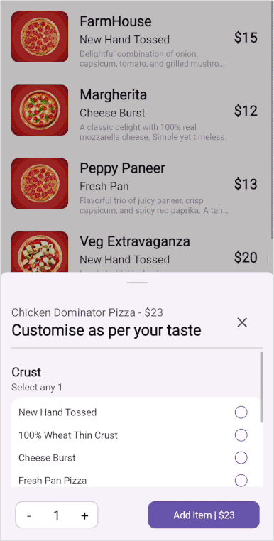
Full expanded
In this state, the bottom sheet will expand to cover the full screen.
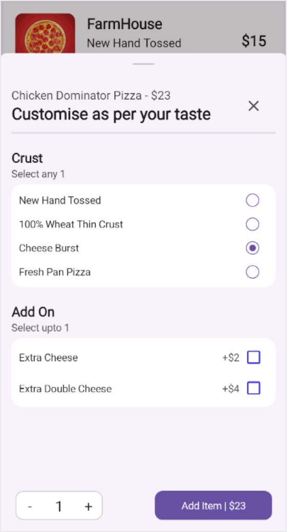
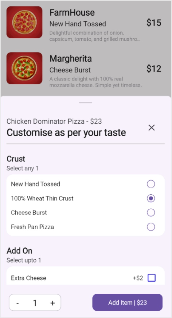
Half expanded
In this state, the bottom sheet will expand to cover half the screen.
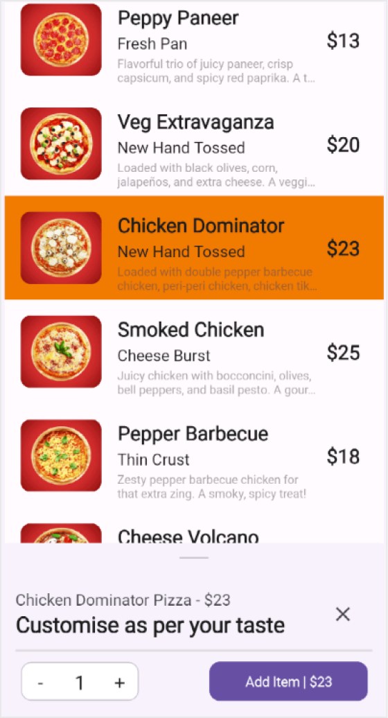
Collapsed
The sheet will remain collapsed at the bottom of the screen.
Adjust the height
The following features allow users to modify the height of the bottom sheet:
Full expanded height
This property is used to adjust the height of the bottom sheet to full screen.
Half-expanded height
This property is used to adjust the height of the bottom sheet to half the screen.

Collapsed height
Used to set the height of the bottom sheet to a collapsed state.
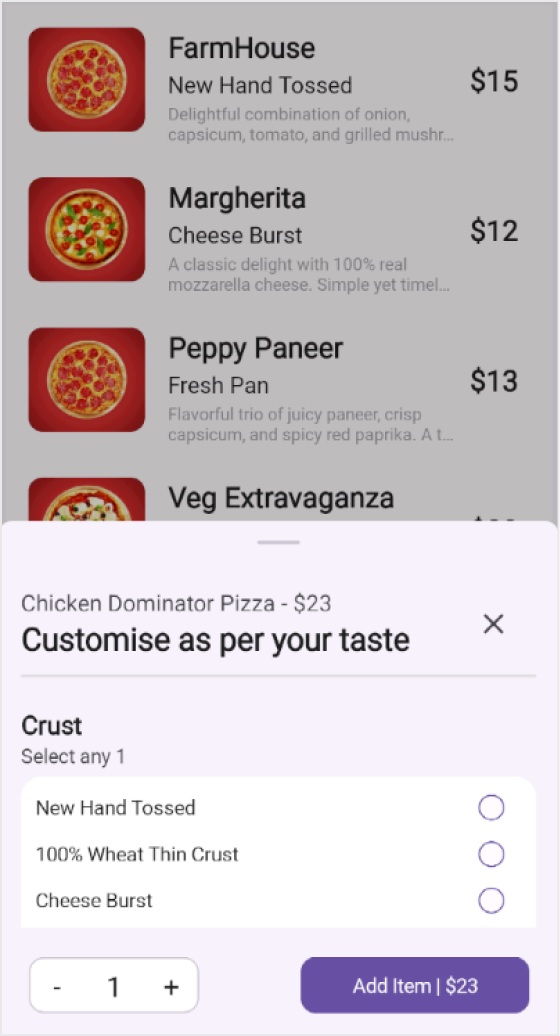
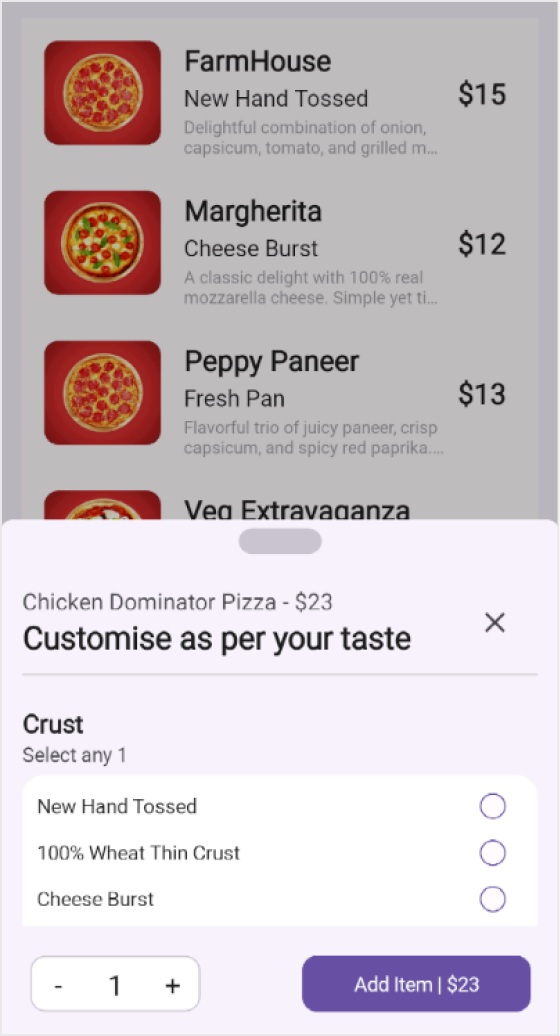
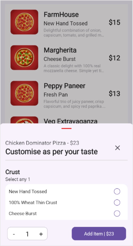
Grabber customization
The bottom sheet control features a grabber UI, which enables users to interact with the bottom sheet by dragging it up and down.

Grabber height and width
This feature is used to adjust the height and width of the grabber.
Grabber corner radius
Allows users to customize the corner radius of the grabber.
Grabber background
Customize the background color of the grabber using this feature.
Swipe gesture
The .NET MAUI Bottom Sheet control’s swiping feature transitions between different states.
 95+ UI controls
200+ interactive .NET MAUI demos
1.8M+ downloads
95+ UI controls
200+ interactive .NET MAUI demos
1.8M+ downloads
.NET MAUI DataViz & UI Controls
Our Customers Love Us


See Real Success Stories
Developers around the world trust Syncfusion’s Essential Studio to simplify complex projects and speed up delivery. With a vast library of UI controls, powerful SDKs, and reliable support, Essential Studio helps teams build enterprise-ready applications with confidence.
Explore Case StudiesIndustry
Software development
75% Cost reduction
50% Faster development
Industry
Utilities (oil and gas)
450+ hours saved
Streamlined processes and hours of development effort saved.
Advanced, flexible features
Empowered users through robust and versatile functionality.
Industry
Software and technology
1000+ of hours saved
Accelerated development with enterprise-ready UI components.
Efficient file management
Streamlined workflows with document libraries without building them from scratch.
Industry
Software and technology
2 Years of delay avoided
Two years of delays prevented with proactive planning.
On-time delivery
Projects delivered on schedule using trusted controls.
Industry
IT services and IT consulting
Improved performance
Large datasets handled with easy customization and quick debugging.
Highly customizable
Plug-and-play controls with quick template integration.
Industry
Professional services
Instant access
Quick availability of features and resources.
Reduced dependencies
Fewer dependencies for faster development.
Rated by users across the globe


Awards
Greatness—it’s one thing to say you have it, but it means more when others recognize it. Syncfusion® is proud to hold the following industry awards.

