
The Xamarin.iOS Rating control is similar to the Android RatingBar control that allows users to select a rating value from a group of visual symbols like stars or emojis.
Provides flexible precision support to handle full, half, or exact values of rating.
Provides complete value for the selected items

Provides accurate value to near half of the selected items

Provides accurate value of the selected item

The control provides two custom view collection options for normal and selected states to change look and feel.
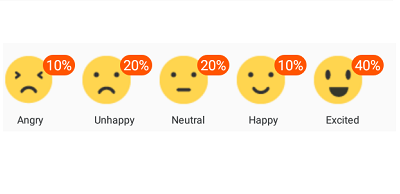
The rating control can also be in read only state; it allows users to only view the control. In this mode, users cannot interact with control.

The rating control provides tooltip that indicates the selected value when the user interacting on it.
Tooltip can be placed at either the bottom or top. You can also view the rating control without tooltip.
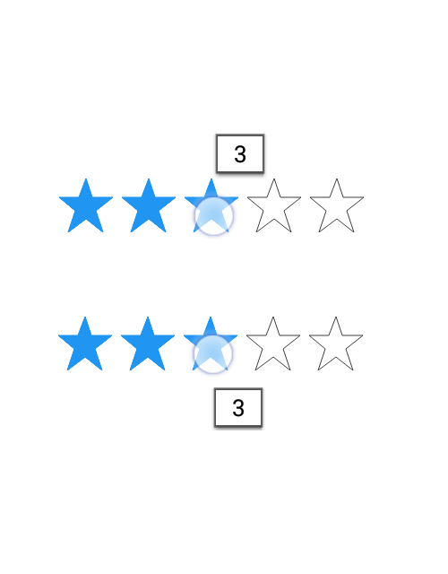
Precision to the tooltip values allows user to know the accurate values in which the control is filled.
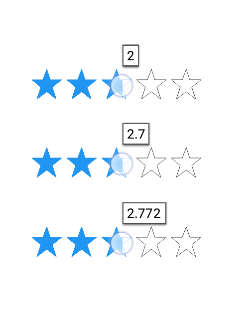
The rating control provides tooltip that indicates the selected value when the user interacting on it.
You can get thick border by customizing the border thickness, if needed
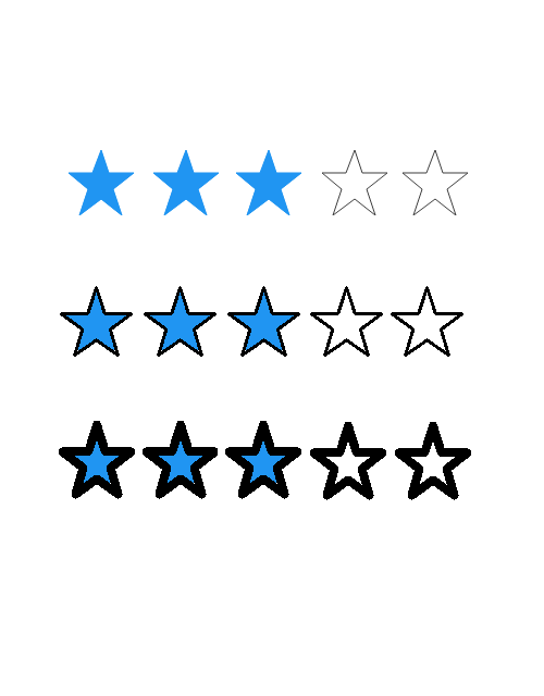
You can make this control more accessible and enhance the accuracy by customizing the item size

Item count can be determined, so users can rate whatever value (e.g., 5 stars, 6 stars, etc.) they desired

The spaces between each item of rating can be specified.

Fill color of the selected and normal states of an item can be customized.
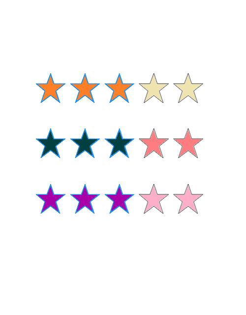
Star’s border color makes the view more attractive. Border color highlights the selected and unselected item’s fill color.

 Documentation
Greatness—it’s one thing to say you have it, but it means more when others recognize it. Syncfusion® is proud to hold the following industry awards.