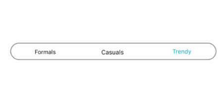
The Xamarin Segmented control is a linear segment made up of multiple segments with each segment functioning as a button. The segments are the same size and allow users to select between multiple contexts.
Depending on your application, different scenarios may require icons, text, or a combination of both for effective communication. The Xamarin.Forms Segmented control supports these three options.

Items populated in the Segmented control will be displayed as text by default.

Display items populated in the Segmented control as icons.

Display items populated in the Segmented control as icons with accompanying text.
When the available space in the Xamarin.Forms Segmented control is not equally distributed, the items beyond the edges of the control can be viewed by scrolling the panel.

Segments can be populated from a collection of strings, views, or a collection of objects in a built-in class.

Set a collection of strings as a data source.

Add custom views or images as segments.

Customize the text or icons om segments, or use other built-in customization options available for the segments. Segment item collections can also be used.
Use icon fonts to avoid icon scalability issues and reduce the app footprint.
![]()
The Xamarin.Forms Segmented control can be customized to behave as a switch with two or more options.

Use a selection strip to indicate the selected item in the Xamarin.Forms Segmented control. Customize the selection strip into many forms.

Set the selection strip as a border to highlight the selected item.

Place the selection strip over a segment item to indicate it is selected. You can customize its color to highlight the item.

Display the selection strip as a line with customizable color and thickness and it positioned at the top of an item.

Display the selection strip as a line with customizable color and thickness and it positioned at the bottom of an item.
The Xamarin.Forms Segmented control supports customizing the segment color, text color, icon size, selection color, and more, enabling the segments to fit your application’s theme.
Easily get started with the Xamarin Segmented Control using a few simple lines of C# code as demonstrated below. Also explore our Xamarin Segmented Control that shows you how to render and configure the Xamarin Segmented Control.
- <buttons:SfSegmentedControl
- HeightRequest="80">
- <segmentCollection:List x:TypeArguments="x:String">
- <x:String>1</x:String>
- <x:String>2</x:String>
- <x:String>3</x:String>
- </segmentCollection:List>
- </buttons:SfSegmentedControl>
- private SfSegmentedControl segmentedControl;
- public MainPage()
- {
- InitializeComponent();
- segmentedControl = new SfSegmentedControl();
- segmentedControl.HeightRequest = 80;
- List<string> list = new List<string>
- {
- "1","2","3","4","5","6"
- };
- segmentedControl.ItemsSource = list;
- stack.Children.Add(segmentedControl);
- this.Content = stack;
- }
The Syncfusion Xamarin Segmented Control provides the following:
You can find our Xamarin Segmented Control demo here.
No, this is a commercial product and requires a paid license. However, a free community license is also available for companies and individuals whose organizations have less than $1 million USD in annual gross revenue, 5 or fewer developers, and 10 or fewer total employees.
A good place to start would be our comprehensive getting started documentation.
 Documentation
Greatness—it’s one thing to say you have it, but it means more when others recognize it. Syncfusion® is proud to hold the following industry awards.