The Xamarin.Android Rotator control is a UI that provides an interactive way to rotate images and navigate through a collection of views. It supports various navigation options like swiping, auto-play, and tapping.
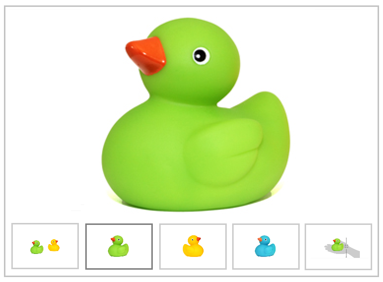
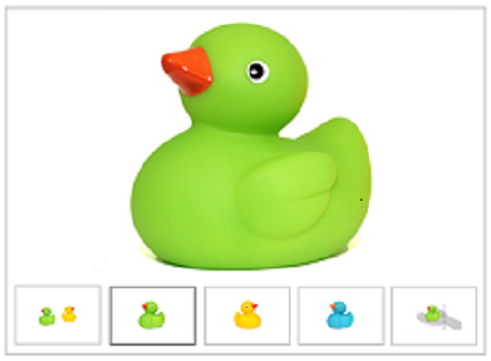
The rotator control supports various modes such as dots and thumbnails for navigating easily to the desired item.
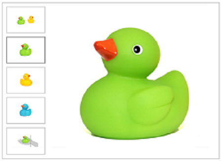
Thumbnails representation of the items provides simple preview on items, so users can directly navigate to required items by tapping.

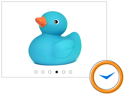
Simple dots representation will allow selected item to occupy full space; the highlighted dot represents count and selected index

User can navigate to previous item or next item by simple swiping from the left to right or the right to left, respectively. This option provides good user experience on navigation

Navigation can be performed either vertical or horizontal sliding animation. Here, the horizontal option represents the left to right arrangements of item whereas the vertical option represents the top to bottom arrangement of items.


Dot and thumbnail representations can be displayed at any one of the four sides such as left, right, top, and bottom. In mobile devices, the top or bottom placement provides more horizontal space to display the selected items.
Looping option helps users to navigate to first item when they reach last time. This will provide better review experience when the control is loaded with more items.

The control can be used as slide show when the user wants to display the set of items in defined interval of time and no interactions.

The interval duration for auto play can be customized.

A user can perform any command with selected item by placing the button (or any view) on items, because the rotator control is not limited to load only image data, a collection of custom view also can be loaded as rotator items.
 Documentation
Greatness—it’s one thing to say you have it, but it means more when others recognize it. Syncfusion® is proud to hold the following industry awards.