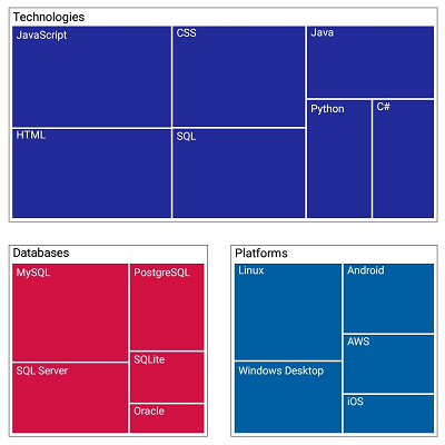
The Xamarin.Android TreeMap control is a data visualization component that provides a simple and effective way to visualize flat or hierarchical data as clustered rectangles with a specific, weighted attribute determining the size of each rectangle. This control has highly customizable features such as displaying hierarchical and flat-level data, legends, different layouts, and color mapping.

The levels of a tree map can be categorized into two types, TreeMapFlatLevel and TreeMapHierarchicalLevel, to visualize data.

Visualize the levels for a flat data collection. The items source set to the tree map must be a flat data collection.

Visualize the levels for a hierarchical data collection that contains tree-structured data. The items source set to the tree map must be a hierarchical data collection.
A tree map contains groups of data collections; each group has one or more leaf nodes. Each leaf node is displayed as a rectangle, sized and colored according to values that you assign.

Leaf node borders can be customized to enhance readability.

Gaps within the group of leaf nodes can be customized to enhance readability.

The TreeMap control provides template support for tree map nodes, which allow any type of custom template to be created with any type of view element.
Color mapping supports categorizing the nodes by customizing their colors based on the underlying values.

Colors can be applied to nodes by comparing their values with a desired numeric range. For example, colors can be applied to countries based on their population growth.

Colors can be applied to nodes by comparing their values with desaturation color order. For example, transparent color can be applied to countries based on their population variation from higher to lower.

A single color can be applied to entire nodes.

Each node can be colored with each color specified in palette color mapping.
The tree map provides different types of layout options to view the child nodes in effective ways.

The data is visualized in this layout in the form of square-like rectangles with the best aspect ratio.

The data is visualized in this layout in the form of long, thin rectangles, which can be displayed either vertically or horizontally, with high aspect ratio.

This layout creates rectangles with high aspect ratio and displays them horizontally.

This layout creates rectangles with high aspect ratio and displays them vertically.
A legend is used to add additional information for interpreting a tree map with various colors, shapes, or other identifiers.

The type of legend icon can be changed to built-in shapes such as circles, rectangles, or custom shapes to indicate the node color.

The position of a legend can be changed or moved to any place inside a tree map.
Data labels can be easily annotated to improve the readability of particular nodes’ names.

The look and feel of the default labels can be customized using the font style, size, and color properties.

Labels can be aligned smartly within the node boundaries and can be trimmed, wrapped, or hidden to avoid labels overlapping.
Tooltips display pop-ups with additional information about the nodes when they are tapped.

 Documentation
Greatness—it’s one thing to say you have it, but it means more when others recognize it. Syncfusion® is proud to hold the following industry awards.