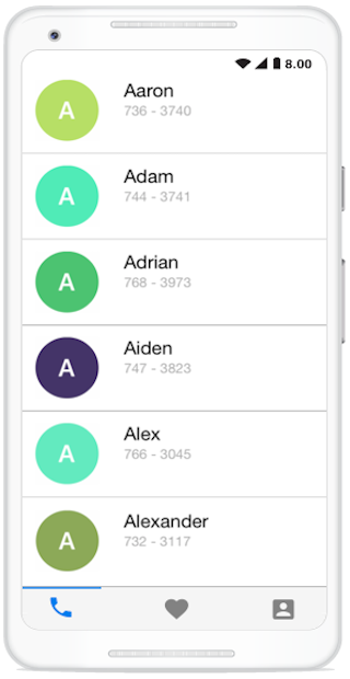
The Xamarin.Android Tabbed View is a simple and intuitive interface for tab navigation in mobile application, where users can explore and switch between different tabs.
Tab view will display a list of tabs that will hold required views. Tab items can be populated either by adding or binding them. Tab view can hold any number of tab items. Users can define visible tab count and remaining tabs can be accessed through a drop-down or simply by scrolling to make them visible.

Only the selected tab item’s view can occupy the entire content area. Users can explore and switch among different views by simply tapping on the header or swiping.

The Tab header panel can be placed at either top or bottom.

We may have various scenarios where icons, text, or text with icons is more optimal, so tab view comes with all these options.
![]()
The tab view control has a provision to customize the header color, text color, icon size, selection color, etc., so thorough customization of the tab view can be done to fit your application’s theme.
Custom view support has been added to tab item header so you can provide your own view. For example, an extra label can be added to display simple information about the view.

Use the built-in icon font support of tab view to get rid of icon scalability issues and reduce app footage by avoiding solid images.

 Documentation
Greatness—it’s one thing to say you have it, but it means more when others recognize it. Syncfusion® is proud to hold the following industry awards.