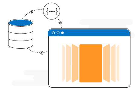
The Xamarin.Android Carousel View control is an intuitive interface for navigating through a collection of views with and without scaling and rotation transformations.
The default view of carousel is an intuitive interface used to navigate through a collection of views with offset images, scaling, and rotation.


The rotate option helps users to set the rotation angle of non-selected items.

The scale option helps users to change the size of non-selected items.
The carousel control allows users to populate collections of views in a horizontal linear layout.

The carousel control accepts templates for carousel items that help you to change the look of the item used in it.

The load more option enables users to load a subset of data in carousel. This helps users to improve initial loading performance when populating huge items.

The carousel control has been designed with virtualization in mind, so you can get just the weight of the grid app when loading the huge view collection.

Data binding works out of the box for the most popular data sources. The carousel control has been designed with an MVVM pattern in mind for every aspect.

The carousel control has the option to set the space between non-selected items and the selected item.

The linear view has the option to set space between all items.
 Documentation
Greatness—it’s one thing to say you have it, but it means more when others recognize it. Syncfusion® is proud to hold the following industry awards.