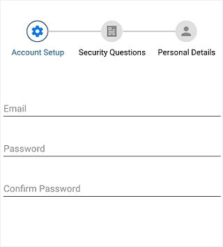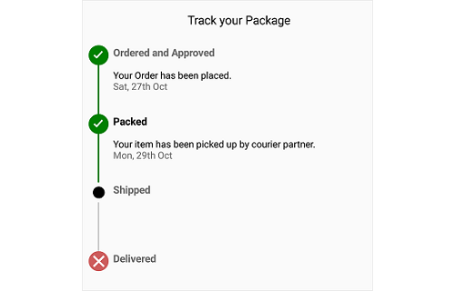
The Xamarin StepProgressBar is a control that indicates the progress of a multiple step (state) process, such as new user registration or package status tracking. You can customize its appearance by changing the step shape, step content, progress bar color, and more.
Visualizes the progress of a multi-step process in horizontal or vertical orientation.


A step has three statuses: Not started, in progress, and completed.

A step can contain description on either side. Primary description will be on the right or bottom of the step and secondary description will be on the left or top of the step. These descriptions can be customized with different formatting styles.

The shape of a step marker can be a circle or a square.

Customize the step content with numbers, ticks, crosses, dots, or images.

Each status of the step progress bar can be customized by defining an individual style to it. Marker color, marker shape type, marker content color, marker content type, marker stroke color, marker stroke width, marker size, marker content size, progress line color, and font customization can be defined for a style.

 Documentation
Greatness—it’s one thing to say you have it, but it means more when others recognize it. Syncfusion® is proud to hold the following industry awards.