
The WinUI Range Slider is a highly interactive UI control, allowing users to select a smaller range from a larger data set. The range can be selected by moving the thumb along the track. It provides rich features such as labels, ticks, dividers, thumb styles, and tooltips.
Easily customize label styles. Customize the format, render them for specific intervals, and add prefixes and suffixes. You can also visualize values as text, like Low, Medium, High.

Set both major and minor ticks in the axis. Use major ticks to show the intervals clearly and minor ticks to help choose values between two intervals easily. You can also customize the positions of tick marks.

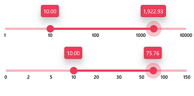
Show any numeric scale range with intervals. Users can show the range with custom or logarithmic intervals.
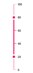
Render the Range Slider in both vertical and horizontal orientations.
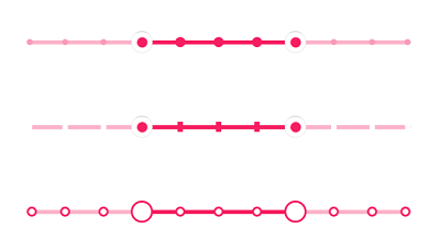
Render dividers in each interval to show the ranges in an intuitive way. Customize the size, shape, and position of the dividers.
Select a numeric value by dragging the thumb. Customize the thumb shapes with built-in shapes or a custom thumb. Add text or an icon inside the thumb using a data template.
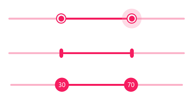
Use tooltips to indicate clearly the current selection during interaction. Customize the format, whole text, and visibility using the built-in APIs. You can also place the tooltip on the top or bottom of the track and show the tooltip on both thumbs or only on the active thumb.
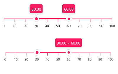
You can select only discrete numeric values if needed.

Right-to-left rendering support is available for users working in RTL languages like Hebrew and Arabic.

The WinUI Range Slider is easily accessed by keyboard.
Greatness—it’s one thing to say you have it, but it means more when others recognize it. Syncfusion® is proud to hold the following industry awards.