
The ASP.NET Core Ribbon control provides a structured and easy-to-use user interface for users to access different features and functions using a series of tabs, improving user experience and efficiency.

Provides a structured way to organize and group related functions, improving user experience by enabling quick access to specific features within categorized sections. Each group contains a launcher button that reveals additional functions, allowing users to explore and utilize more tools efficiently.

The ASP.NET Core Ribbon offers a simplified mode that organizes items and groups into a single row for improved usability and reduced clutter. End users can quickly navigate to other commonly used items in the overflow menu and switch to normal mode using built-in toggle button.

Several built-in support items, such as buttons, checkboxes, dropdown buttons, split buttons, combo boxes, and more can be customized and used to execute specific actions. Three size modes: large, medium, and small, are supported.
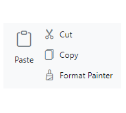
Use different sized buttons to showcase content and icons in a visually appealing and interactive manner.
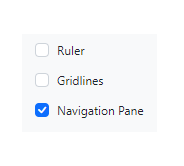
Enables users to toggle between checked and unchecked states, caption the checkbox and position the label either before or after the checkbox.
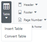
The dropdown button item functions like a regular button, but includes a dropdown menu that displays menu items.
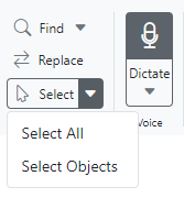
The split button item combines the functionality of a button with a dropdown menu, allowing users to perform a default action and access additional options.

The combobox item combines a drop-down list with an editable textbox, enabling users to select from predefined pop-up list options.
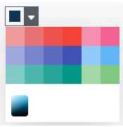
The color picker ribbon item enables users to select colors from a palette or define custom colors.

In addition to the existing built-in items, gallery items allow users to perform specific actions by displaying a collection of related items, including icons, content, or images.
The ASP.NET Core Ribbon supports templates to customize the ribbon items with any non-built-in items or HTML content.
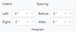

The contextual tab allows users to display ribbon tabs on demand based on their needs. Similar to the normal ribbon tabs, it supports adding all built-in and custom ribbon items to execute specific actions.
The help pane template, positioned at the right side of the Ribbon, enables users to access help content typically for actions such as managing document permissions, sharing functions, and more.
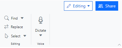

KeyTips enable users to quickly access the tabs or ribbon items using defined unique key tips (up to 3 characters). To display, press Alt + Windows/Command keys, and close or traverse back by pressing the Esc key.
The ASP.NET Core Ribbon control supports tooltips to display information when hovering over items, offering users additional details, enhancing user experience.

Supports a built-in menu that allows you to add file-related actions easily.
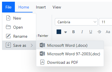
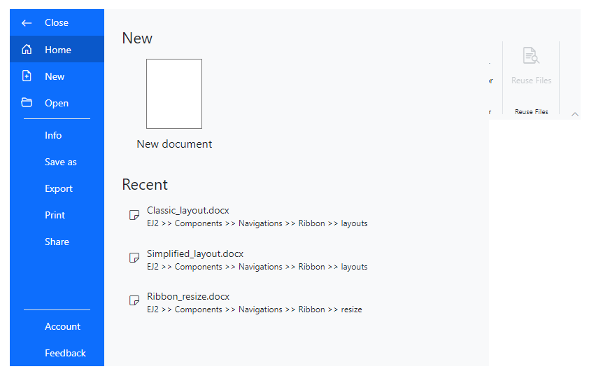
In addition to the traditional file menu, the backstage view displays information such as application settings, user information, etc. The backstage options are displayed on the left, while the content of each option is shown on the right.
The Ribbon efficiently manages space by expanding or collapsing groups, with larger groups collapsing first during resizing. Users can customize the order of groups according to their needs for a personalized Ribbon.

The ASP.NET Core Ribbon supports these built-in themes: Tailwind CSS, Bootstrap 5, Bootstrap 4, Bootstrap, Material, Fabric, Fluent, and high contrast. Users can customize one of these built-in themes or create new themes to achieve their desired look and feel by simply overriding SASS variables or using the Theme Studio application.
Easily get started with the ASP.NET Core Ribbon using a few simple lines of C# code example as demonstrated below. Also, explore our ASP.NET Core Ribbon example that shows you how to render and configure the ASP.NET Core Ribbon.
- @using Syncfusion.EJ2
- @using Syncfusion.EJ2.Navigations
- @using Syncfusion.EJ2.Ribbon
-
- @{
- List<MenuItem> pasteOptions = new List<MenuItem>() { new MenuItem { Text = "Keep Source Format" }, new MenuItem { Text = "Merge format" }, new MenuItem { Text = "Keep text only" } };
- List<MenuItem> tableOptions = new List<MenuItem>() { new MenuItem { Text = "Insert Table" }, new MenuItem { Text = "This device" }, new MenuItem { Text = "Convert Table" }, new MenuItem { Text = "Excel SpreadSheet" } };
-
- List<MenuItem> menuItems = new List<MenuItem>() {
- new MenuItem { Text = "New", IconCss = "e-icons e-file-new", Id="new" },
- new MenuItem { Text = "Open", IconCss = "e-icons e-folder-open", Id="Open" },
- new MenuItem { Text = "Save as", IconCss = "e-icons e-save", Id="save" }
- };
- }
-
- <div id="control-section">
- <ejs-ribbon id="ribbon">
- <e-ribbon-filemenusettings visible="true" menuItems=menuItems></e-ribbon-filemenusettings>
- <e-ribbon-tabs>
- <e-ribbon-tab header="Home">
- <e-ribbon-groups>
- <e-ribbon-group header="Clipboard" orientation=Column>
- <e-ribbon-collections>
- <e-ribbon-collection id= "paste-collection">
- <e-ribbon-items>
- <e-ribbon-item type="SplitButton" id="pastebtn" allowedSizes=Large>
- <e-ribbon-splitButtonSettings iconCss="e-icons e-paste" content="Paste" items=pasteOptions></e-ribbon-splitButtonSettings>
- </e-ribbon-item>
- </e-ribbon-items>
- </e-ribbon-collection>
- <e-ribbon-collection id= "cutcopy-collection">
- <e-ribbon-items>
- <e-ribbon-item type="Button">
- <e-ribbon-buttonsettings iconCss="e-icons e-cut" content="Cut"></e-ribbon-buttonsettings>
- </e-ribbon-item>
- <e-ribbon-item type="Button">
- <e-ribbon-buttonsettings iconCss="e-icons e-copy" content="Copy"></e-ribbon-buttonsettings>
- </e-ribbon-item>
- </e-ribbon-items>
- </e-ribbon-collection>
- </e-ribbon-collections>
- </e-ribbon-group>
- </e-ribbon-groups>
- </e-ribbon-tab>
- <e-ribbon-tab header="Insert">
- <e-ribbon-groups>
- <e-ribbon-group header="Tables" >
- <e-ribbon-collections>
- <e-ribbon-collection>
- <e-ribbon-items>
- <e-ribbon-item type="DropDown">
- <e-ribbon-dropDownSettings iconCss="e-icons e-table" content="Table" items=tableOptions></e-ribbon-dropDownSettings>
- </e-ribbon-item>
- </e-ribbon-items>
- </e-ribbon-collection>
- </e-ribbon-collections>
- </e-ribbon-group>
- </e-ribbon-groups>
- </e-ribbon-tab>
- </e-ribbon-tabs>
- </ejs-ribbon>
- </div>
 Documentation
Greatness—it’s one thing to say you have it, but it means more when others recognize it. Syncfusion® is proud to hold the following industry awards.