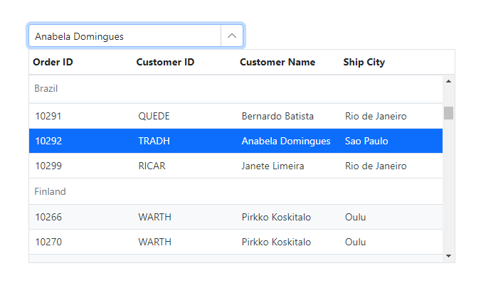
The ASP.NET Core MultiColumn ComboBox is a dropdown control that displays items in a detailed, table-like format with multiple columns, offering more information than standard dropdown lists. It enhances user interaction with features such as data binding from various sources, item grouping, and advanced filtering for quick searches. Additionally, it supports sorting, virtualization for large datasets, and customizable templates for headers, footers, and list items.


Bind data from various sources, including JavaScript object arrays and remote data sources, using adapters such as OData, OData V4, URL, JSON, and Web APIs. Efficiently manage data and customize data requests, and process with the help of the data manager.
Organize items into categories within the MultiColumn ComboBox to enhance data visualization and improve the user experience. Grouping related items together allows users to filter and select items more efficiently.


The ASP.NET Core MultiColumn ComboBox offers built-in filtering support with a comprehensive set of filtering configurations to meet various application needs. The filter search can be customized to be case-sensitive and performed with a minimum number of query string characters.
Easily sort items in ascending or descending order. The MultiColumn ComboBox supports single-column and multi-column sorting for better data organization and user experience.

Enhance the performance of the MultiColumn ComboBox by displaying only the items currently in view. Virtualization enables smooth scrolling and efficient handling of large datasets, minimizing load times.

Customize the appearance of the drop-down list to create a unique look by modifying the header, footer, and list items using templates.

Design custom headers for the pop-up list using header templates.

Customize the appearance of row items in the pop-up list with item templates.

Design your own custom static footers for the pop-up list using footer templates.
The ASP.NET Core MultiColumn ComboBox supports these built-in themes: Tailwind CSS, Bootstrap 5, Bootstrap 4, Bootstrap, Material, Fabric, Fluent, and high contrast. Users can customize these built-in themes or create new themes to achieve their desired look and feel by simply overriding SASS variables or using our Theme Studio application.
Fully supports WAI-ARIA accessibility guidelines to work with screen readers and assistive devices.
Follows WAI-ARIA best practices for implementing keyboard interaction.
Designs the UI visual elements, such as foreground and background color, line spacing, text, and images, based on the WCAG 2.0 standard.
Supports right-to-left (RTL) direction for users working with RTL languages like Hebrew, Arabic, or Persian.
The ASP.NET Core MultiColumn ComboBox control offers APIs for customizing its appearance and behavior, as well as templates for changing its look and feel. With these APIs, developers can create a unique and highly customized OTP Input that fits seamlessly into their applications.
 Documentation
Greatness—it’s one thing to say you have it, but it means more when others recognize it. Syncfusion® is proud to hold the following industry awards.