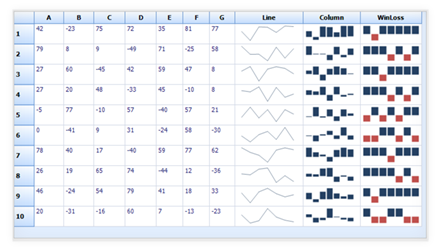
A sparkline is a type of information graphic characterized by its small size, high data density, and minimal server load time. It presents trends and variations in a very condensed fashion.
A sparkline does not contain an axis scale and is intended to give a high-level overview of what happened to data over time.
A sparkline can display a trend based on adjacent data in a clear and compact graphical representation. The purpose of a sparkline is to quickly see the data range difference with high-density data represented in a simple graphic.
The following screenshot shows three types of sparklines drawn inside the grid control cell based on row values.

The marker feature supports high, low, start, end, and negative data points in line, column, and win-loss sparklines. You can choose the marker color for data points.


 Documentation
Greatness—it’s one thing to say you have it, but it means more when others recognize it. Syncfusion® is proud to hold the following industry awards.