Trusted by the world’s leading companies

Overview
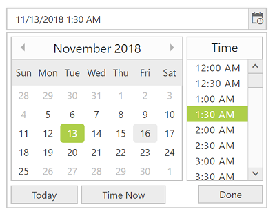
The ASP.NET Web Forms DateTime Picker control is used to enter or select date and time values from a pop-up calendar and dropdown time list. It provides month, year, and decade views for quick navigation to the desired date.

Custom date and time format
Change the default culture’s specific date and time format in the text box to improve readability or enter the value properly.


Date and time range
You can restrict the DateTime Picker, so that only date and time values within a specific range can be entered or selected by specifying the min and max date time options.
Disable date time ranges
Disable any date in the DateTime Picker to show it as an inactive date. Easily prevent weekends and holidays from selection by disabling them in the pop-up calendar.


DateTime Picker in multiple languages
Update the culture-specific datetime format and first day of the week, and translate the names of months, days,and today button text to any supported language with our globalization feature.
Date and time validation
Allow only valid values to be entered in the DateTime Picker control’s input by validating them with disabled, out-of-min, and out-of-max date-time.


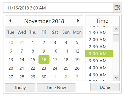
Change the first day of the week
Auto-update the first day of the week based on the specified culture or change it based on your application.
Web accessibility
- Fully supports WAI-ARIA accessibility that allows the DateTime Picker to be accessed by screen readers and assistive devices.
- Follows WAI-ARIA best practices for implementing keyboard interaction.
- Uses WCAG 2.0 based design for UI element visuals such as foreground color, background color, line spacing, text, and images
- Supports right-to-left (RTL) direction for users working with right-to-left languages like Hebrew and Arabic.


Responsive UI
The ASP.NET Web Forms DateTime Picker provides a responsive mode that gives an adaptive UI appearance for mobile devices.
Developer-friendly APIs
You can control all UI elements and their behaviors according to the end user’s requirements using a rich set of developer-friendly APIs.
Built-in themes
The ASP.NET Web Forms DateTime Picker supports several built-in themes such as material, bootstrap, office-365, and high contrast. Users can customize any one of these built-in themes or create new themes to achieve their own desired look and feel by using our Theme Studio application.
75+ ASP.NET UI CONTROLS
Our Customers Love Us


 Documentation
Awards
Greatness—it’s one thing to say you have it, but it means more when others recognize it. Syncfusion® is proud to hold the following industry awards.


