Trusted by the world’s leading companies

Overview
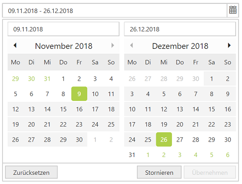
The ASP.NET Web Forms DateRangePicker control allows an end user to select start and end date values as a range from a calendar pop-up or by entering the value directly in an HTML input text box.

Predefined set of date ranges
Define the preset of ranges (like last 30 days or last week) to set date ranges frequently used by the end users.


Format date
The DateRangePicker control’s input value is set to be a custom date formatted apart from the default culture-specific date format.
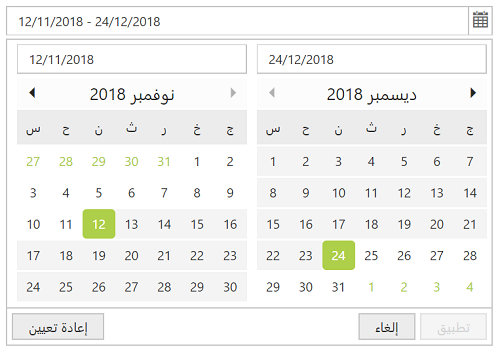
DateRangePicker with multiple language
The ASP.NET Web Forms DateRangePicker supports globalization to translate the names of months days, and the today button text to any supported language. The date format of the week are set to a specific culture.


Date selection within a range
Enter or select a value within a specific range of dates by defining the min and max properties.
Date-range validation
Allow only valid values to be entered in the DateRangePicker control’s input by validating them with disabled or out-of-min and out-of-max date ranges. The invalid and out-of-date-range values are set in a disabled state to prevent users from entering them or selecting them from a date range.


Customize DateRangePicker
You have complete control over the appearance of the component. Customize the style based on your application’s look and feel.
Web accessibility
- Fully supports WAI-ARIA accessibility so that the DateRangePicker is accessible by on-screen readers and assistive devices.
- Follows WAI-ARIA best practices for implementing keyboard interaction.
- Designed the UI element visuals such as foreground color, background color, line spacing, text, images based on WCAG 2.0.


Mobile-friendly UI
The ASP.NET Web Forms DateRangePicker provides a responsive mode that gives an adaptive UI appearance for mobile devices.
Developer-friendly APIs
You have control over all the UI elements and behaviors of the DateRangePicker with a rich set of developer-friendly APIs to provide the best experience to your end users.
Built-in themes
The ASP.NET Web Forms DateRangePicker supports several built-in themes such as material, bootstrap, office-365,and high contrast. Users can customize any one of these built-in themes or create new themes to achieve their own desired look and feel by using our Theme Studio application.
75+ ASP.NET UI CONTROLS
Our Customers Love Us


 Documentation
Awards
Greatness—it’s one thing to say you have it, but it means more when others recognize it. Syncfusion® is proud to hold the following industry awards.


