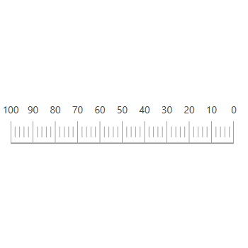
The WPF Linear Gauge is a data visualization component that helps display numerical values on a linear scale. It has highly customizable features such as scales, pointers, and ranges. Also, it lets you create a value indicator, pressure gauge, thermometer, ruler, progress bar, KPI, and more.
The axis of a WPF Linear Gauge is a linear scale, where a set of values can be plotted based on any business logic. The appearance of a scale can be customized easily. You can change linear scale orientation to either horizontal or vertical.

Customize the look and feel of the default labels using the font style, size, and color properties. Prefix or suffix text also can be added to the label.

Define your own style for minor and major ticks using the size, color, and thickness properties.

You can change the scale direction to backward (inversed) or forward.
A range is a visual element that helps to quickly visualize a value that falls on a linear scale.

You can change or move the range position to any place in a gauge.

Range thickness varies based on values, visualizing the importance of actual usage and enhancing readability.

Add multiple ranges to a scale to show color variations in a gauge.

The bar pointer is used to point out the current value from the start value of a linear scale. Change or move the position of the bar pointer to any place in the gauge.

You can point out the current value in the linear scale by using symbol pointers. Change the pointer type to built-in shapes such as triangles, inverted triangles, squares, or circles to highlight the values.
 Documentation
Greatness—it’s one thing to say you have it, but it means more when others recognize it. Syncfusion® is proud to hold the following industry awards.