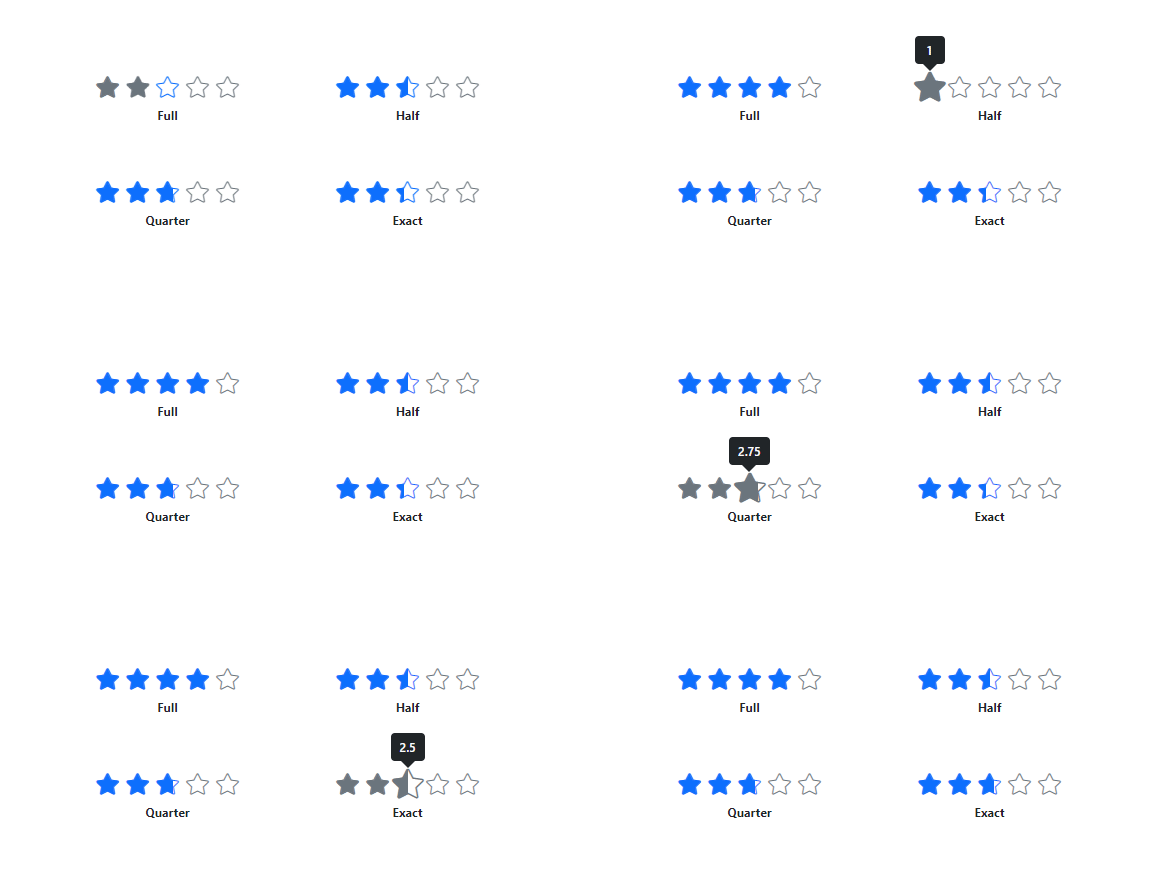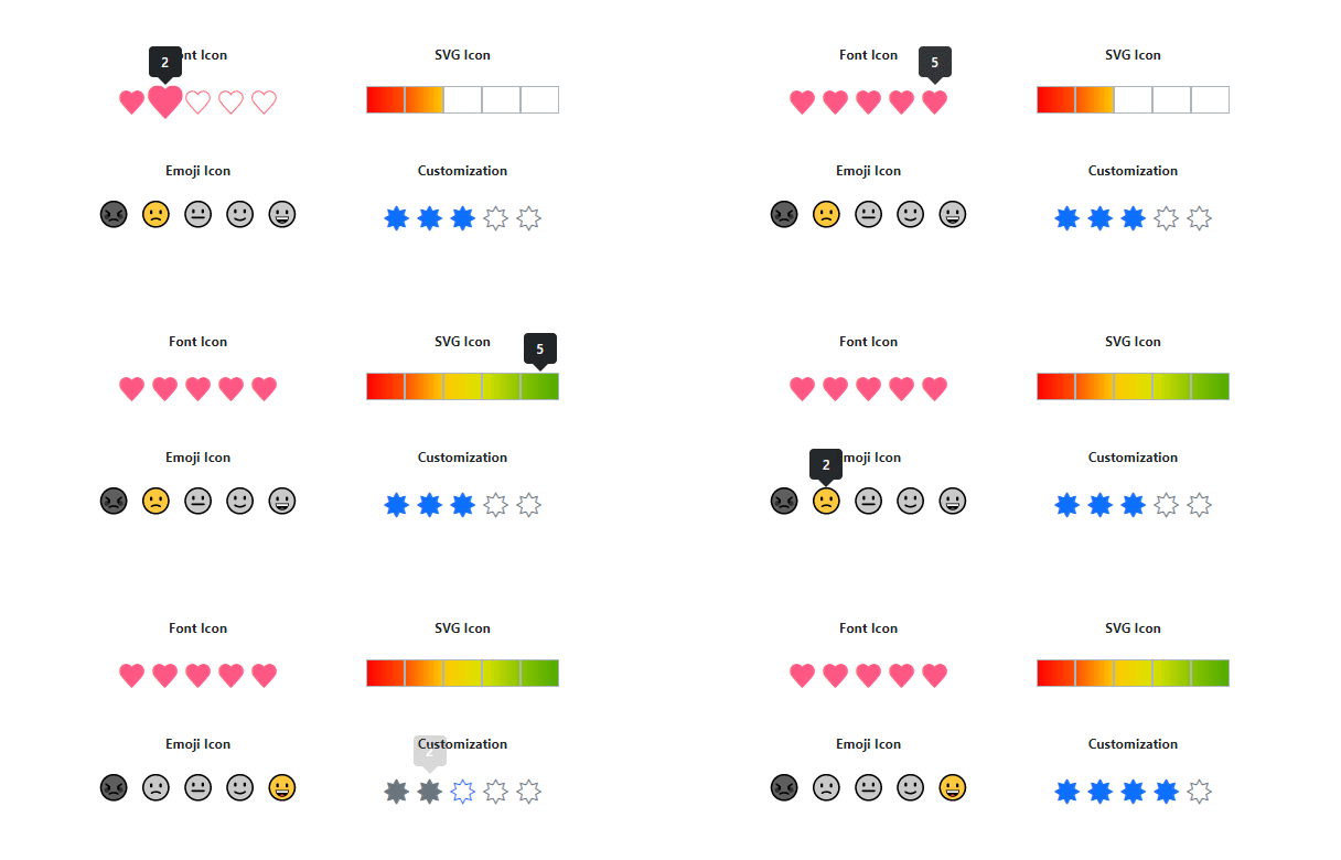
The Blazor Rating is a highly customizable component to rate products or services with precise and accurate values by using built-in precision modes. The customization supported in the Blazor Rating component makes rating more expressive instead of just showing numeric values.

The Blazor Rating component has several precision modes, which are listed below.
Full: The rating value is displayed in multiples of 1 (whole number).Half: The rating value is displayed in multiples of 0.5 (half).Quarter: The rating value is displayed in multiples of 0.25 (quarter).Exact: The rating value is displayed in multiples of 0.1 (fraction).
The Blazor Rating component supports tooltips to provide more information about the rating. Tooltips can be customized using the template to provide more expressive content rather than the item’s numerical values.

Labels provide additional information about the current rating value. Labels can be customized using the template and placed in different positions around the rating.


The Blazor Rating component supports templates to customize rating items in different ways. Custom icons can be in the form of emojis, hearts, stars, SVG, and more.
The Blazor Rating component supports right-to-left (RTL) rendering.

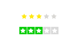
Customize rating items’ spacing, rated/unrated fill color, border color, and more, enabling it to fit the application’s needs.

Customizing the size of the items makes the Rating component more accessible and accurate.

Adjust the space between items in the Rating component.

Customize the fill color of rated and unrated states of an item.

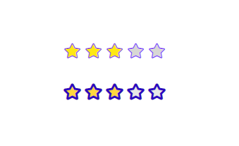
Customizing the border color and stroke thickness of rated and unrated items enhances their appearance and makes them stand out.
The Blazor Rating supports these built-in themes: Tailwind CSS, Bootstrap 5, Bootstrap 4, Bootstrap, Material, Fabric, Fluent, and high contrast. Users can customize one of these built-in themes or create new themes to achieve their desired look and feel by simply overriding SASS variables or using our Theme Studio application.
Tab: Navigate to the Rating component.Left Arrow: Decrease the rating value.Right Arrow: Increase the rating value.Up Arrow: Increase the rating value.Down Arrow: Decrease the rating value.Easily get started with the Blazor Rating using a few simple lines of C# code example as demonstrated below. Also explore our Blazor Rating example that shows you how to render and configure the Blazor Rating.
- @using Syncfusion.Blazor.Inputs
-
- <SfRating Value="3" />
The Rating component is also available in Angular, React, Vue, and JavaScript frameworks. Check out the component on other platforms using these links:
 Documentation
Greatness—it’s one thing to say you have it, but it means more when others recognize it. Syncfusion® is proud to hold the following industry awards.