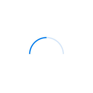
The Blazor ProgressBar indicates the progress of a task with customizable visuals. It includes features to visualize progress in rectangular and circular shapes, determinate and indeterminate states, segments, and customized ranges in different colors. It also supports animation.
Visualize progress in different shapes (rectangle, circle, and semi-circle) to give a unique appearance to your app design.


Visualize the progress in different modes.

Use the determinate mode progress bar when progress can be estimated.

Use the indeterminate mode progress bar when progress cannot be estimated or calculated. It can be combined with determinate mode to let users know that the app is estimating the progress before the actual progress starts.

Uses a secondary progress indicator when the primary task depends on the secondary task. This will allow users to visualize both primary and secondary tasks’ progress simultaneously.
Avoid writing several lines of code to create and position multiple progress bars: just divide a progress bar into multiple segments using a single API to visualize the progress of multiple sequential tasks.

Customize the start and sweep angles of circular progress to give a unique style to the circular progress bar.

Add any view to the center of a circular progress bar to: indicate the completion of the progress; add start, pause, or cancel buttons to control the progress interactively; add an image that indicates the actual task in progress; add custom text that conveys the progress.

Along with visualizing the progress of a task, users can also visualize multiple ranges with gradient colors or solid colors that are mapped to each range to enhance the readability.

The appearance of a Blazor progress bar is highly customizable.

Tweak the thickness of the track and progress indicator to render the Blazor progress bar with different appearances.

Apply appealing colors to the track and progress indicator to match your app theme.

The corner radius of the Blazor progress bar can be customized.
Easily get started with the Blazor ProgressBar using a few simple lines of C# code example as demonstrated below. Also explore our Blazor ProgressBar Example that shows you how to render and configure the progress bar in Blazor.
- @using Syncfusion.Blazor
- @using Syncfusion.Blazor.ProgressBar
-
- <SfProgressBar Type="ProgressType.Linear" Height="60" Value="100" Minimum="0" Maximum="100">
- <ProgressBarAnimation Enable="true" Duration="2000" Delay="0" />
- </SfProgressBar>
ProgressBar is also available in JavaScript, Angular, React and Vue frameworks that are built from their own TypeScript libraries. Check out the different ProgressBar platforms from the below links,
 Documentation
Greatness—it’s one thing to say you have it, but it means more when others recognize it. Syncfusion® is proud to hold the following industry awards.