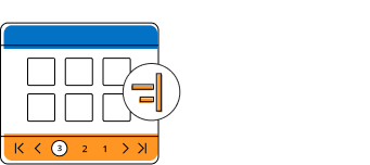
The Blazor Pager component has an option to split the data set into sectioned pages for a great experience by viewing them page by page through an intuitive UI. Navigation is the key role of this component and it can be done with built-in numeric elements and buttons that can also be customized with rich APIs.

The Blazor Pager has an option to customize the default settings using its rich APIs. It allows users to customize or control the number of items to be displayed in a single page, number of numeric elements to be displayed for navigation, total number of items in the data set or data collection, and the page to be viewed currently in the pager numeric element. It also has more than enough methods and events to perform external actions to access the Pager component.


The Pager has an option to show a different page size as a list in the pager dropdown which helps to dynamically change the page size of each page. An initially defined page size is selected by default in the pager dropdown.
The Blazor Pager component allows you to customize or change the appearance of the entire Pager UI with HTML elements or other components.


The Blazor Pager acts intelligently and changes its UI responsively based on the Pager dimensions. Its optimized design provides the best UI interaction in different devices.
Several built-in SASS-based themes are available such as Fluent, Tailwind CSS, Bootstrap 5, Bootstrap 4, Bootstrap, Material, Fabric, and high contrast. Simplify theme customization by overriding the existing SASS styling.


Blazor Pager ensures that every cell is keyboard accessible . Major features like page navigation, accessing pager drop down, navigating to first and last pages can be performed using keyboard commands alone; no mouse interaction is required. This helps in creating highly accessible applications using this component.

The Blazor Pager has complete WAI-ARIA accessibility support. It includes high-contrast visual elements, helping visually impaired people have the best viewing experience. Also, valid UI descriptions are easily accessible through assistive technologies such as screen readers.

RTL rendering displays the text and layout of the Blazor Pager from the right to left. This improves the user experience and accessibility for RTL languages like Hebrew, Arabic, Persian, etc.

Localize all the strings that are used in the user interface of the component. The localization (l10n) library is used to localize UI strings.
Easily get started with the Blazor Pager using a few simple lines of C# code, as demonstrated below. Also, explore our Blazor Pager Example, which shows you how to include the Blazor Pager component with highlight customization.
- @using Syncfusion.Blazor.Data
- @using Syncfusion.Blazor.Navigations
- @using Syncfusion.Blazor.Lists
-
- <div class="col-lg-12 control-section sb-property-border">
- @{
- var listData = ListData.Skip(SkipValue).Take(TakeValue).ToList();
- <SfListView @ref="@List" DataSource="@listData" TValue="DataModel" HeaderTitle="Contacts" ShowHeader="true">
- <ListViewFieldSettings TValue="DataModel" Id="Id" Text="Name"></ListViewFieldSettings>
- </SfListView>
- }
- <SfPager @ref="@Page" PageSize=5 NumericItemsCount=4 TotalItemsCount=25 ItemClick="Click">
- </SfPager>
- </div>
- @code {
- SfPager Page;
- public SfListView<DataModel> List { get; set; }
- public int SkipValue;
- public int TakeValue = 5;
- List<DataModel> ListData = new List<DataModel>();
- protected override void OnInitialized()
- {
- base.OnInitialized();
- ListData.Add(new DataModel { Name = "Nancy, Berlin, France" });
- ListData.Add(new DataModel { Name = "Andrew, Madrid, Germany" });
- ListData.Add(new DataModel { Name = "Janet, London, Brazil" });
- ListData.Add(new DataModel { Name = "Margaret, Marseille, Belgium" });
- ListData.Add(new DataModel { Name = "Steven, Cholchester, Switzerland" });
- ListData.Add(new DataModel { Name = "Laura , Tsawassen, Venezuela" });
- ListData.Add(new DataModel { Name = "Robert, Tacoma, Austria" });
- ListData.Add(new DataModel { Name = "Michael, Redmond, Mexico" });
- ListData.Add(new DataModel { Name = "Albert, Kirkland, USA" });
- ListData.Add(new DataModel { Name = "Nolan, London, Sweden" });
- ListData.Add(new DataModel { Name = "Jennifer, Berlin, Finland" });
- ListData.Add(new DataModel { Name = "Carter, Madrid, Italy" });
- ListData.Add(new DataModel { Name = "Allison, Marseille, Spain" });
- ListData.Add(new DataModel { Name = "John, Tsawassen, UK" });
- ListData.Add(new DataModel { Name = "Susan, Redmond, Ireland" });
- ListData.Add(new DataModel { Name = "Lydia, Cholchester, Portugal" });
- ListData.Add(new DataModel { Name = "Kelsey, London, Canada" });
- ListData.Add(new DataModel { Name = "Jessica, Kirkland, Denmark" });
- ListData.Add(new DataModel { Name = "Robert, Berlin, Austria" });
- ListData.Add(new DataModel { Name = "Shelley, Tacoma, Poland" });
- ListData.Add(new DataModel { Name = "Vanjack, Tsawassen, Norway" });
- ListData.Add(new DataModel { Name = "shelley, Cholchester, Argentina" });
- ListData.Add(new DataModel { Name = "Lydia, Kirkland, Finland" });
- ListData.Add(new DataModel { Name = "Jessica, Madrid, Sweden" });
- ListData.Add(new DataModel { Name = "Nolan, London, UK" });
- ListData.Add(new DataModel { Name = "Jennifer, Redmond, Italy" });
- }
- public void Click(PagerItemClickEventArgs args)
- {
- SkipValue = (args.CurrentPage * Page.PageSize) - Page.PageSize;
- TakeValue = Page.PageSize;
- }
- public class DataModel
- {
- public string Name { get; set; }
- public string Id { get; set; }
- }
- }
The Blazor Pager works well with all modern web browsers such as Chrome, Firefox, Microsoft Edge, and Safari.

 Documentation
Greatness—it’s one thing to say you have it, but it means more when others recognize it. Syncfusion® is proud to hold the following industry awards.