
The Blazor Circular Gauge is an ideal component for visualizing numeric values on a circular scale with features like multiple axes, rounded corners, and more. Completely customize the appearance of the gauge to simulate a speedometer, meter gauge, analog clock, etc.
The gauge axes are circular scales where a set of values can be plotted based on any business logic. You can also easily customize the appearance of the axes.
Customize the look and feel of the default labels in gauge by changing the font style, size, and color. Prefix or suffix text can also be added to the labels.
Define the desired style for major and minor ticks in the gauge by changing their height, width, and color.
To enhance readability, change the position of the default axes in the gauge by setting the offset value for labels, ticks, and axis lines.
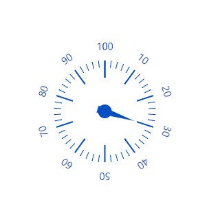
Add a border to the gauge by using axis lines. The appearance of the default axis in the radial gauge can also be customized.
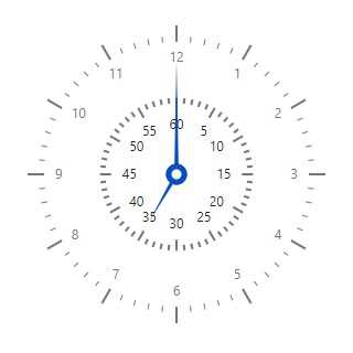
The Blazor Circular Gauge allows you to add multiple axes to a gauge to design it like a clock, speedometer, meter gauge, etc.
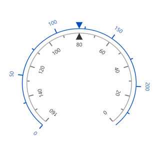
Render the axes in the radial gauge either in a clockwise direction or in a counterclockwise direction.
A range in a Blazor Circular Gauge is a visual element that helps to quickly visualize where a value falls on the axis.
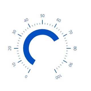
Change the position of a range or move it to any place inside the gauge.
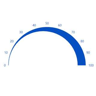
The range width varies based on the values to enhance usage and readability.
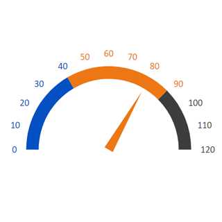
You can add multiple ranges inside the axes to show color variations.
Indicate values on an axis using pointers. The Blazor Circular Gauge component supports three types of pointers: needle, marker, and bar.
Point out the current value in the radial gauge by using a highly customizable needle-type element.
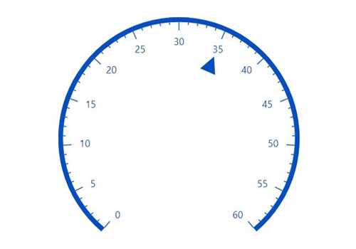
Change the needle pointer type to a triangle or arrow to point out or highlight values.
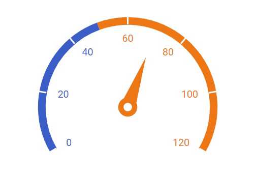
The pointer cap is a rounded ball at the end of the arrow pointer that can also be customized to enhance the pointer’s appearance.
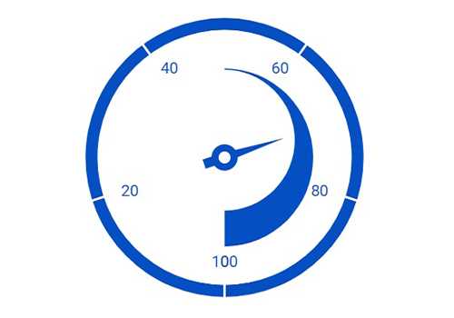
Add extra styling to the pointer cap by adding a tail.
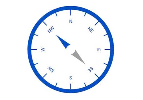
You can add more than one needle pointer to the gauge axes as a result to indicate multiple values.
Point out the current value by using the following different types of marker pointers.
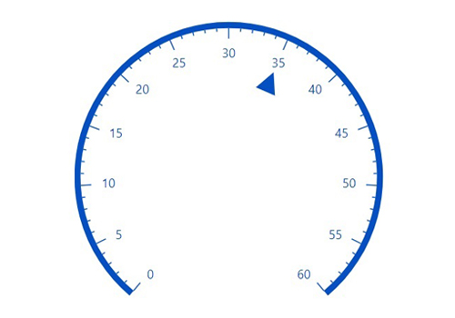
Change the marker pointer type to built-in shapes such as a triangle, inverted triangle, square, or circle to highlight values.
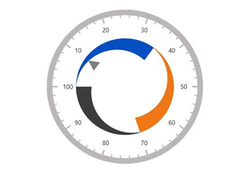
Change or move the marker pointers to any place inside the gauge.
Use bar pointer to point to the current value from the start value of the axes.
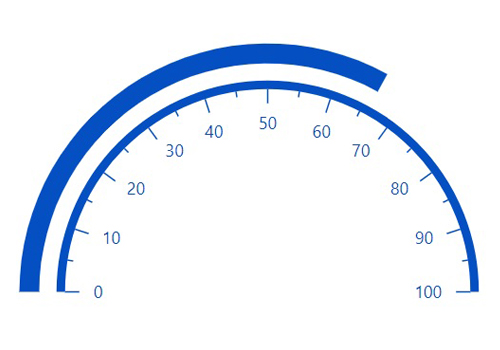
Change or move the bar pointers to any place inside the gauge graphs.
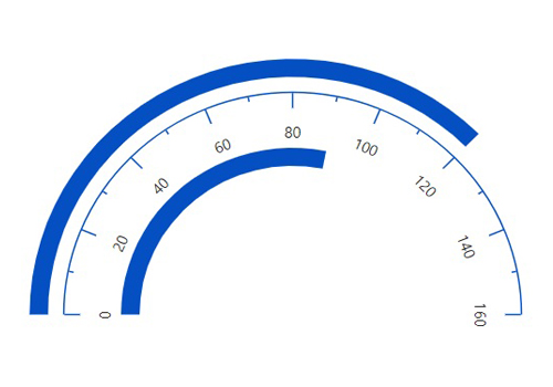
You can add more than one bar pointer to the axes to indicate multiple values.
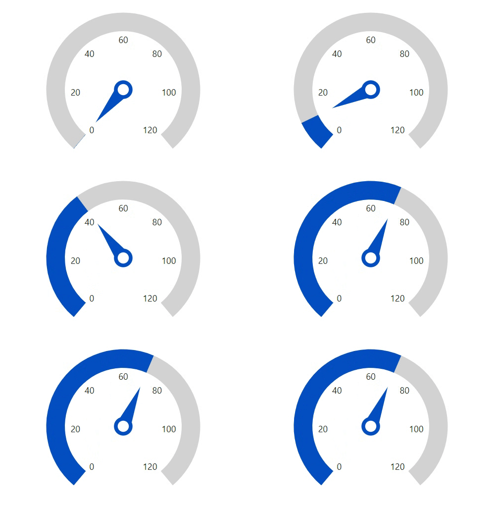
The Blazor Circular Gauge component provides a visually appealing way to view its pointers with animated transitions for a certain duration. Experience smooth pointer transitions by moving the pointer from one place to another.
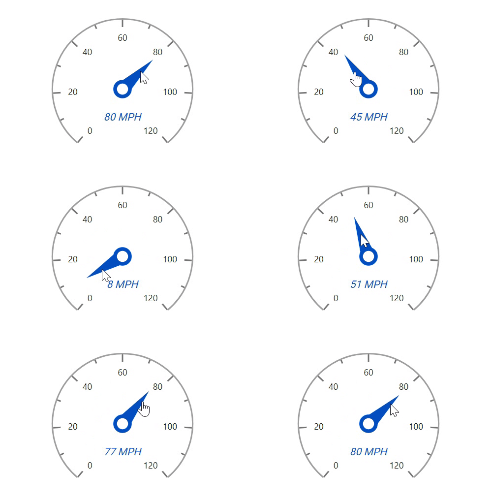
The interactive Blazor Circular Gauge component provides an option to drag the pointer from one place to another. Swipe gestures are used to control the pointer, and the value can be changed at runtime.
The ranges and range bar pointer corners in the radial gauge are rounded to form arc gauges.
A legend provides additional information that is helpful in identifying the ranges in a circular gauge. It can be docked at the left, right, top, and bottom positions around the plot area.
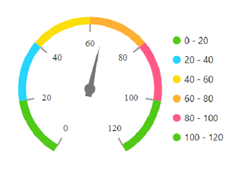
The interactive Blazor Circular Gauge component provides options to display details about a pointer value through a tooltip when hovering the mouse over the pointer.
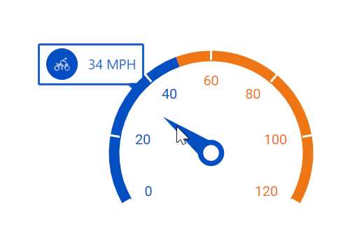
Form half or quarter circular gauges by modifying the start and end angles of a gauge. This allows the gauge to render in a very small area.
Display any HTML element as an annotation at a specific point of interest in the Blazor Circular Gauge. You can also add multiple annotations in a gauge.
The appearance of each element in a Blazor Circular Gauge, such as axes, ranges, axes intervals, pointer positions, label positions, and tick positions, can be customized easily.
Colors applied to the range and pointer can vary gradually to create a smooth color transition.
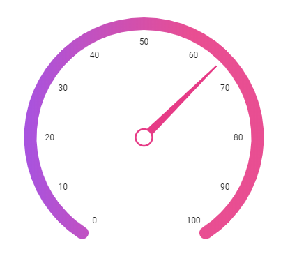
Add a title to visualize additional information on a Blazor Circular Gauge. You can also customize the font of the title in the gauge.
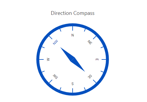
The interactive Blazor Circular Gauge component also support touch interactions.

All the features in Blazor Circular Gauge will work on touch devices with zero configuration. Use the touch features such as tooltip and pointer drag without any customization.
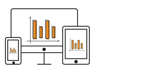
The Blazor Circular Gauge can be viewed on various devices. It is also possible to hide specific elements in the gauge for particular screen sizes by making a very minimal change in the gauge events.

Render Blazor Circular Gauge component in all the modern browsers.
Easily get started with the Blazor Circular Gauge using a few simple lines of C# code, as demonstrated below. Also, explore our Blazor Circular Gauge Example, which shows you how to include the Blazor Circular Gauge component with highlight customization.
- @using Syncfusion.Blazor.CircularGauge
-
- <SfCircularGauge>
- <CircularGaugeLegendSettings Visible="true" Height="50">
- <CircularGaugeLegendBorder Color="green" Width="3"></CircularGaugeLegendBorder>
- </CircularGaugeLegendSettings>
- <CircularGaugeAxes>
- <CircularGaugeAxis Minimum="0" Maximum="100">
- <CircularGaugeAxisMajorTicks UseRangeColor="true">
- </CircularGaugeAxisMajorTicks>
- <CircularGaugeAxisMinorTicks UseRangeColor="true">
- </CircularGaugeAxisMinorTicks>
- <CircularGaugeAxisLabelStyle UseRangeColor="true">
- </CircularGaugeAxisLabelStyle>
- <CircularGaugeRanges>
- <CircularGaugeRange Start="0" End="25" Radius="108%" LegendText="light air">
- </CircularGaugeRange>
- <CircularGaugeRange Start="25" End="50" Radius="108%" LegendText="light air">
- </CircularGaugeRange>
- <CircularGaugeRange Start="50" End="75" Radius="108%" LegendText="light breez">
- </CircularGaugeRange>
- <CircularGaugeRange Start="75" End="100" Radius="108%" LegendText="Gentle breez">
- </CircularGaugeRange>
- </CircularGaugeRanges>
- </CircularGaugeAxis>
- </CircularGaugeAxes>
- </SfCircularGauge>
The circular gauge is also available in JavaScript, Angular, React, and Vue frameworks that are built from their own TypeScript libraries. Check out the different Circular Gauge platforms from the links below,
 Documentation
Greatness—it’s one thing to say you have it, but it means more when others recognize it. Syncfusion® is proud to hold the following industry awards.