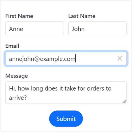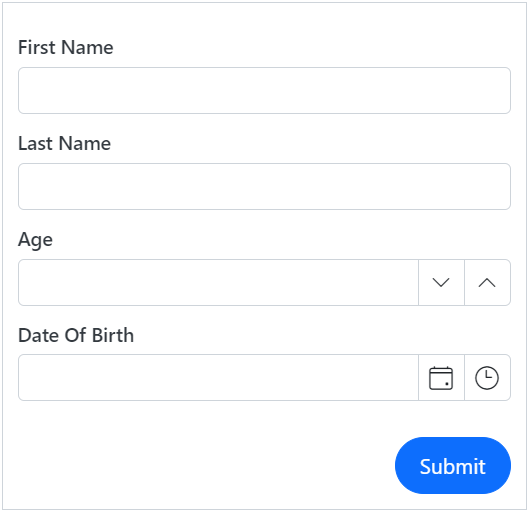
The Syncfusion Blazor Data Form component simplifies form creation in Blazor applications by providing a rich set of features for automatic field generation, layout customization, and seamless data binding. Whether working with simple forms or complex data models, the Data Form component streamlines the development process while offering flexibility for customization.

The Blazor Data Form component supports built-in editors for primitive data types such as string, integer, date-time, date-only, time-only, and enumeration. It also provides custom editors to enhance the user experience.


Automatically generate form fields based on the properties of the data model. Data Form creates built-in components automatically based on the field type, such as TextBox, NumericTextBox, DatePicker, or TextArea. It saves development time by eliminating the need to define each form field manually.


Enable seamless two-way data binding between the form and the data model. This will ensure that users directly set the values of the model and save time. When the form is provided with a data model, it will automatically generate an input field for every property in the model, depending on its type.
The form fields can be customized by changing their appearance, data binding model values, adding placeholders, and more.


The Blazor Data Form can be validated in its entirety through the built-in Blazor validation and other validation methods. Users can provide validation rules directly on the model using attributes such as Required, Range, or MaxLength. Additionally, any field that the form contains can be validated individually. The validation error message can be displayed in three ways: as a validation summary, inline, or using tooltip options.
The Blazor Data Form component offers a straightforward method to modify the default field editors according to the provided data type. Users can select a date picker, date-time picker, or time picker for the DateTime type, and a text box or text area for the string fields.


The component offers a straightforward method for organizing form fields into multiple columns with column-spanning options, enhancing the visual layout and user experience.
The Blazor Data Form component provides options for grouping the form fields, allowing the organization of related fields together.


The Data Form component allows easy customization of the labels, form editor component, and validation messages in any use case.
The Blazor Data Form component supports right-to-left configuration for users who communicate in a right-to-left language script, such as Arabic and Hebrew.

The Data Form offers multiple built-in themes: Tailwind CSS, Bootstrap 5, Bootstrap 4, Bootstrap, Material, Fabric, and high contrast. Users can customize these built-in themes or create new ones in order to achieve the desired appearance and style. This can be done by overriding the Sass variables or utilizing the Theme Studio application.
Easily get started with the Blazor Data Form using a few simple lines of C# code, as demonstrated below. Also explore our Blazor Data Form example, which shows how to render and configure the component.
- @using Syncfusion.Blazor.DataForm
- @using System.ComponentModel.DataAnnotations
-
- <SfDataForm ID="MyForm" Model="@EmployeeDetail">
- <FormValidator>
- <DataAnnotationsValidator></DataAnnotationsValidator>
- </FormValidator>
- <FormItems>
- <FormAutoGenerateItems />
- </FormItems>
- </SfDataForm>
-
- @code {
-
- public class EmployeeDetails
- {
-
- [Required(ErrorMessage = "Please enter first name")]
- [Display(Name = "First Name")]
- public string FirstName { get; set; }
-
- [Required(ErrorMessage = "Please enter last name.")]
- [Display(Name = "Last Name")]
- public string LastName { get; set; }
-
- [Required(ErrorMessage = "Please enter email address.")]
- [EmailAddress(ErrorMessage = "Please enter a valid email address.")]
- [Display(Name = "Email")]
- public string Email { get; set; }
-
- [Display(Name = "Date Of Birth")]
- [Required(ErrorMessage = "Please enter the date of birth.")]
- public DateTime? DOB { get; set; }
-
- }
- private EmployeeDetails EmployeeDetail = new EmployeeDetails();
- }
 Documentation
Greatness—it’s one thing to say you have it, but it means more when others recognize it. Syncfusion® is proud to hold the following industry awards.