
UWP Smith Chart is a data visualization control for high-frequency circuit applications to visualize complex functions. It has two sets of circles to plot the parameters of transmission lines.
Visualize both the impedance and admittance of transmission lines using the UWP Smith Chart control.
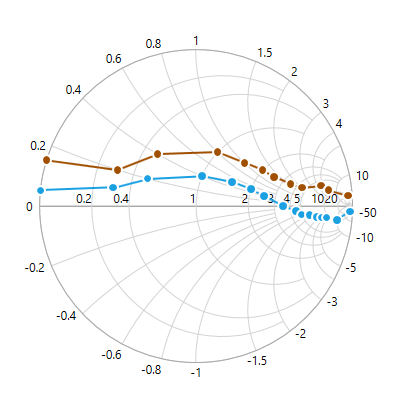
An impedance Smith chart is composed of two families of circles: normalized resistance circles and normalized reactance circles.
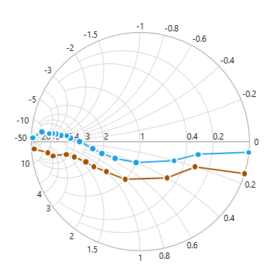
An admittance Smith chart is composed of two families of circles: normalized conductance circles and normalized susceptance circles.
A Smith chart has horizontal and radial axes. The appearance of both axes can be customized, including their labels and major and minor gridlines.
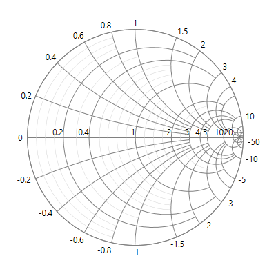
The horizontal axis is used for plotting resistance values of transmission lines.
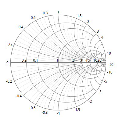
The radial axis is used for plotting reactance values of transmission lines.

Customize the appearance of an axis line using dash styles and axis line color properties.
Plot any number of line series to represent data. Also use different color models and customizable options.
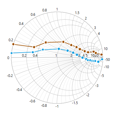
Customize a line’s stroke and width by using the interior and stroke width properties of line series.
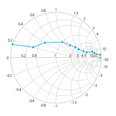
Add marker shapes to a series to indicate each data point.
Easily annotate data points with labels to improve the readability of data.
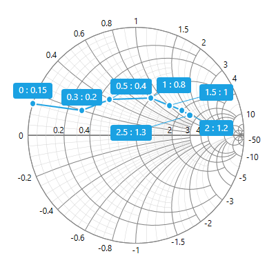
Data labels provide additional information about the data points. By default, the data labels are displayed at the top of their data points.

The data labels are smartly arranged to avoid overlapping when plotting a large amount of data.
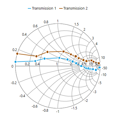
Legends provide additional information that is helpful in identifying individual series in a Smith chart. They can be docked to the left, right, top, or bottom positions around the plot area. Clicking a legend item toggles the visibility of its series.
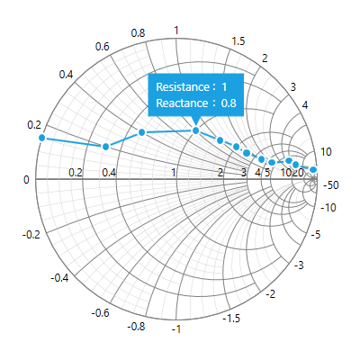
A tooltip displays a pop-up with additional information when the pointer hovers over a data point.
 Documentation
Greatness—it’s one thing to say you have it, but it means more when others recognize it. Syncfusion® is proud to hold the following industry awards.