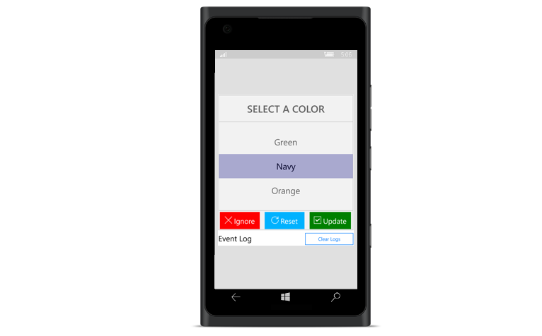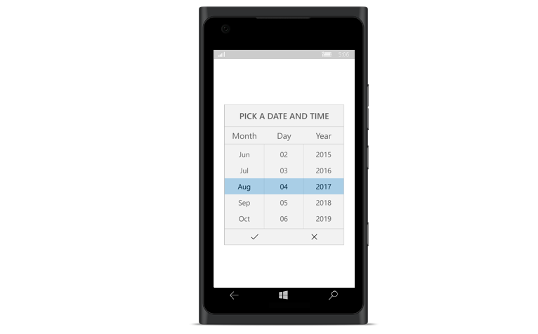
The picker control allows users to pick an item among a list of items that can be customized with custom view. This control can be opened as a dialog. Its rich feature set includes functionalities like data binding, multicolumn, header/footer, custom view on header/footer, and default validation buttons.

Data binding works out-of-the-box for the most popular data sources. The picker control can automatically generate its columns based on data source structure.

The picker control can populate one or more collections in a row. The user can define a column’s data source based on selected items from another column. For example, the user can define two columns, “Country” and “State,” where the “State” column’s data source is dependent on the “Country” column’s selected item.

Users can add additional information using custom view or header text in header/footer view of the picker. Footer view has default validation buttons that can be replaced with custom view if needed.

Open picker control as a dialog.

 Documentation
Greatness—it’s one thing to say you have it, but it means more when others recognize it. Syncfusion® is proud to hold the following industry awards.