Trusted by the world’s leading companies

Overview
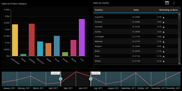
The range selector control provides an effective interface for selecting a smaller range from a large collection. It is commonly used in financial dashboards to filter the time range for which the data is visualized. The interface is also optimized for touch.
Data Types
Range selector has support for working with numeric and date-time data types.


Range Padding
Range padding rounds the start and end range values to the nearest possible nice values.


Common Usage Scenario
The range selector is commonly used along with data-bound controls like the chart and grid to filter the selected range of data.

Chart Types
Data in the range selector can be plotted using several chart types, including line, area, column, spline, step line, step area, and spline area.


Tooltip
Tooltips for sliders show the selected start and end values.


Localization
The data displayed can be customized to any desired culture.
RTL
Right-to-left language orientations like Arabic or Japanese are also supported.

Customization
Rich customization options for labels, gridlines, thumb, and slider are available.


Themes
Several predefined themes are available.


85+ ASP.NET CORE UI CONTROLS
Awards
Greatness—it’s one thing to say you have it, but it means more when others recognize it. Syncfusion® is proud to hold the following industry awards.


