Trusted by the world’s leading companies

Overview
The ribbon control provides support for application menus, button, split buttons, toggle buttons, drop-down, custom control, contextual tabs, expanding/collapsing the ribbon, and group expanders. We can group elements and separate elements using group separators.

Resizing
Ribbon control supports all levels of automatic resizing with group controls. The group controls will be replaced by the custom drop-down button and we can view the group controls by expanding it.

Gallery
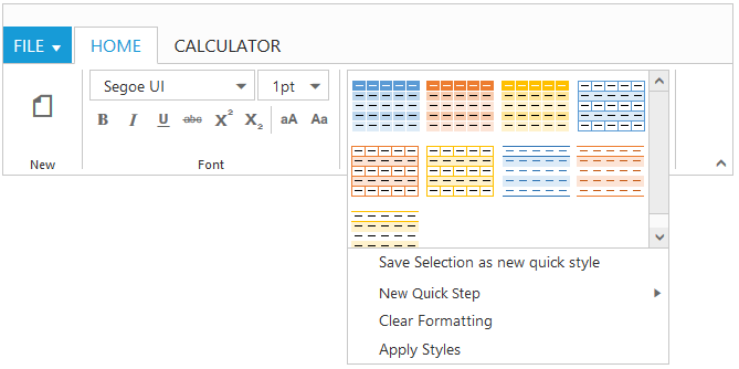
The gallery is used to save space on the ribbon by arranging button controls in it. Most significantly, it provides a means to present user options graphically on the ribbon.


Custom Tooltip
Users can customize the tooltip with the following: ribbon button, split button, drop-down, toggle button, and gallery controls with title, descriptions, and images to represent the control graphically.

AngularJS Support
Ribbon allows users to use HTML as the template language and extend HTML syntax to express all the ribbon features like application tabs, contextual tabs, gallery, resizing, custom tooltip, etc. Ribbon also supports button, split button, drop-down list, menu, and toggle button controls in AngularJS.
Backstage
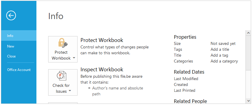
The backstage page in ribbon control is a rich, customizable user interface like Office 2013 backstage. The left side of the backstage page contains tab, button items, and a close button; the right side of the backstage page contains the corresponding user control items.

Responsive Rendering
The ribbon control can adapt to a given screen size. Ribbon tabs, groups, and content automatically change in a mobile view.


On-Demand Rendering
Loading content on demand improves the initial rendering time of the ribbon by rendering tab and backstage content when tabs and backstage items are clicked. This feature also supports initial collapsible rendering of the ribbon, which results in ribbon tabs rendering without any content initially.
85+ ASP.NET CORE UI CONTROLS
Awards
Greatness—it’s one thing to say you have it, but it means more when others recognize it. Syncfusion® is proud to hold the following industry awards.


