Trusted by the world’s leading companies

Overview
Maps is a powerful data visualization widget that can be used to articulate data as a map. It is frequently used in financial dashboards for plotting sales across geography.
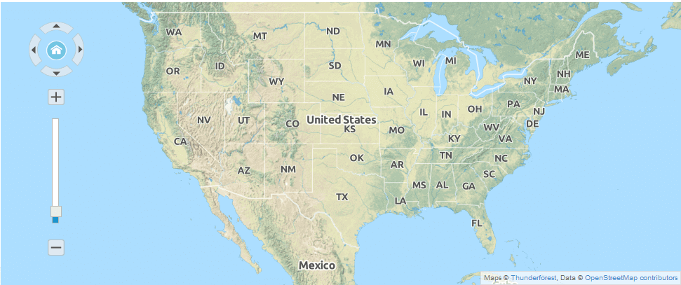
GeoJSON
Use the GeoJSON format shapes to render any geometric shapes for powerful shape data visualization.
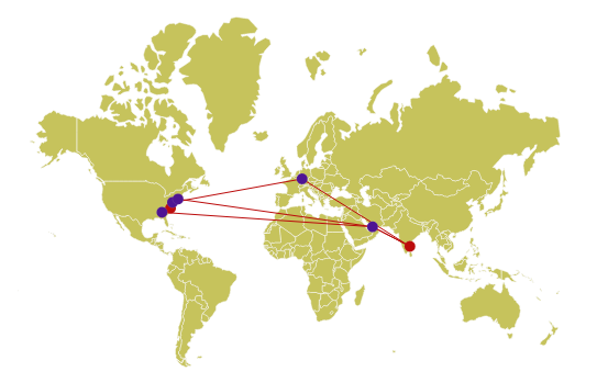
Interactive Zooming and Panning
Zoom and pan the map with the mouse for close-up analysis for easy navigation across its regions.

Multilayers
Visualize multiple layers in one view. Easily drill into each layer as desired.
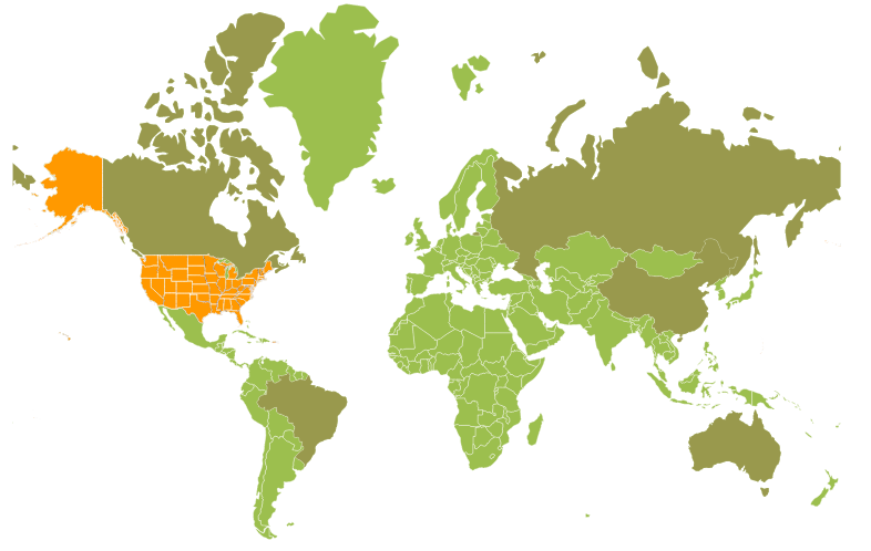
Geo-Imagery Visuals
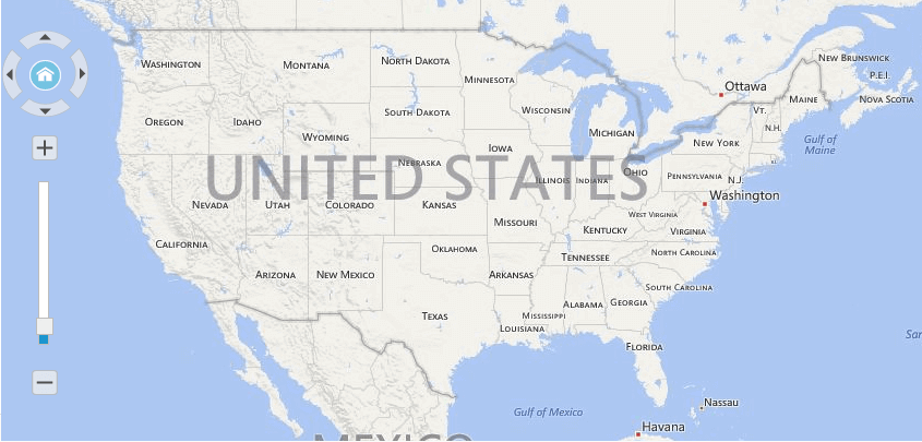
Built-in support for external geospatial imagery services, including Bing® Maps and © OpenStreetMap to visualize satellite, aerial, street map, or other kinds of imagery tiles without any external shape inputs. Using this external services, locating map data is made easy.
OpenStreetMap
Access external geospatial imagery services like OpenStreetMap for deep zoom satellite view.

Bing Map
Access external geospatial imagery services like BingMap for deep zoom satellite view.
Heat Map
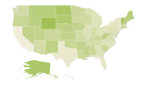
Provides values to fill colors within regions on a map to generate a simple, yet powerful visualization for any set of business data in more comprehensive way.
Palettes
Access built-in palettes with customizable options to fill various ranges of colors by default.

Bubbles
Design map element bubbles to visualize detailed map data and its size can be varied according to underlying values.
Markers
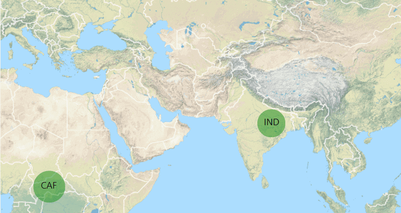
Design map element markers to showcase your data such as weather, routes etc. at specific mark points based on latitude and longitude position as per your application needs.

Legends
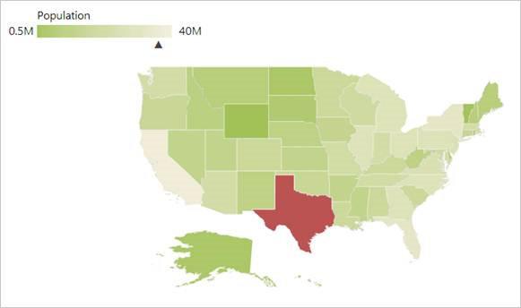
Design map element legends to showcase swatches of symbols with descriptions or a single rectangle with an interactive arrow to provide valuable information for interpreting the map with various colors, shapes, or other identifiers based on the data and application needs.

85+ ASP.NET CORE UI CONTROLS
Awards
Greatness—it’s one thing to say you have it, but it means more when others recognize it. Syncfusion® is proud to hold the following industry awards.


