End users can enable the following built-in features of Pivot Chart either through UI or a simple, user-friendly API.
The control supports common chart types: column, stacking column, bar, stacking bar, area, step area, spline area, stacking area, pie, pyramid, line, step line, doughnut, scatter, bubble, waterfall, funnel and spline. Each chart type is easily configurable with built-in API support for creating stunning visual effects.


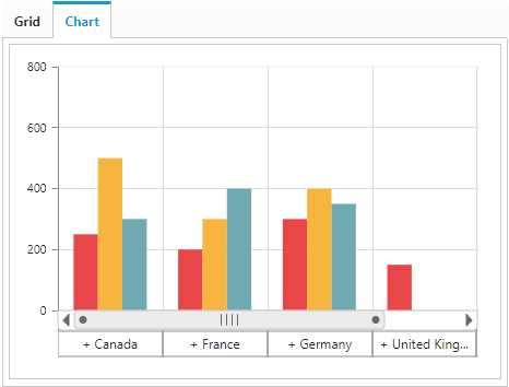
The multilevel labels, also known as grouping labels, allow you to drill down and drill up to different levels based on the bound data.
The control offers a 3D view for bar charts, column charts, stacking bar charts, stacking column charts, doughnut charts, and pie type charts for stunning visualization.


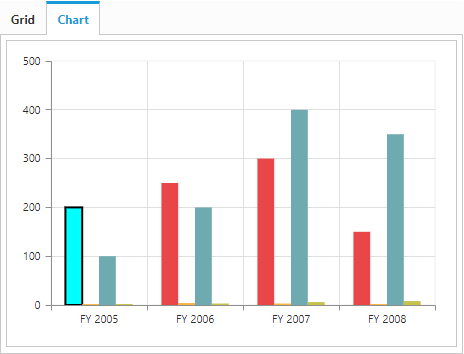
Customize the series color, border color, and border width of the control. You can perform custom operations programmatically.
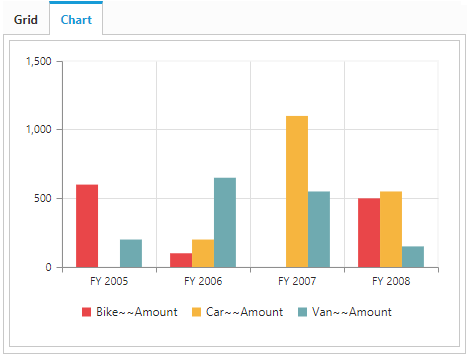
A color code helps to differentiate among chart series items. The legend has labels beside each color to present some detail about the series.


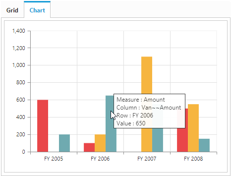
Tooltip provide basic information about a series while the pointer is hovering over it.
