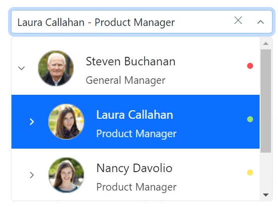
The Dropdown Tree component allows users to select a single value or multiple values in an input box from hierarchical data in a tree-like structure. It has several out-of-the-box features, such as data binding, checkboxes, templates, UI customization, accessibility, and preselected values.


Bind data to the Dropdown Tree component from different data sources, either self-referential data that contains a list of objects with ParentID mapping or heirarchical data that contains a nested list of objects. Data can be local or in any remote service and fetched using different kinds of adapters like OData, OData V4, URL, and web API.
The Dropdown Tree component has different render modes to visualize selected items.
The selected items are displayed as a chip (box) in the Dropdown Tree input box.

The selected items are displayed with the delimiter character in the Dropdown Tree input box.

The default mode is a combination of both the box and delimiter modes. When the component is in focus, selected items will be displayed as chips similar to the box mode. Otherwise, they will be displayed with a delimiter character as in the delimiter mode.


The Blazor Dropdown Tree component provides built-in support for checkboxes, allowing users to select more than one item. Enabling the checkboxes and autocheck functionality makes the parent and child items dependent on each other.
The Dropdown Tree component allows users to select more than one item in the pop-up using the multiselection functionality. Ctrl and Shift key combinations can be used for node selection.

Use templates to change the appearance of the selection pop-up for tree items,the header and footer of the pop-up tree.
Design your own header for the pop-up tree using the header template.

Define the custom appearance of each tree item using the item template.

Define the custom appearance of selected values in the Dropdown Tree input using the value template. Control the presentation of the selected items, such as adding custom HTML, text formatting, or icons to match your application’s design.

Design your own custom footer for the pop-up tree using the footer template.This allows you to fully customize the footer content according to your requirements, offering flexibility in design and functionality.

The Blazor Dropdown Tree component supports in-built filtering through which users can filter the required items based on the characters searched in the search box.

The Blazor Dropdown Tree component supports built-in themes: Material, Material 3, Bootstrap, Fabric (Office 365), Tailwind CSS, Fluent, and high contrast. Users can customize these built-in themes or create new themes to achieve their desired look and feel by either overriding Sass variables or using our Theme Studio application.
Developers can customize all UI elements and component their behaviors according to the end user’s requirements using the component’s rich set of client-side APIs.
Easily get started with the Blazor Dropdown Tree using a few simple lines of C# code, as demonstrated below. Also explore our Blazor Dropdown Tree example, which shows how to render and configure the Blazor Dropdown Tree.
@using Syncfusion.Blazor.Navigations
<SfDropDownTree TItem="ProductCategory" TValue="int?" ID="list" Placeholder="Select a Category" PopupHeight="200px">
    <DropDownTreeField TItem="ProductCategory" DataSource="@Categories" ID="Id" ParentID="ParentId" Text="Name" HasChildren="HasChild" Expanded="Expanded"></DropDownTreeField>
</SfDropDownTree>
@code{
    List<ProductCategory> Categories = new List<ProductCategory>
    {
        new ProductCategory { Id = 1, Name = "Electronics", HasChild=true, Expanded = true },
        new ProductCategory { Id = 2, Name = "Smartphones", ParentId = 1 },
        new ProductCategory { Id = 3, Name = "Laptops", ParentId = 1 },
        new ProductCategory { Id = 6, Name = "Clothing", HasChild=true  },
        new ProductCategory { Id = 7, Name = "Men's Clothing", ParentId = 6 },
        new ProductCategory { Id = 8, Name = "Women's Clothing", ParentId = 6 },
        new ProductCategory { Id = 11, Name = "Home & Furniture", HasChild=true },
        new ProductCategory { Id = 12, Name = "Living Room", ParentId = 11 },
        new ProductCategory { Id = 13, Name = "Bedroom", ParentId = 11 },
        new ProductCategory { Id = 16, Name = "Sports & Fitness", HasChild=true, Expanded=true },
        new ProductCategory { Id = 17, Name = "Exercise Equipment", ParentId = 16 },
        new ProductCategory { Id = 19, Name = "Team Sports", ParentId = 16 },
        new ProductCategory { Id = 20, Name = "Books & Media", HasChild=true },
        new ProductCategory { Id = 21, Name = "Books", ParentId = 20 },
        new ProductCategory { Id = 24, Name = "Toys & Games", HasChild = true },
        new ProductCategory { Id = 25, Name = "Board Games", ParentId = 24 },
        new ProductCategory { Id = 26, Name = "Outdoor Games", ParentId = 24 }
    };
    class ProductCategory
    {
        public int? Id { get; set; }
        public string Name { get; set; }
        public int? ParentId { get; set; }
        public bool HasChild { get; set; }
        public bool Expanded { get; set; }
    }
}

 Documentation
Greatness—it’s one thing to say you have it, but it means more when others recognize it. Syncfusion® is proud to hold the following industry awards.