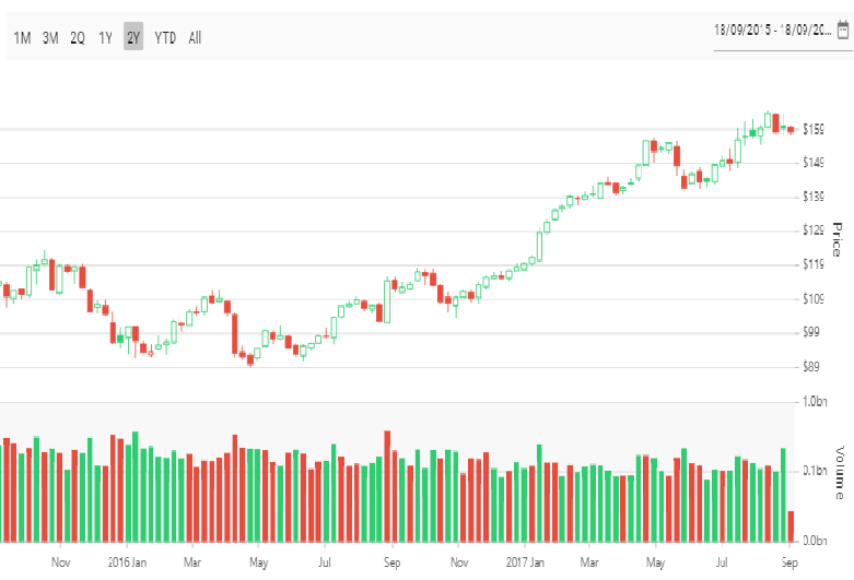
Vue OHLC chart is like a candle chart. The horizontal lines at the left and right are used to show open and close values of the stock, and the vertical line represents high and low values. They are easily customizable and supports interactive features such as trackball, tooltip, selection, and zooming to track information of the data.
Plot multiple series in a single chart to compare different data sets. Enabling legend and tooltip gives more information about the individual series.
Render the stock prices in different panes of a chart. Visualize the OHLC values in one pane and the volume in another pane.
You can use the range selector along with financial chart to filter and navigate through a large number of data points.

Customize bull and bear colors.
Zoom and pan when dealing with large amounts of data to visualize data points in any region.
Easily get started with Vue OHLC Chart by using a few lines of HTML and JS code, as demonstrated below. Also explore our Vue OHLC Chart Example that shows how to render and configure the chart.
- <template>
- <div id="app">
- <ejs-chart id="container" :primaryXAxis='primaryXAxis'>
- <e-series-collection>
- <e-series :dataSource='seriesData' type='HiloOpenClose' xName='x' yName='y'> </e-series>
- </e-series-collection>
- </ejs-chart>
- </div>
- </template>
- <script>
- import { ChartPlugin,Category, HiloOpenCloseSeries} from "@syncfusion/ej2-charts";
- Vue.use(ChartPlugin);
- export default {
- data() {
- return {
- seriesData: [
- { x: 'Jan', open: 120, high: 160, low: 100, close: 140 },
- { x: 'Feb', open: 150, high: 190, low: 130, close: 170 },
- { x: 'Mar', open: 130, high: 170, low: 110, close: 150 },
- { x: 'Apr', open: 160, high: 180, low: 120, close: 140 },
- { x: 'May', open: 150, high: 170, low: 110, close: 130 },
- { x: 'Jun', open: 120, high: 160, low: 100, close: 140 },
- { x: 'Jul', open: 150, high: 190, low: 130, close: 170 },
- { x: 'Aug', open: 130, high: 170, low: 110, close: 150 },
- { x: 'Sep', open: 160, high: 180, low: 120, close: 140 },
- { x: 'Oct', open: 150, high: 170, low: 110, close: 130 }
- ],
-
- primaryXAxis: {
- valueType: 'Category'
- },
- };
- },
- provide:{
- chart: [HiloOpenCloseSeries, Category]
- }
- };
- </script>
- <!DOCTYPE html>
- <html>
-
- <body>
- <div id="app"></div>
- </body>
-
- </html>
