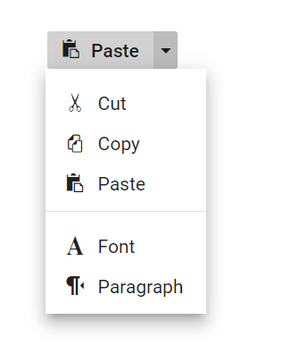
The React Split Button triggers a default action when the primary button is clicked and provides a list of actions when the drop-down button is clicked. It has built-in support for icons and their positioning, varied sizes, disabling items, separators, RTL, and UI customization.
You can make use of different split button sizes, default and small.
Users tend to perceive visual information better than text. The React Split Button has built-in options to include an icon to the left or above the text or provide an icon-only button.
The pop-up is a toggleable container that holds a list of action items or custom content that will open or close when the button is clicked. You can customize all the items in a pop-up.


You can use a horizontal line separator to represent similar action items as a group within the list of available items.
The React Split Button supports built-in themes such as Bootstrap 5, Tailwind CSS, Fluent, high contrast, and more. Users can customize these built-in themes or create new themes to achieve the desired look and feel either by simply overriding SASS variables or using the Theme Studio application.
The Split Button component is also available in Blazor, Vue, Angular, and JavaScript frameworks. Check out the different Split Button platforms from the links below,
In Split Button, you have component over all the UI elements and its behaviors. This provides the best user experience to users through a rich set of developer-friendly APIs.
 Documentation
Greatness—it’s one thing to say you have it, but it means more when others recognize it. Syncfusion® is proud to hold the following industry awards.